Showing posts with label Bible. Show all posts

Friday, July 5, 2024

Hibiscus Mercies with The Greetery


My heart has gone out to the town where The Greetery is located.  All around that Iowa, SD area faced unrelenting rain storms a few weeks ago and its created significant flooding issues.  And while I can’t fix a flood, I can create with some beautiful designs from The Greetery with my hopes and prayers for a full recovery.  

This beautiful set of Botanicuts Hibiscus dies is gorgeous to layer up and feels like summer sun to me!  After I had cut all the flower dies up I added some coloured pencil detailing to them.  It happened that  our daughter was over and she suggested a navy background - and wow was she ever right!  I love the deep drama of the dark colour against the pops of the hibiscus blooms.  


I chose to use a background die from Concord & 9th called Plaid Card Front Thick Die.  This created some strong texture.  I also embossed the whole plaid die cut with clear EP which not only deepened the colour, but added some shine too (but a doozy to photograph!  :) )

The embossed sentiment uses The Greetery’s sentiment set called New Day.  And that scripture passage is a beautiful encouragement.  


Thanks for joining me today - I hope you are enjoying the sweetness of Summer!  


Sunday, September 10, 2023

Golden Leaves with PTI


Alright, I’m giving in that it’s ok for Autumn to come.  It is such a golden season with the changing of leaves, vibrant colours and new starts.  I pulled out a gorgeous background from Simon Says Stamps called Overlapping Dots.  To me it looks just like interlocking leaves, and it’s perfect for embossing, and using resist techniques.  


I used some jewel and autumn toned Lindy’s Magical Pigment Powders  and spritzed lots of water to create this gorgeous rich coloured background.  Then I used the same powders to also run through some leaf die cuts to accent this beautiful embossed verse from PaperTrey Ink called Psalm Reflections:  March Mini.  

Then I went a little crazy with gold splatter....I think I’d dial that down if I could now!  


Thanks for enjoying the beautiful colours of fall with me! 

Monday, May 15, 2023

Golden Glow Petal Die Cuts from PTI


Hello and Happy Monday!  I’m popping in with a design from Paper Trey Ink that celebrates their beautiful Into the Blooms: Gerber Daisies dies.  These are such detailed layering dies that are so fun to use!  I cut out several layers of flowers on heavy white cardstock, and ink blended some golden warm shades for the layers, and glued them up.  


Meanwhile, I foiled one of my fancy Spellbinders dies onto whitc cardstock, and embossed this beautiful Psalm from Psalm Reflections:  February Mini Set to continue that golden glow.   I arranged the flowers on a card that’s 5 x 6 1/4, a little larger than I normally work with, but it needed some extra real estate for all those pretty flowers.  Some watered down gold Lunar Paste is splattered across the layers, and over the card base to give a shimmery but weathered look.  Golden-shabby-chic!  


A lovely flowery start to the week!  Thanks for joining me!   


Monday, April 24, 2023

Cherry Blossoms from PTI


I think because we have a cherry tree in our backyard, I have such an affinity for all things cherry.  Those blossoms are always just gorgeous in the spring.  So, this new die set from PaperTrey Ink really spoke to me.  It’s called Into the Blooms:  Cherry Blossoms.  It’s so elegant and classy, and you can colour it up, cut it from cardstock, or add variation in colour using ink blending.  


For this design I paired it with the Psalm Reflections:  March Mini stamp set, stamping this beautiful verse from Psalms in Seedless Preserves Distress Oxide Ink, and the coordinating Joy die.  

Each of the blossoms is given colour with ink blending, and layered for a gorgeous multi-dimensional look.  The background is run through a quilted die, and I added a ombre background with Distress Inks as well.  


Spring is SO SLOW in coming to our part of the world.  I can’t wait to see these blossoms in real life!  Thanks for joining me today.  

Monday, April 17, 2023

Cherry Whimsy with PTI


Hello and happy Monday!  I love starting a bright and shiny new week with something pretty and uplifting.  Today I’ve got a pretty one with new products from PaperTrey Ink.  When I saw these So Cherry Sweet Stencils, I knew I NEEDED them!  They have just the right touch of sweetness and whimsy, and they were fun to stencil in peachy shades.  After stenciling I ran the layer with a stitched coverplate die and then starting layring with pretty shades of peach and vellum.  


This beautiful Psalm sentiment is from PTI and its called Psalm Reflections March Mini, at just $4.50 US its a great buy!  I stamped the verse using Distress Oxide ink on the vellum and clear embossed it.  The shine and raised embossing looks really classy.  I also stencilled the peach layer behind the vellum for just a hint of the cherries.  


To accent I added some Spellbinders paper accent pieces and a couple of enamel dots.  Doesn’t it just feel full of delight!  A great card of encouragement.  Thanks for joining me today!  


Wednesday, March 29, 2023

Morning Glory Mercies: Watercoloured Die Cuts


Hello!   Today I’m bringing you some beautiful pops of colour on die cuts!  I don’t know how it works for you with inspiration, but sometimes ideas pop into my head that I just have to execute in real life.  As I was thinking about these beautiful new Morning Glory Botanicuts dies I received from The Greetery I knew that I wanted to use bright fushia pink on a navy background.  I think this palette is a really great one!  So, to get that vibrant pink I was looking for, I pulled out my Zig Clean Color Real Brush Markers and watercoloured the flowers and greenery on watercolour paper.  Those Zigs really have saturated colour!  I used direct to paper with the markers and then blended with a water brush. Even then the colour is eye-popping.  


After running a slimline cards layer through a Quilted Card Front die from Concord and 9th.  I began to assemble the layers of flowers and attach them with foam dots.  The dimension is really lovely, like the flowers are bursting off the paper. All those layers from the die give such realism.  


The sentiment from The Greetery’s beautiful New Day sentiment set is embossed on navy cardstock for the perfect touches of white and texture.  It’s part of a very hopeful and encouraging Bible verse from Lamentations 3.  Isn’t all that colour lush?  

Appreciate you joining me today!  I hope you’re inspired to create something that delights you too!  

Friday, September 16, 2022

Leaves All Around with The Greetery


Have the leaves begun to turn in your part of the world yet? That is, if you’re in the Northern Hemisphere, like I am.  We’re just starting to see some tinges of yellow on the leaves, which is always a beautiful stage.  

Today I’m bringing you some lovely leaves from The Greetery’s Leaves All Around stencil and die set,  (on sale right now!), with two cards.    

This first design is a Birthday one that has lots of vibrant colour.  My favourite!  


I started by die cutting and stenciling up this beautiful leaf frame with Distress Oxide inks (Mowed Lawn and Peacock Feathers).  I find that this is one design that it’s better to cut it from the die first so that your stencilling fits perfectly inside.  I also created a background for the design with other Distress Oxide inks, (Abandoned Coral and Seedless Preserves), splashing on some water and white ink splatters.  


To accent I added another The Greetery die, Botanicuts Hollyhocks which was sponged with softer versions of the background ink.   I love the 3D layered effect!  The card is layered together with the leaves popped up using foam squares.  I’ve added some clear holeless sequins in the background and the sentiment die is a retired one from The Cat’s Pajamas.  

Now a cool version with these products:  


For this design I used a similar palette for the leaves, but sponged Peacock Feathers in the background and a Bible Verse sentiment from Stamp Simply’s set Hope.  


I added a few extra leaves from the dies for the top of the card, and the sentiment, and overall kept the layers flat with the exception of that enamel dot.  These leaves are such a great way to frame up a great stamped sentiment or die.  

Appreciate you popping by today!  Enjoy the autumn (or spring) leaves, wherever you are!  


Wednesday, March 2, 2022

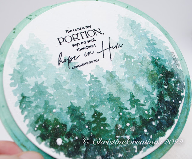
Watercolor Hope Series - Day 3


I appreciate you popping by to join me for day 3 of the Watercolor Hope Series this week.  I’m continuing the show the watercoloring images I worked on last year now that I’m putting them into cards under the theme of HOPE.  

Today’s card is a lovely way to showcase the ombre style by painting evergreen trees in different concentrations of colour.  This colour is Daniel Smith Cascade Green, which I just love because it has different granualation of green and blue depending on how the pigment dries.  I did add a little Lunar Black to the Cascade Green in the darkest rows of trees to create deeper contrast.  I think it’s easier to start dark to light, by increasing the amount of water to paint.  At the end, I added the Lunar Black to the bottom row to make it even darker.  

The verse is from Stamp Simply’s set, Hope.  


After the paint was dry I splashed some white paint and spritzed it with iridescent sparkle to really give the feeling of a dreamy snowy scene.  


For the background of the circle card I first sponged the layers with Distress Oxide Ink (Evergreen Bough), and then added some paint splashes.  I decided it also needed that Ombre feel, so I ended up watercoloring Cascade Green on the bottom third of the background.  I love how the paint took on different colours.  

I’ll be back with the last of the Watercolor Hope Series tomorrrow!  


Sunday, February 27, 2022

Watercolour Hope Series - Day 1


It seems with events around the world we could use a good infusion of hope.  So, this week I’m going to showcase some of the watercolour wreaths I painted last year that I’ve made into cards, pairing them with some Stamp Simply Scripture stamps.  

Today I’m starting with this pretty olive wreath I painted using Daniel Smith Watercolours paired with the Hope stamp set.  Olive leaves have a beautiful long wispy style and vary from silvery green to lighter green.  


This Scripture passage works so perfectly with the theme of hope and olives - as it’s the crushing of olives that produces the oil.  So even in the midst of suffering or affliction, God can be producing something beautiful, useful, fragrant, and hopeful.  So much beautiful symbolism.  Like many crafters around the globe our prayers are fervant for people in Ukraine. 

Hope you’ll join me again tomorrow for another Watercolour wreath.  

Saturday, February 6, 2021

Watercolor Hope Wreath Giveaway


Happy Saturday Everyone!  

Today I have a sweet little giveaway for you with love from my hand.  I’ve been working on my freehand watercolouring this year, I even joined the #100DayProject (on my Instagram Art account christinecreationsart ) to work on a series of watercolour wreaths for 100 days, so I thought I’d do a giveaway showcasing them today.  I have two wreaths to show you today for the Giveaway.  

This pretty wreath combines some of my favourite florals and an encouraging hand painted sentiment that focusses on Hope. I love the idea of hope opening up like a flower.  


6 1/2 x 6 1/2 inches in size, painted with Daniel Smith Extra Fine Watercolors on 300 lb Cold Pressed watercolour paper.  Its ready for a little frame or propped up on a mini easel like this one was.  

Next is a more full and luscious wreath.   


This design has much more layering of colour and leaves and showcases a lovely stamped sentiment from Stamp Simply’s Hope set.  It reads, "Be Joyful in hope, patient in affliction, faithful in prayer."  Romans 12:12


This wreath is also 6 1/2 x 6 1/2 inch size and painted with Daniel Smith Extra Fine Watercolours on 300 lb Cold Pressed Paper.  

To Enter: All you need to do is comment on this post and tell me some of your favourite colour combinations.  One entry per person.  I’ll choose a winner by next Saturday (February 13) and if you’re chosen, you can pick which wreath you’d like.  Please leave your email in the comments so I can contact you to arrange mailing.  


WINNER OF THE TCP Grassy Patches Giveaway:  

Random.org picked:  
sharon g said...

I would just love to win this grass die. I would give it a good home, and take it out to play often :)

February 2, 2021 at 8:55 PM

Sharon I’ll send you a note to collect your prize!  

Thursday, April 18, 2019

Watercolour Wreaths for Easter


On this beautiful Easter weekend, and today as we celebrate Good Friday, I thought it would be fitting to share some Scripture and a couple more watercolor wreaths I’ve worked on.  (more wreaths HERE, HERE and HERE). And where that first Good Friday must have felt deeply sorrowful, full of questions and fear, I have two beautiful portions of Scripture that reinforce the truth that we are not alone and we are loved.  Friday doesn’t have the final word, Sunday’s coming!

For this first design, I wanted to try out some greenery instead of flowers.  I LOVE how it turned out overall, probably because green is my favourite colour, and there are so many shades of it that you can play with.  There are elements of it that I do need more practise on, primarily the Monstera leaves.  I love that they are multiple colours, but their shape needs some work, and I ended up fiddling with them too much.  


It’s a start and I’ll keep practising!  The painting is done with Daniel Smith watercolours and the Bible Verses are from Stamp Simply’s set Fear Not.  One of the drawbacks of watercolor paper is that the ink tends to feather a bit too much, so its not as crisp as I’d like.  Do you have an ink you like on watercolor paper for really crisp words?  


This design showcases another stamp from the Fear Not set, and some pretty spring tulips.  I like the simplicity and shape of the tulips here.  


I think my next purchase will be a rigger brush.  I’ve been working with a round brush 0 or 1 and I think the rigger would be good for some of the more intricate details I need when flowers or lines are small.  Lots still to learn!  Thanks for sharing the process with me!  

Blessings on your Easter friends.  Praying you will be encouraged and impacted by the love of Christ this season.  

Tuesday, April 9, 2019

Watercolour Wreath Series - Three


Hello!  I’ve been doing a bit more watercolouring this week to continue my series of original art wreaths.  The first two of the series are Here and Here.  I’m trying to branch out  - so to speak - with some different styles of flowers and improve my brushstrokes.  This is such new territory for me, because whenever I’ve done original art in the past, I always sketch first.  Here, I’m starting just with brush and paint.  So...sometimes I have more success than others!  I’m also trying to develop my own style, and I think that takes a long time to figure out. So, I’ll continue to call these experiments :)!  Happy ones, because I’m enjoying myself, but still works in progress.  

Today I’ll start with this fun one that is supposed to be a loose interpretation of sunny ranunculus blooms.  I think that’s one unique thing about watercolour, it can be very detailed and precise as a medium, but it's often an equally successful medium by its suggestion of shape, with brushstroke and colour.  Your eye fills in the details and reads it as (hopefully) what the artist intends.  That said, my youngest son thought they were woodcuts!  (ha!) Obviously I still have a ways to go!  


All of these cards today are painted with Daniel Smith Watercolours.  This one above in Quinachridone Gold, Quinachridone Coral, Phthalo Turquoise, Hookers Green, Hansa Medium Yellow and Cobolt Blue.

The sentiment is Stamp Simply’s lovely set,  Encouragement Combo.


I love how these irises turned out, but they started out as a completely different flower!  But the more I looked at them, the more I saw iris, so that’s the direction I went.  I really wish I would have tipped that bottom iris a bit to the left so it followed the curve of the circle better, but once the paint is down, it’s down.  This design also uses the above Phthalo Turquoise, Hansa Yellow and Hookers Green, and adds Quinachridone Rose to mix with Cobolt Blue to create the pretty purples.  


 The sentiment is from Stamp Simply’s set Fear Not.


Lastly for today, I created some more tiny roses and greenery for this one.  I’m learning to start more gradually with softer colours and more washes rather than bold colour right up front.  In that way, it’s the opposite from Copics where you blend out your colour, watercolour is soft washes that build colour in layers.  Completely different mindset for my brain!  


This sentiment is also created with Stamp Simply’s set, Encouragement Combo.

And, all of these designs are painted on Strathmore Cold Pressed 140 lb paper.  It’s nice and sturdy for the card designs.  Heavy enough to even be used as card weight.

Thanks for stopping by!

Tuesday, March 26, 2019

Watercolor Wreath Series - Two


Hello there!  I’m back with the series of original watercolor wreath artwork I’ve been working on.  The first post is HERE in case you want to catch up.  For this trio I used the same 4 1/4 x 4 1/4 inch size of card, Strathmore watercolor paper, and Kuretake Gansai Tambi watercolors.  

This first card does have the look of Christmas berries, but I think the pop of lime green could make it work for any season.  I’ve stamped the Bible Verse from Stamp Simply’s Words of Encouragement set.  


This card shows off a bit more delicate feel with tiny leaves, pointed petal open blossoms and a sweet palette of colours.  


I did some splattering on this one and the Bible verse is from Stamp Simply, Pastor and Minister Appreciation Scripture Sentiments.  


This last one is all cool blues and greens with heart shaped blossoms and simple lines.  


It’s really fun to play with different types of brush strokes to get unique flower and leaf looks!  


Saturday, July 21, 2018

Love One Another - Home Decor Watercolour

We’re back with another brand new illustration from Power Poppy in our 5 Days of Digis Kickoff!  Today it’s the spring gardeners dream, Love One Another.  


As soon as I saw this image I let out a gasp!  Not only does it combine some of my favourite spring flowers in a spectacular way, I also love the verse included.  We want that to be a hallmark of our family.  We all need that reminder of living out love for toward each other.   I think it is incredibly beautiful!  So, as I did with the image yesterday, this lovely digital got a super-size treatment and I made another 8 x 10 piece for our home, printed on Arches Cold Press 90 lb paper.


I took a few days to watercolour this one so that the layers of glazing could show through the work, and you’d get the sense of a depth of colour.  Watercolouring is done with a mix of Daniel Smith and Gansai Tambi watercolours.  I’ll admit the first few layers, I had my doubts that I could make it work, but I’m so pleased with how it finally came together.  I still think I paint a bit too “tight” and need to continue to practise on making it a bit looser, but I love the vibrance I was able to achieve and how cheerful it is.  On long winter days it will be a good reminder of spring coming.  


I’ll show you a few closeups of some of the elements.  I was able to give that luna moth some fun colour that I’m really pleased with, and even used my tiny #0 brush to lightly feather in the detail to his antennae.  

I looked up some colouring for beetles and found a fun one (as much as beetles can be fun), that was an iridescent teal with bronze.  Well, my Gansai Tambi Watercolours have a gold/bronze metallic shade that was perfect for making him come to life.  I also had a lot of fun with the caterpillar (I made him to look like a monarch caterpillar) on the bottom right which you can just catch a glimpse of.  


I gave a little varied colour treatment to the sentiment to make it sing.  I love this version of the verse from John 13:34.  "So now I am giving you a new commandment: Love each other. Just as I have loved you, you should love each other.” (NLT).  Oh, I hope our lives continue to be characterized by love.  Tender, self-sacrificing, relentless, hope-filled, believing-in kind of love.  

Here is the image which comes with or without the sentiment, be sure to check it out HERE.


And now, more sneak peeks of this beauty can be found with the Bloom Brigade and Instant Gardeners HERE:
Christine (you are here)
Stacy
Rhea
Barbara
Cheryl 
Save