Showing posts with label Sympathy. Show all posts

Wednesday, March 6, 2024

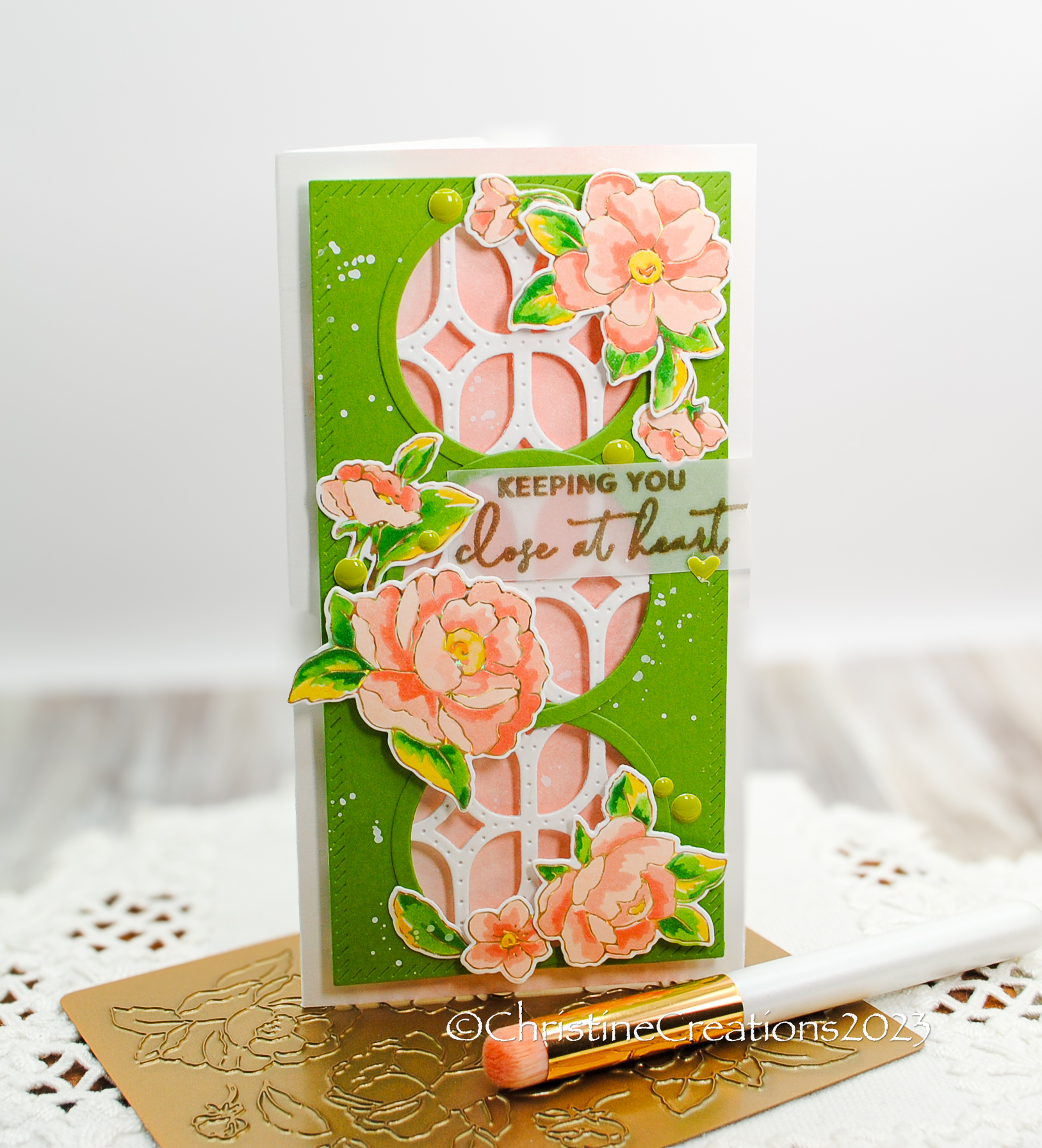
Frames of Flowers with Pinkfresh Studios


Hello!  I’m dropping in tonight with some wonderful flowers for Pinkfresh Studio’s March Challenge.  This one is showcasing frames on your design.  This beautiful set from Pinkfresh is called  Peony Fantasy and it has a floral stamp set, hot foil plate, dies and stencils.  Today I used the Peony Fantasy Hot Foil plate and the Coordinating Stencils to accent these pretty circular frames on the mini-slimline card.  


I used several Pinkfresh dies to layer the design including the outer frame and circles with Essentials Mini Slimline Die Bundle,  and to create the lattice I used Elongated Lattice Coverplate.  

The bright green is a great backdrop for the flowers, and I ink blended the card base in soft peach, to peek through the circles, and splattered white acrylic paint for some  added interest.  


The gold embossed vellum sentiment really ties in to the foiled flowers nicely.  Perfect for a friend who could use some encouragement or even a sympathy card.  Hope you’ve enjoyed the inspiration today!  

Tuesday, July 18, 2023

Spellbinders Stitched Sympathy


I’ve enjoyed doing some stitching on recent projects, its one thing I can do while watching a show at night, and it’s relaxing.  I purchased some stitching dies when they were on sale recently, including this one from Spellbinders, Layered Stitch Background.  I has numerous die layers you can put together (and I can’t wait to try that), but I chose this time to use the small stitching part of the die twice on this card front and only stitch a pattern into it with several shades of periwinkle, lime green and sparkly white floss.  


I made the pattern quite intricate with the layers of white metallic thread between the stars, and then only added two small parts of the layering dies from the set to highlight the sentiment.  This is a silver foiled sentiment from Spellbinders called Mini Everyday Sentiments.  I allows the pattern to show nicely without covering it up too much.  I thought the soothing nature of the stitching would work for a sympathy design.  
 

The texture, sparkle from the thread and dimension is just beautiful in person!  

Friday, February 25, 2022

A Sympathy Poppy


Last Fall I seeded some poppies in our flower bed.  I’m so hoping they winter well so that we will enjoy them this summer.  I love the papery-thin petals and the gorgeous centers.  Today I’m bringing you another stunning poppy from Power Poppy called Ultimate Poppy.  I really showcases the flower so beautifully.  And it’s of a really awesome size to make a statement on a card.  Here I’ve used it on a sympathy card, but I think pairing it with white really simplifies it in a way that’s elegant.  


I’ve placed the poppy on some elegant damask paper, which also includes the sentiment, and framed the edge with some Spellbinders dies.  


Here is the verse inside the card, also from a retired Power Poppy set.  You never wish to send a sympathy card, but it means so much to the recipient to know you are thinking of and praying for them.  


Here is a peek at the Copics I used for colouring.  


Friday, June 5, 2020

Sunrise Rose


There have been a lot of heavy things in the world in the last weeks and months.  My heart has been deeply burdened for so many, enough that I don’t even know how to put it into words.  So, I won’t try to now, but I will try to bring some hope through what I create.  

It’s been a hard week in our family on a different level.  A beloved teacher passed away who taught our sons for several years, and she was also a colleague of our daughter’s in her first year of teaching.  She mentored our daughter in countless ways and we are so sad she is gone.   She was a rare and wonderful lady.  Then we got the news that my favourite Auntie passed away.  She lived a beautiful life of almost 87 years.  She was my mom’s closest sibling and we spent much of my growing up together with them.  In the midst of all of the necessary isolation we have to live in, we won’t even be able to go to a funeral for her.  But I will remember her life, and the grace and love she showed to us.  

This card is for my Mom as we remember my Auntie’s life.  This Spring we planted a new Morden Rose Bush, called Sunrise, in honour of my mother-in-law who passed away in December.  I wanted something living to be a reminder of her.  It’s a beautiful bush type rose with petals from golden yellow to peach and orange.  I can’t wait for it to begin growing.  When I picked up Marcy’s FREE Rose image, from Power Poppy I used those colours to guide my Copics.  


A beauty of an image!  The sentiment is from Power Poppy’s retired set, Sweet Memories.  I’ve stamped it in both Memento Pear Tart and Bamboo Leaves ink to get the ombre look, and I’ve inked the background with a gradiation of those inks as well.  The framing shape is sanded down and I’ve added some twine and dots for accent. 


Pop on over to see what my friend Leslie has in store today, it’s a beauty!

And....Happy Birthday to Power Poppy’s own lovely Marcella Hawley today!

Wednesday, May 22, 2019

TCP New Release: Henna Batik


It’s Day Three of Sneaky Peek Week at The Cat’s Pajamas!  Today’s set is such a unique one that I think you’ll really love.  The Cat Pack has some really unique takes on it too, so you’ll find lots of inspiration along the way today.  It’s called Henna Tattoos.  


When I first saw the set, I thought it would look really great embossed because of all the detail, and then I imagined that watercolouring with it would really bring out some of the uniqueness too.  So, this is a bit of my version of a watercoloured batik fabric design.  Two of the larger tattoo elements are embossed on watercolour paper in a random pattern, and then I used my Daniel Smith Watercolours to paint in layers over the embossing, finishing it off with some splashing of leftover paint and shimmery gold.  


The pretty scripted sentiment is embossed on vellum with more splashes of gold paint, and accented with a couple of sequins.  Quite a clean design, but with lots of rich colour.  I think it would make a great card for encouraging someone or even as a sympathy card too.  


Such a intricate and detailed set isn’t it?  

Another day another chance to win at In It To Win It!  Comment on The Cat Pack’s posts today and you could be chosen to win a Gift Code to the TCP Store!  

Here’s the gang with more inspiration today....

Alma at The Cat’s Pajamas
Christine Okken (you are here)
Brenda Nakandakari
Julee Tillman
Kerry Urbatch
Melissa Chipperfield
Nancy Thomas

Tuesday, April 9, 2019

Watercolour Wreath Series - Three


Hello!  I’ve been doing a bit more watercolouring this week to continue my series of original art wreaths.  The first two of the series are Here and Here.  I’m trying to branch out  - so to speak - with some different styles of flowers and improve my brushstrokes.  This is such new territory for me, because whenever I’ve done original art in the past, I always sketch first.  Here, I’m starting just with brush and paint.  So...sometimes I have more success than others!  I’m also trying to develop my own style, and I think that takes a long time to figure out. So, I’ll continue to call these experiments :)!  Happy ones, because I’m enjoying myself, but still works in progress.  

Today I’ll start with this fun one that is supposed to be a loose interpretation of sunny ranunculus blooms.  I think that’s one unique thing about watercolour, it can be very detailed and precise as a medium, but it's often an equally successful medium by its suggestion of shape, with brushstroke and colour.  Your eye fills in the details and reads it as (hopefully) what the artist intends.  That said, my youngest son thought they were woodcuts!  (ha!) Obviously I still have a ways to go!  


All of these cards today are painted with Daniel Smith Watercolours.  This one above in Quinachridone Gold, Quinachridone Coral, Phthalo Turquoise, Hookers Green, Hansa Medium Yellow and Cobolt Blue.

The sentiment is Stamp Simply’s lovely set,  Encouragement Combo.


I love how these irises turned out, but they started out as a completely different flower!  But the more I looked at them, the more I saw iris, so that’s the direction I went.  I really wish I would have tipped that bottom iris a bit to the left so it followed the curve of the circle better, but once the paint is down, it’s down.  This design also uses the above Phthalo Turquoise, Hansa Yellow and Hookers Green, and adds Quinachridone Rose to mix with Cobolt Blue to create the pretty purples.  


 The sentiment is from Stamp Simply’s set Fear Not.


Lastly for today, I created some more tiny roses and greenery for this one.  I’m learning to start more gradually with softer colours and more washes rather than bold colour right up front.  In that way, it’s the opposite from Copics where you blend out your colour, watercolour is soft washes that build colour in layers.  Completely different mindset for my brain!  


This sentiment is also created with Stamp Simply’s set, Encouragement Combo.

And, all of these designs are painted on Strathmore Cold Pressed 140 lb paper.  It’s nice and sturdy for the card designs.  Heavy enough to even be used as card weight.

Thanks for stopping by!

Monday, March 27, 2017

Drywall Dust and Renovations

Hi there friends!

Right now we’re in the middle of a bathroom renovation.  We gutted the basement bathroom to renovate it this week because it’s a week of vacation for us.  So, you can imagine me right now with drywall dust clinging to my eyelashes.  We really hope to have it all finished by the end of this week, but everything takes so much longer than you’d like it to, thus, my creative time is lacking right now!

In the spirit of the “renovation” theme,  I thought I’d show you a collection of cards that have been sitting in my photo files, but I’ve hesitate to show them to you.  They are creations I made where something isn’t quite right about them to me.  I’m hoping that maybe you have those off days too in your card making too.  Maybe these cards also need some renovation!  :)


First up is this pretty flower by Power Poppy from the set, Prairie Cheer.  I love echinacea, or coneflowers!  I love their pretty deep pink blooms, and earthy centers.  I had wanted to use my Prismacolor pencils for a change, so I pulled them out to colour this design.  I like elements of the card....I like the layout, the fun pennants and the buttons, but there’s something funky about it to me.  I think maybe I shouldn’t have coloured up the sentiment (but it’s such a sweet one right?), or maybe it’s the pink and yellow combo that makes me unsure, or how the flower looks perched on the outside edge like that....  


Regardless...reno or not....it’s still a thoughtful card :)  So, I’m sticking with that.  

Next up some MFT for a masculine birthday.  


I’ve loved these cute cows from the MFT set, The Whole Herd, and I knew I wanted to do a grouping of them to work with the cute sentiment from the set.  I masked a number of them together like they’ve come over to say Happy Birthday!    I like elements of this card too, the fun dots in the background to mimic their dairy cows spots, and I like the more neutral palette, and yet something feels off to me about this one too.  I think it’s the addition of the green grass and yellow hay paired with the black and white, and despite my best efforts, my colouring with black Copics always looks too sharp to me, like I haven’t blended well.  


They are so cute though aren’t they?  Below is the inside of the design with a few more cow spots.  


This one used a ton of Copics to colour...


And finally, a really simple design for a sympathy card.  


This card design uses Power Poppy’s set Soothing Sympathy.  I actually really do like this card , but it is very CAS, and sometimes I wonder if it’s “enough” to show you, know what I mean?  I like the embossed layer, the colour palette, and the pretty additions of the vellum.  It’s soothing I think.   

So, now I’ll get back to the reno’s downstairs, and catch up with you soon, I hope! And, hopefully, with no drywall dust in sight!  Thanks for your visit!


Save

Friday, January 13, 2017

Warm Hugs


We’re back this week with a new round of inspiration from Power Poppy, and this week I’ve got some more ideas for our Winter Blooms Challenge from Stacy.  One of my all-time favourite images from Marcy (and that’s saying something) is this little vase of hellebore, or lenten roses.  I don’t know what it is but, I just love these simple blooms that come to remind us that winter doesn’t have the final say :).   Marcy has them in digitial format in this set, Hellebores.   

For fun this time I flipped the image 180 degrees so that the vase is aligned on the right side of the page.  That is another really nice advantage to using digi images.  

I looked up some fun new colours for hellebores and found this one below that I wanted to replicate.  


Of course, in creation they are much more beautiful and natural, but I enjoyed playing with those yellowy greens and that deep pink, plus that really rich green in the leaves.  It was a fun combination to colour.  


The design is quite simple and clean with strips of paper and washi tape, and then a little bit of rhinestone scalloping as a pretty little bit of bling.  The sentiment is stamped in Memento Gray Flannel from the set Nice Things To Say.  I’m sending it to my sister-in-law who lost her beloved grandma recently.  I know she’ll appreciate it.  


Here’s the Copic collection for the colouring.  

And now the rest of the Bloom Brigade playing along today....

Allison Cope
Christine Okken (
you are here)
Cindy Lawrence

Julie Koerber
Stacy Morgan


Friday, January 6, 2017

Winter Blossoms


We’re back with Power Poppy’s new January Challenge, and Stacy is our hostess this month!  She’s given us a fabulous “Winter Blooms” Challenge.  Here are the details:  "When winter comes, many of us long to say goodbye to the chill and say hello to those cheerful and fresh spring flowers! Did you know there are lots of blooms that sprout at the end of winter (you can cheat and include early spring as well)? How about camellias, crocus, paperwhites, holly, snowdrops, or poinsettias? Let's see how you can bring these pretty little petals and glorious greens to life and enjoy this last bit of winter as well!” 

Well, in my winter up in Canada we are a long way from blooms, but a girl can still dream, so it’s fun to celebrate and colour some pretty things that will bloom soon.  I picked a lovely Power Poppy set to play with.  


It’s been a tough few weeks as people we love, have lost loved ones, so this card is to one of “my girls” that recently lost her mom.  I call them my girls still because they were students we had in our youth ministry when we were youth pastors.  They are all so special to me still, as I watch them now as young women getting married, starting families and going through all the good and difficult that life brings.  I hope this is an encouragement to her and her little family in a very sad time.  

I started with Power Poppy’s lovely set Bloomin’ Wonderful.  This particular image with the crocuses , snowdrops and pussywillow are also found in one of Power Poppy’s digital images too, Winter Pick Me Up, if you prefer that method of delivery.  I stamped in a softer grey ink from Memento, then coloured it up with Copics.  

I wanted to keep the overall design simple with some burlap paper, a bit of patterned paper, the yellow seam binding bow and some enamel dots.  


A bit of a closer look at the colouring for you.  And below the Copics I used.  


So we hope you’ll join us with this Winter Bloom Challenge.  Play along and you could win a Power Poppy set of your choice!   Marcy even set aside a special gallery of which Power Poppy sets would work for the challenge HERE.  

Now here’s some more of the Power Poppy Bloom Brigade to inspire you with their Winter Blooms:

Christine Okken (you are here)
Cindy Lawrence
Julie Koerber
Kathy Jones
Katie Sims

Stacy Morgan
Tosha Leyendekker


Friday, September 2, 2016

Peace Brother


So quickly life can change (just so you know, heartfelt personal post ahead).

August 12 found our family heading back home after a family reunion with my husband's siblings.  There were 24 of us there with 3 generations together, it was important time with family.  Driving back home means about 24 hours of driving time and we were about three hours from our house when I pulled out my phone and opened my email to learn that one of our dearest friends had suddenly passed away from a heart attack.  His name was Randy and he was just 54 years old.  He leaves behind a beautiful wife of 30 years and a 15 year old son.  I actually wrote about him in this gratitude post HERE in February as he spent the weekend with us at a conference at our Church.  After we found out the news of his death it was a whirlwind the next several days as we got kids where they needed to go and flew back down for the funeral.  

Randy's life impacted our lives in such profound ways, and his loss has shaken us.  I know that as we walk authentically through grief that God will meet us there, and more than anything else, as we do that, Randy's influence will live on.  I want the life he lived to continue to impact me, propel me, challenge me, deepen me.  But right now, we just miss him so much.  

So, even as I show you the card I made for his wife and son that we love, I'll tell you more about what made Randy so amazing, and how blessed we feel to have known him.  


Randy lived a life that engaged people to be authentic and deep.  He had this way of asking a level of question that was both challenging, encouraging and would have you pondering for days.  He chose to listen and value people and their stories, their journeys, and the experiences that made them unique.  When you were with Randy you felt like you mattered, your story mattered, your calling mattered, your future mattered, and not only that it mattered to him, he reminded you that it mattered deeply to God.  He was so willing to speak truth and hope, and also to get under your skin and make you uncomfortable.  He believed in us and mentored us, and walked this very real life in front of us at really significant moments in our lives.  He was an author, a runner, a coffee lover, a goofy and good friend, and built an leadership organization that put three important questions in front of thousands of people around North America through curriculum he wrote.  They are,  "Who is God', "Who am I", "What does God want to do through my life"...prompted by Ephesians 2:10; “For we are what He has made us, created in Christ Jesus for good works, which He prepared beforehand to be our way of life.” Randy lived out love because he knew he was loved by Jesus.  

I wish we had more time.  I'm not ready for him to be gone.   And in the midst of it all, we feel so blessed for the time we had.  

So, that's why it's been quiet over here on the blog.  We're pondering and wrestling with a lot of things.  All good things, but they are hard things too.  


Randy had lots of signature phrases he'd use.  Everyone knew them, and they made him goofy and fun and real.  One of them was how he'd say "peace" and hold up his two fingers in the peace sign, it was sort of his little blessing he'd extend to others.  So, when I was putting together this card I had to include that word on it.  He extended peace to others, he dwelt in peace with God, he knows the full measure of peace now, and I know his wife and son are comforted by peace in these days.  


This was Randy running a marathon just 6 weeks before he passed away.  Look at that smile!  We sure loved him.  

Here’s the rest of the Power Poppy team bringing you inspiration today:

Christine Okken (you are here)
Cindy Lawrence
Julie Koerber
Katie Sims
Stacy Morgan


Stamps:  Power Poppy - Soothing Sympathy;  Paper:  XPress it Blending Cardstock, SU Pool Party, SU Barely Banana;  Accessories:  Copics:  Y11, Y21, Y23, Y26, BG11, BG000, YG41, YG45, YG00, MFT Scalloped Circle Die, Firefly Embossing Folder, Satin Ribbon, Corner Rounder.  


Friday, June 24, 2016

Peaceful Peony


We’re kicking off a brand new set of Power Poppy Polymer!  Marcy is releasing SEVEN new sets and calling it all the Midsummer Stunner!  I think you’re going to love what’s in store over the next few days.  We’re so excited to show them to you!

Today we’re kicking it off with a beautiful new set that is design to send messages of healing and hope in difficult times.  It’s called Soothing Sympathyand it’s so very lovely.  In this set you’ll find botanical illustrations featuring symbolic images: "There's rosemary, that's for remembrance", wrote Shakespeare in Hamlet. A simple peony stem symbolizes peace. And the curling sprig of forget-me-not for reasons we don't have to explain.


I started with the beautiful sprig of peonies, colouring them in rich burgundy shades to really give it a rich pop of colour, then pairing it with some soft buttery-yellow designer paper.  I think these two colours give it a warm and comforting feel. 


I added some embossing on the simple strip of burgundy paper and some pretty creamy lace, with a few enamel dots to finish it off.  Nicely clean and simple, but I think that often works best when you’re creating a card like a sympathy card.  


Here’s the Bloom Brigade bringing you beautiful inspiration today!

Christine Okken (you are here)
Cindy Lawrence

Kathy Jones
Stacy Morgan
Tosha Leyendekker


And you’ll want to visit the Power Poppy Blog to see what Marcy has to say about this beautiful set. I’ll see you back here tomorrow with more in store!


Monday, January 27, 2014

Irises for Iris

Timeless-Tuesday-New-Logo


Hello fellow Flourishes fans! It's Tuesday and we're here with another fantastic Timeless Tuesday Challenge for you! Have you checked out the latest and greatest Gambler's Sale this week? You don't want to miss this... it's 20% off everything in the store. Things go fast, so shop now to ensure you get all those stamps on your "must have" list! Click here for more details and your shopping code.

This week Allison is our hostess and she is challenging you to create using the newest Pantone Color of the year... Radiant Orchid... but any shade of purple will do!

FTTC256 Purple
 

According to the Pantone View, "Since 2000, the Pantone Color Institute™ has been designating a Color of the Year to express in color what is taking place in the global zeitgeist. A color that will resonate around the world, the PANTONE Color of the Year is a reflection of what people are looking for, what they feel they need that color can help to answer. Not necessarily the hot fashion color of the moment, but a color crossing all areas of design which is an expression of a mood, an attitude, on the part of the consumers." Have fun using purple in your creations this week!


I had a difficult occasion to make this card for.  My Uncle passed away and we went to the funeral out of town last week.  It was tough.  We knew his time was coming - but still it came too soon.  My lovely Aunt’s name happens to be Iris and as I was getting ready to use this gorgeous Flowers for Jan set, I realized how perfect this particular image would be for her.  Irises for Auntie Iris.  

I decided I wanted to make an Iris garden for her, so I stamped the image on both Flourishes Classic White cardstock and then created a mask on Eclipse tape, cutting it out carefully and then stamping twice more with the masks on the cardstock.  The Copics I used were from the Violet Collection as well as the Olive Green Collection, and then filling in with some pretty BV’s in the shadows to add some depth.  I used an out of the box cutting style for the top of the design and I chose a simple layout that also accents the flowers with this pretty Color Made Easy - Crocus Collection of cardstock.  


I’ve added some gorgeous lace, seam binding and enamel dots.  


And just a quick look at the sentiment from another Flourishes set (Anemones) I used because it was perfect - this set is already out of stock...so you know why it’s a gamble to wait on this great sale!

This week, we have asked the Senior Design Team to join us in celebrating the colour purple. Take a moment and leave some lavender love on each one of our designers this week!