Hello! I’ve been doing a bit more watercolouring this week to continue my series of original art wreaths. The first two of the series are
Here and
Here. I’m trying to branch out - so to speak - with some different styles of flowers and improve my brushstrokes. This is such new territory for me, because whenever I’ve done original art in the past, I always sketch first. Here, I’m starting just with brush and paint. So...sometimes I have more success than others! I’m also trying to develop my own style, and I think that takes a long time to figure out. So, I’ll continue to call these experiments :)! Happy ones, because I’m enjoying myself, but still works in progress.
Today I’ll start with this fun one that is supposed to be a loose interpretation of sunny ranunculus blooms. I think that’s one unique thing about watercolour, it can be very detailed and precise as a medium, but it's often an equally successful medium by its suggestion of shape, with brushstroke and colour. Your eye fills in the details and reads it as (hopefully) what the artist intends. That said, my youngest son thought they were woodcuts! (ha!) Obviously I still have a ways to go!
All of these cards today are painted with Daniel Smith Watercolours. This one above in Quinachridone Gold, Quinachridone Coral, Phthalo Turquoise, Hookers Green, Hansa Medium Yellow and Cobolt Blue.
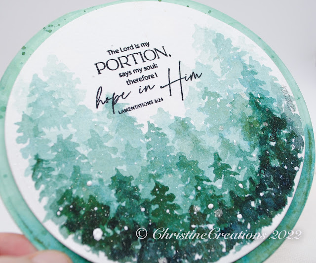
The sentiment is Stamp Simply’s lovely set,
Encouragement Combo.
I love how these irises turned out, but they started out as a completely different flower! But the more I looked at them, the more I saw iris, so that’s the direction I went. I really wish I would have tipped that bottom iris a bit to the left so it followed the curve of the circle better, but once the paint is down, it’s down. This design also uses the above Phthalo Turquoise, Hansa Yellow and Hookers Green, and adds Quinachridone Rose to mix with Cobolt Blue to create the pretty purples.
The sentiment is from Stamp Simply’s set
Fear Not.
Lastly for today, I created some more tiny roses and greenery for this one. I’m learning to start more gradually with softer colours and more washes rather than bold colour right up front. In that way, it’s the opposite from Copics where you blend out your colour, watercolour is soft washes that build colour in layers. Completely different mindset for my brain!
This sentiment is also created with Stamp Simply’s set,
Encouragement Combo.
And, all of these designs are painted on Strathmore Cold Pressed 140 lb paper. It’s nice and sturdy for the card designs. Heavy enough to even be used as card weight.
Thanks for stopping by!