Showing posts with label Prismacolor. Show all posts

Friday, December 15, 2023

Magnolia Bouquet for Christmas with Power Poppy


Hello!  It’s always so good to take a little break from the busyness of work and Christmas preparations to colour!  I pulled out this amazing image from Power Poppy called Winter Flora, and my Copic Markers to bring this arrangement to life, beautiful magnolias, hellebore, and sprigs of greenery, with little ornaments nestled in make for an amazing combination of colour.  


After colouring I combined a few dies, from Simon Says Stamps Pincushion Plate Die and white pine greenery from The Greetery with Big Branches: Pine Die to accent the pretty framed die from Spellbinders.  I decided to add a blue green background with my prismacolor pencils, so the beautiful rich Oceanside cardstock really sets of the festive colours.  And then, just a little bling with clear sequins, placed like berries in the greenery.  


Christmas Blessings to all of you out there!  

Sunday, September 17, 2023

MFT Coloring Superstar Entry


Hello!  Today I’m throwing my colouring utensils into the ring at My Favorite Things Card Design Superstar Challenge - Coloring Virtuoso.  I had a great time combining a number of MFT sets and adding in some of my own hand drawn details to create this cozy Autumn scene.  

I started with MFT’s Nobody Nose Me Like You Do - a since retired YUZU stamp set did some masking, and also added in the Scene Builder from Stacy Yakula. I hand drew the blanket and some of the hill line with a multi-liner pen, and then began colouring with Copics.  


To add in more details and depth of colour, I pulled out my Prismacolor Pencils and Faber Castell pencils and added in more colour.  Its great for adding in textures like the Corgi’s fur, the texture of the jeans, straw hat and tree trunk.  


Cutting the scene out with a Stitched Rectangle Scalloped Edge Frame die and a sweet sentiment strip finishes off the design.  It was so fun to create!  

Monday, January 16, 2023

The Blossom Challenge: Clean Slate!


Welcome to a new year Power Poppy friends!  We’re starting off the new year right with a new theme for The Blossom Challenge!  January brings a lot of new starts, maybe even new creative goodies and creative juices, so we’re all about a Clean Slate this month!  Where you can show your best clean and simple designs that celebrate that simple yet graphic style that packs a punch! 

I love when Clean and Simple designs accomplish somethings really eye-catching in more simple ways, so today I pulled out a now retired polymer set from Power Poppy which showcases all sorts of fun mushrooms!  Parts of that set are also available in digi form as Mushroom Trio, Miraculous Mushrooms and Morel Standards.  I stamped the image on Kraft cardstock and then pulled out my Prismacolor Pencils because I always love how pencils look on Kraft.  


You can achieve a look that almost glows!  I always lay down a layer of white prismacolor for the rest of the colours to lay on and blend.   A simple snail die from The Greetery seemed like the perfect accent, and then a bit of ribbon adds another pop of colour but keeps it clean.  


Come and join us for this month’s Clean Slate!  All you need to do is create a design show casing any Power Poppy image and link it up to The Power Poppy Blog to be in the running!  

Did you know Marcy’s got a gorgeous freebie you can use too?!  Just in time for Valentine’s The Rose Digi is FREE!  It would be a beautiful clean design image to use!  More details on the Power Poppy Blog!  

Sunday, October 9, 2022

Give Thanks with a Grateful Heart


Happy Canadian Thanksgiving friends!  It’s our day for thankfulness, and I’m happy to share this day with my family and celebrate all that God has given us.  I just returned from travelling for work and am happy to be home again for a few weeks.  While I was away I picked up some new goodies from The Greetery and the Calico Fields release that was so fun!  

These stencils and coordinating stamp sets are so fun to play with.  And I really enjoyed pulling out all my fall colours of Distress Ink for The Greetery’s Stencilscapes Autumn Stencil and  Thankful Heart Stamp and Stencil.  


I’ve added popped up pumpkins and corn stalks to give some dimension, and a greeting from the stamp set.  I used my prismacolour pencils to fill in a few of the white areas to add a little soft colour and really give it that beautiful vibrant fall landscape.  

See you soon!  

Monday, September 19, 2022

The Blossom Challenge: Eat Your Fruit and Veggies

Hello!  I’m kicking of this month’s The Blossom Challenge at Power Poppy called “Eat Your Fruit and Veggies”, with two cards celebrating both gratitude and yummy fruit and veggie designs, something that Power Poppy does SO well!    


My first design showcases Power Poppy’s Cabbage Patch set.  Each of these cabbages or kale are coloured with Copic Markers and trimmed out.  

They are arranged on a mini-slimline background you’ll see more of in a sec, and I added some assorted green and blue-green sequins to accent. 


The sentiment is from the polymer version of this set, which is embossed in white and inked in black below.

You can see peek at the coordinated background I created for the card above, and how I did it pictured below.  After I sponged on lots of Distress Oxide ink (Mowed Lawn and Evergreen Bough) onto the heavy cardstock panel, I used my polymer stamps of this set and a paper towel soaked with water as my ink pad.  I used my Misti to “lift” off the ink with the water, because water reacts with Disress Oxide ink.  It’s a soft subtle effect and you’re left with a faded-sueded pattern.  By doing it in the Misti, I could stamp each cabbage several times with water to get  a more defined lift of colour.  Then, I dried it with my heat tool to complete the reaction.  


Next up is a card with one of my favourite fall sets from Power Poppy called:  Pumpkins and Pears.


Marcy always does little vignettes so well, and they are really delightful to colour.  

The background is a Kraft panel that was masked off with tape and then Distress Oxide Ink was added (Crackling Campfire, Abandoned Coral, Fossilized Amber and Seedless Preserves).  After splattering with water and some white ink and it was dry,  I ran the panel through with a pierced die.  I love the look it gives. It’s finished off with some patterned paper, inked die cut leaves and enamel dots.  


Have you been eating your Fruits and Veggies?  How about creating with them?! Come on in and join us at Power Poppy with a design using some form of Fruit or Vegetable in the card and Power Poppy stamps.  The Challenge is open for a month and you could win a gift card to the Power Poppy Store!   And to top it off, Marcy has discounted some of my favourite Fruit and Veggie themed stamps in the store if you want to play along!  

Here’s more Fruit and Veggie goodness from the Bloom Brigade playing along today.  Thanks so much for stopping by!  

and link your entry at the Power Poppy Blog!


Tuesday, September 6, 2022

Italian Villa Window with The Greetery


If you’ve been following me for a while, you know that my favourite element of cardmaking is colouring.  But, over the last few months, the stamps, stencils and dies from The Greetery have really won my heart!  They are so different from my normal style with the emphasis on stencils and sponging.  Yet, the look you get from them when you lift the stencil is so fantastic!  It must be a bit like how a printmaker feels when their images come through the screens.  

I picked up a few sets from the latest release at The Greetery, including this one, Floral Arches Stamp and Stencil and had a fantastic time putting together this card made to look a little like a floral arch around a window in an Italian villa.  


I primarily used Distress Oxide inks, Fossilized Amber, Crackling Campfire, Aged Mahogany, and then a few greens Memento Pistachio and Olive Green, and then used the coordinating Floral Arches die to cut it out.  You’ll notice that I have elements popped up on the arch, as well as stamped items behind the arch to give it dimension.  

I also sponged the Fossilized Amber in the background layer, to make it look like Italian plaster, and added a few delicate shading with my Prismacolor pencils.  The sentiment is from another The Greetery set called Print Shop:  Spring Mix.  


Monday, August 29, 2022

Masculine and Pencil Work


Getting down to those dog days of summer in the Northern Hemisphere!  We were driving this weekend through Alberta and the fields are looking ready for harvest, and some farmers are already at work.  All of our kids start school this fall, (teaching or University) and I’m longing for some temperatures that are just a bit cooler.  I picked up a new Stampin’ Up! set over Sale A Bration called Stylish Sketches.  It has a nice loosely drawn feel that is perfect for a more masculine style, and since I’m starting to lean a little more to Autumn, I pulled out my Prismacolor Pencils and some Kraft cardstock and coloured up a couple of cards using this set.  

These two ducks are a lovely pair and white pencil pops so well on Kraft cardstock.  I first laid down a layer of white pencil and then added in the greys, browns and almost iridescent blue/greens that comprise the ducks.  

The layout uses some patterned paper I had in my stash and a woodcut die from The Greetery.  


The sentiment is from a retired SU set, little friends.  I love that typewriter font.  


For this design I went decidely more fall with warm shades for the fox from the set.  I just saw a fox traipsing across our pathway when we were on the motorcycle last weekend in a National Park.  He tucked right into the woods, so I mostly saw his body and tail escaping.  Red Fox have such a nice combination of rust, grey and white that I tried to convey in the colouring, again laying down white pencil first and then adding colour over top.  The mustard cardstock has a basketweave stencil to pull in a bit more rich colour.  


The patterned paper is from Craft Consortium and I’ve added die cut leaves with some distress ink sponging to really capture that autumn feel.  

He does look ready for adventure doesn’t he?  


Friday, August 19, 2022

TCP’s August Blizzard!


Hi there!  Well, we’ve been in a heat wave for weeks here, and for us that’s not so pleasant without central air conditioning, so today I’m going to COOOL it off with some of the newest August Release goodies from The Cat’s Pajamas.  I have two designs today, starting with this one called All The Trimmings.  Today I’ve got a dapper snow-Santa with a teal blue-green hat and bow tie to coordinate with that shapely carrot nose.  He’s surrounded with presents from the set and placed on a fun background that uses a retired  swirling snow die from TCP that creates indented pattern, and some fun sponging and spritzing with sparkly Shimmer Mist.  


In real life those colours from the background paper and the presents match much better than how the photo captured it.  I wanted the patterned paper to look like a wrapped package and the snowman design to appear as the tag accent to the present.  


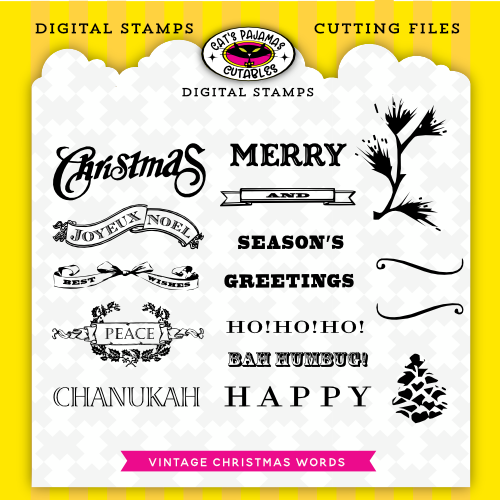
Now moving to something more warm and cozy, I used the Vintage Holiday Words digi stamp to create a woodsy warm Christmas card.  I printed the digi in a very pale greyscale and then used very sharpened Prismacolor Pencils to add colour to the words and pine accents.  It really gives the words a cozy softness that pairs with the woodland paper from Craft Consortium.   


A few die cut accents from TCP retired dies add a pop of colour to coordinate with the paper, as well as a couple of enamel dot berries.  

I’ll be back on Tuesday with more from the TCP Release, but for now here’s a peek at the New Release items I used today.  


Monday, June 20, 2022

The Blossom Challenge: Glassy-Eyed


Welcome to our second The Blossom Challenge from Power Poppy!  This month we’ve got a fun theme called Glassy Eyed!  We’re going to be using sets from Power Poppy that show an image in glass or under glass, and showcase different ways to colour translucent glass.  So dig into your Copics, Pencils or watercolour...and any Poppy image that uses something in OR under glass, you could even be totally artsy and use a Power Poppy image and draw your own glass in!  


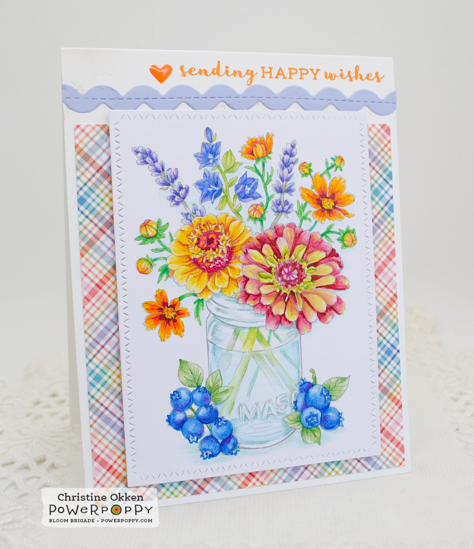
Today I’m using the NEW image from Power Poppy called Accentuate the Positive.  What a gorgeous array of flowers and fruit around this pretty mason jar.  I printed the image quite lightly for colouring and then used Copics and Prismacolour Pencils to brighten up the blooms.  One of my favourite varieties of zinnia is Queen Red Lime, they have such a nice fade between lime and rosy red, so I tried to give the flower on the lower right that treatment in my colouring.  

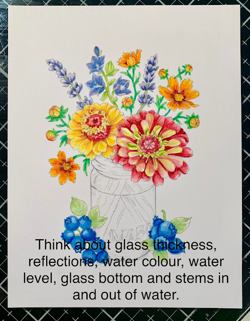
I’ll give you a short tutorial on what I think are important features of colouring glass.  These were all taken on my iPhone while I was colouring, but should give you an idea of features I use when colouring glass.  

Things I like to consider when colouring something in or under glass.  
  • Where the light is reflecting on the glass
  • The width of the glass for colouring, and the bottom edges (if in a vase)
  • Will the glass be coloured or clear
  • Will there be a water level be and will you define it
  • How stems refract and colour fades in water


Here is my image without colouring the glass.  It’s a mason jar, so I’ve decided its going to be one with a blue tint to it.  


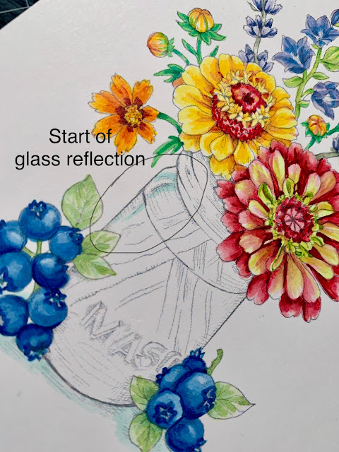
Glass always has reflection points where the light bounces off and refracts.  It is usually white or clear.  Marcy has illustrated a highlight point already in this design and I’ve given the light space some colourful edges so you can define it.  You can add your own reflections to images as well.  


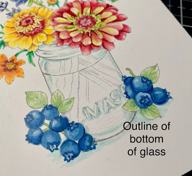
Colour “pools" in glass in certain areas, the neck of where the mason lid would fit, the letters spelling MASON and the outline of the bottom of the vase.  I added a BG10 to those areas to define them.  You can also see I didn’t colour right to the edge of the glass.  It has thickness to it where you don’t typically see colour.  So, I add colour inside of where I imagine that glass thickness to be.  This gives it more realism.  


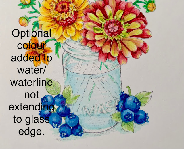
Water is clear, but would like be slighly blue in a blue jar, so I’ve added a very light BG0000 to the water line front, and just a hint of th eback of the waterline.  Again, not extending to the edge of the glass.  


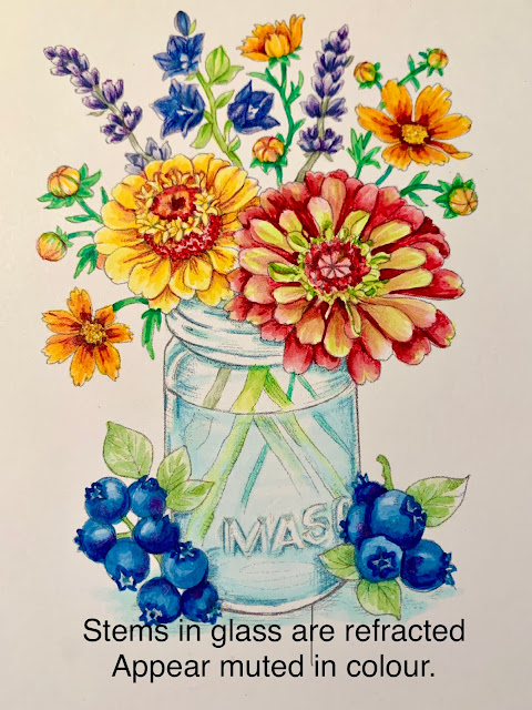
Stems in glass usually are muted or lighter in colour or because the water and glass have a refracted, mis-matched look from the stem above water.  I usually add a bluer tone to the stems and lighten them up.  


Here’s a peek at the close up finished vase.  I tightened up the outlines with a light blue/green prismacolour pencil to give it better definition.  


So that’s a simple but helpful way to up your glassy-eyed game!  I hope you can join us for the challenge this month and create something in or under glass with Power Poppy!  Link up your creation HERE.  

Remember: You must use a Power Poppy image somewhere on your design and this month Marcy has a number of images using glass on sale!  

Enjoy more gorgeous inspiration from The Bloom Brigade

Essie
and Me!  

Wednesday, June 8, 2022

Spring Frames and Windows with MFT


We’ve just returned home from a bit of vacation with family and I brought back a brutal cold with me, so I’ve been laying pretty low the last bit.  One of things I like to do if I’m travelling to the States for work or fun is to ship any stampy shopping I might do to where I’m going to be (even hotels will let you do that).  That way I save on crazy postage prices and paying duty.  So I brought home all kinds of fun new creative things to play with, but haven’t had much energy for it!  But I did make a couple of sweet Clean and Simple designs to show you today using a new set from MFT called, Sunshine Friends, illustrated by Stacey Yacula.  I love her whimsical style.  

I just started by colouring all the images in the set, and then decided that there was enough to put together to cards.  This first design also showcases the arched window using MFT’s Stitched Arch Stacked Dienamics, cut into a background using Pink Fresh’s Intricate Stitched Ovals Coverplate Die.  Gorgeous isn’t it?  That subtle pattern is so classy!  


I’ve created a scene in the window with a sponged sky and grass, adding a few grass blades with a Prismacolor Pencil.  The Copic coloured bees and tree tuck in nicely, and a simple gingham bow gives the black pop it needs to coordinate with the bees.  Perfect for anyone you call honey :)  

Next is a happy pair of friends!


Also created with MFT’s Sunshine Friends these two really do make me smile.  I decided to keep the background plate layer as it is and add the images on top, but it needed something extra to help the design, so I pulled out the MFT Stitched Rectangle Scallop Edge Frame in yellow and that pop of colour was what the card needed, the frame anchors the space perfectly.  

Windows and frames are just the ticket to make your focal points sing!  

Monday, May 30, 2022

A Crown of Daffodils


Hello Friends!  We’ve just come back from a week away visiting some of our US family for our niece’s graduation.   It was the first time some of our us have been out of the country in 2 1/2 years.  It was really fun, and now I have the typical mound of laundry, plants that need planting, garden beds that need weeding....and host of other things to do!  

But before I left I created this pretty design with a newly released set from Power Poppy!  It’s called Sketches of Spring Volume I.  Just look at what a beauty it is!  I’m growing in appreciation for daffodils in the past few years.  I’m generally a tulip lover, but the uniqueness and variety of daffodils that are now available are really gorgeous.  Marcy illustrated several different varieties here of narcissus and daffodils and paired them with Viridiflora Tulips and Pointed Petal Fritillary.  I coloured up the bouquet with Copics, and finished off the details with prismacolor pencils.  


I’ve added a little die cut “crown” as accent to the design.  Did you know the popped up centers of daffodils are called coronas?  And you are probably aware with the pandemic that corona means crown....I like this version of crown much better.   A couple of clear holeless sequins add a touch of sparkle.  The sentiment is from the Power Poppy polymer set Simply Camellias.  

This set is one of many on sale right now at Power Poppy in The Blossom Challenge Digis.  And you still have just over 2 weeks left to join us in the new Blossom Challenge going on at the store.  Be sure to create a design and you could win a prize to the Power Poppy store!  More details HERE!   

Appreciate your visit!  

Wednesday, May 18, 2022

New Stamping Styles with The Greetery


Do you have a preferred style of stamping?  Mine has always been a stamp I can colour.  But, it’s good to try out something new sometimes!  I’ve been eyeing up the beautiful sets at The Greetery for some time.  I love Betsy’s style and polish, so I finally bought some of the stamps, dies and stencils from this March’s release and am using  Springtime Stamp Set and Coordinating Dies on this card.  

I was thinking about a baby shower design, and when I saw the umbrella in the set I thought it would be so sweet to have the flowers from the set bursting out of the umbrella.  The teeny tiny images take a little getting used to, but it was so fun to put the pieces together, almost like an intricate puzzle.  I’ve stamped all the layers and added some prismacolour pencil colouring to bring in the details.  


It’s all placed on a watercoloured background, and I’ve framed it up and added a few Nuvo iridescent dots as accents on the background an din the flowers like dew drops.  


That little bunny is so darn cute!  Thanks for joining me today! 

Monday, March 14, 2022

Easter Celebrations at The Cat’s Pajamas- Take 2


Greetings friends!  I’m back with NEW March inspiration from The Cat’s Pajamas!  Part one of my designs this month is located HERE.  Today its all about Easter!  One of the most beautiful times of the year for my faith, and also a beautiful time to celebrate life, growth and hope.  I have two cards to show you today, one more playful and one more elegant.  This card uses the new Sugar, Sugar Digi.  

Just today my husband bought a huge bag of Cadbury Mini Eggs.  Oh my heart.  He needs to hide them because I LOVE that candy coated chocolate!  So, this card speaks my language about Easter chocolate.    Our favourite bunny is lounging in the Easter basket after a sugar coma of chocolate coated fun.  

Colouring is with Copics, with detail added in with Prismacolor Pencils, like the blades of grass, the texture of the basket and the sky on the tag.  The main image is printed on Copic XPress it Blending and cut with a retired tag die from TCP.  The background is sponged with Tumbled Glass Distress Oxide Ink.  


Other cool things on the design are new from TCP including the Grassy Patches Cutables and the Happy Spring digital patterned paper, it makes for such a fun spring card!  


Next up is a lovely Easter card with the new FREE Digital Download called Fancy Happy Easter.  The script and designs in the set are lovely!  I coloured the image with Copics and added in backgrounds and detailing with Prismacolor Pencils.  The mini-slimline design also uses our new Happy Spring Digi Papers,  tiny flowers cut to accent and holeless sequin accents.  


The pops of colour add such Spring freshness to the design.  

Here is a peek at the NEW items I used from TCP today....go check them out!