
Welcome to our second The Blossom Challenge from Power Poppy! This month we’ve got a fun theme called Glassy Eyed! We’re going to be using sets from Power Poppy that show an image in glass or under glass, and showcase different ways to colour translucent glass. So dig into your Copics, Pencils or watercolour...and any Poppy image that uses something in OR under glass, you could even be totally artsy and use a Power Poppy image and draw your own glass in!
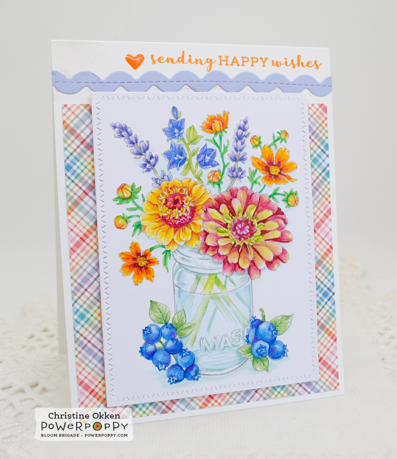
Today I’m using the NEW image from Power Poppy called Accentuate the Positive. What a gorgeous array of flowers and fruit around this pretty mason jar. I printed the image quite lightly for colouring and then used Copics and Prismacolour Pencils to brighten up the blooms. One of my favourite varieties of zinnia is Queen Red Lime, they have such a nice fade between lime and rosy red, so I tried to give the flower on the lower right that treatment in my colouring.
I’ll give you a short tutorial on what I think are important features of colouring glass. These were all taken on my iPhone while I was colouring, but should give you an idea of features I use when colouring glass.
Things I like to consider when colouring something in or under glass.
- Where the light is reflecting on the glass
- The width of the glass for colouring, and the bottom edges (if in a vase)
- Will the glass be coloured or clear
- Will there be a water level be and will you define it
- How stems refract and colour fades in water
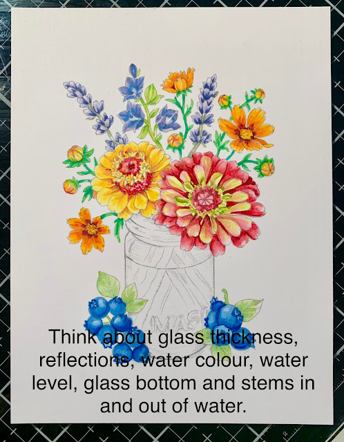
Here is my image without colouring the glass. It’s a mason jar, so I’ve decided its going to be one with a blue tint to it.
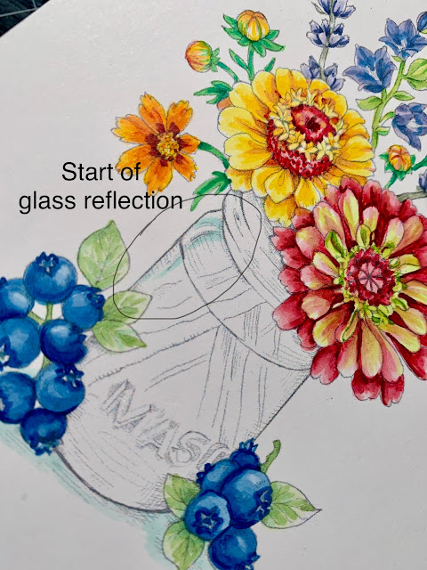
Glass always has reflection points where the light bounces off and refracts. It is usually white or clear. Marcy has illustrated a highlight point already in this design and I’ve given the light space some colourful edges so you can define it. You can add your own reflections to images as well.
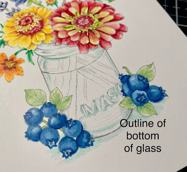
Colour “pools" in glass in certain areas, the neck of where the mason lid would fit, the letters spelling MASON and the outline of the bottom of the vase. I added a BG10 to those areas to define them. You can also see I didn’t colour right to the edge of the glass. It has thickness to it where you don’t typically see colour. So, I add colour inside of where I imagine that glass thickness to be. This gives it more realism.
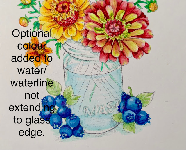
Water is clear, but would like be slighly blue in a blue jar, so I’ve added a very light BG0000 to the water line front, and just a hint of th eback of the waterline. Again, not extending to the edge of the glass.
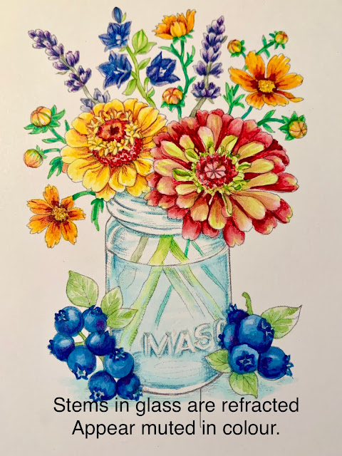
Stems in glass usually are muted or lighter in colour or because the water and glass have a refracted, mis-matched look from the stem above water. I usually add a bluer tone to the stems and lighten them up.

Here’s a peek at the close up finished vase. I tightened up the outlines with a light blue/green prismacolour pencil to give it better definition.

So that’s a simple but helpful way to up your glassy-eyed game! I hope you can join us for the challenge this month and create something in or under glass with Power Poppy! Link up your creation HERE.
Remember: You must use a Power Poppy image somewhere on your design and this month Marcy has a number of images using glass on sale!
Enjoy more gorgeous inspiration from The Bloom Brigade
Essie
and Me!


2 comments:
Gorgeous bouquet, such lovely coloring and thanks for the tips on coloring!
Stunning, Christine! You're a wealth of information and just looking at your beautiful coloring and shading is inspiring. I hope to play, but we'll see.
Post a Comment