Showing posts with label Tutorial. Show all posts

Tuesday, February 6, 2024

Faux Embossing with Stencils and SSS


Stencilled Spring Leaves with Simon Says Stamps Card

hello!  After a week in CA for work, I’m ready for Spring! Winter is still sticking around here, so I created a little splash of Spring leaves with this pretty stencil from Simon Says Stamp called Autumn Cascade, but it makes just as lovely a card in other seasons.  

I chose some Distress Inks and ink blended the stencil, also adding in some coloured pencil definition.  Then to give it a bit of extra pop, I got out my light table and embossed it! 


All you need to do is place the coloured image face down over top of your stencil (precisely), and then the light table shining through allows you to use an embossing tool to press the images through, giving you some light embossing.  For a clean and simple design like this, a little touch of depth goes a long way.  


It’s such a pretty touch!  I also added coordinating die cut leaves, and a circle and sentiment from Concord & 9th’s A Bit of Paradise die set and the Short and Sweet Dies.  


Ready for a sweet hello to a friend! 

Thursday, January 4, 2024

Winter Roses with Power Poppy


OO I’ve got some pretty colour for you today!  I will more often lean toward a warm palette, but sometimes you’ve just got to go coooool!  I pulled out this image from Power Poppy called Snowdrops and Tea Roses which is such a beauty!  And though it could lean Christmas, I’m just telling myself it’s still good for Winter, especially with a Birthday sentiment.  

This awesome image was coloured with Copics, and finished with coloured pencils.  I can tell my copic nibs need replacing because some of my colouring is getting shiny, so finishing with pencils help tone that down a little.  

Winter Roses with Power Poppy
 
It’s a gorgeous arrangement of little roses, snowdrops and holly leaves with tiny berries in a cup.  So darn sweet!  

I created the background with Pink Fresh Studios Slimline Diamond Builder and some Distress inks that coordinated with the colouring.  Then I layered some vellum over to give it a bit more softness.  Finished with some slim velvet ribbon, and tiny dew drops that look like water drops on the roses.  


The sentiment is from a Power Poppy polymer set and the banner die is a retired one from The Cat’s Pajamas.  Such a great colouring project to start the year!  

I have a colouring video on my Instagram page for this card if you’d like to pop by!  See me here at ChristineCreationsArt

Thanks for popping by today!  

Thursday, November 30, 2023

Gift Card Holder Tutorial with TCP


12 Days of Crafting

Full Size Gift Card Holder with Polar Bear

Greetings TCP Friends!  I'm here today with another new idea for the 12 Days of Crafting at The Cat’s Pajamas!  If you’re like me, even though I love to give personalized gifts, there are times when you have to resort to a gift card.  Have you noticed that most gift cards these days on the rack at a store come much larger, with a section that hangs on the display rack?  I think this larger size is a bit better so that those gift cards don’t get lost. So, I decided to design a gift card holder that would accomdate that larger size.  

I'll show you a few pictures of the process and then some more pictures of the finished tag holder.  

Gift Card Holder Tutorial 1

Here you can see I’ve cut the holder from a piece of Kraft cardstock and scored it at 3 1/2, and then scored a little 1/2 inch tab.  Then it’s all about the decorating, I stamped some retired TCP postage stamps in white craft ink first.  

Gift Card Holder Tutorial 2

Next, I stamped some red postmarks, then added a retired TCP die cut postage frame.  

Gift Card Holder Tutorial 3

I used a circle punch to cut out “ticket” half circles, and brought in the Copic coloured image from the very cute I Like Big Gifts digi set from November’s Release.  I adore this cute polar bear!  

Gift Card Holder Tutorial 4

Here you can see the outside holder put together and the gift card insert I created to slide inside, it’s a great place to write your greeting for the gift card, and a neat feature is that the gift card “ties” into the tag holder using the baker’s twine.
 
Gift Card Holder Tutorial 5

You can see that the hole you use to hang it on the gift card dispay at the store makes a great spot to tie it into your insert!  

Close Up Gift Card Holder

This is a close up of the Gift Card Holder put together. 
 
Gift Card Holder Open

And now you can see the Gift Card Holder pulled a part, and you can just see a peek of blue where the gift card is behind the tag.  

Gift Card Holder Tag open

Gift Card Holder Flatlay

All in all, a pretty sweet and easy design for those last minute gifts!  Thanks for joining me for today’s episode of the 12 Days of Crafting! 

Sunday, May 14, 2023

Stencil Fun with The Cat’s Pajamas


Hello!  Today I’m showcasing some fun ways to stencil with some tried and true products from The Cat’s Pajamas.   I posted this on the TCP blog earlier this week and realized I hadn’t finished my post on my blog....so here it finally is!  

As I was perusing through some older TCP products looking for some inspiration, I found these cuties called  Yeti to Party that are retired, but oh so cute!  I coloured the Monster’s Ink-like pair with Copics and then created a background to match.  


I don’t think plaid will ever go out of style in cardmaking.  It provides the perfect way to tie colours together.  So, I used my TCP Plaid Maker stencil (retired), on my Make Art Station.  This board with its magnetic ability has been a game changer for me with stencils!  For this design I started with Salvaged Patina Distress Oxide ink.  


Then I did the diagonal with Wild Honey Distress Ink, and added in Copics for the red and teal lines.  I wanted the warm yellow to match better with my one-eyed dude, so I added some Faber Castell Coloured Pencils along that diagnoal to get a more orange tone.  


Next is a great design that shows how to stencil, without stencils!


Folk art is a fun trend in cards right now, and this lovely set from TCP called Folk Art Flowers celebrates those iconic floral patterns found in this style.  


So what do you do when you don’t have a stencil?  Well, its easy to create a temporary stencil from heavy cardstock with coordinating dies!  They aren’t as perfect and crisp as a regular stencil because the paper begins to soften and break down, but you can get a soft background effect that I stamped over with the stamps from the set.  


In this case, it is a nice colour tie-in to bring the card colours together.  For the sentiment, I die cut a circle in the card base and added a vellum layer with embossed sentiment into the card.  


Great sweetness for Spring!  Bloom, Grow and Blossom friends! 


Monday, September 19, 2022

The Blossom Challenge: Eat Your Fruit and Veggies

Hello!  I’m kicking of this month’s The Blossom Challenge at Power Poppy called “Eat Your Fruit and Veggies”, with two cards celebrating both gratitude and yummy fruit and veggie designs, something that Power Poppy does SO well!    


My first design showcases Power Poppy’s Cabbage Patch set.  Each of these cabbages or kale are coloured with Copic Markers and trimmed out.  

They are arranged on a mini-slimline background you’ll see more of in a sec, and I added some assorted green and blue-green sequins to accent. 


The sentiment is from the polymer version of this set, which is embossed in white and inked in black below.

You can see peek at the coordinated background I created for the card above, and how I did it pictured below.  After I sponged on lots of Distress Oxide ink (Mowed Lawn and Evergreen Bough) onto the heavy cardstock panel, I used my polymer stamps of this set and a paper towel soaked with water as my ink pad.  I used my Misti to “lift” off the ink with the water, because water reacts with Disress Oxide ink.  It’s a soft subtle effect and you’re left with a faded-sueded pattern.  By doing it in the Misti, I could stamp each cabbage several times with water to get  a more defined lift of colour.  Then, I dried it with my heat tool to complete the reaction.  


Next up is a card with one of my favourite fall sets from Power Poppy called:  Pumpkins and Pears.


Marcy always does little vignettes so well, and they are really delightful to colour.  

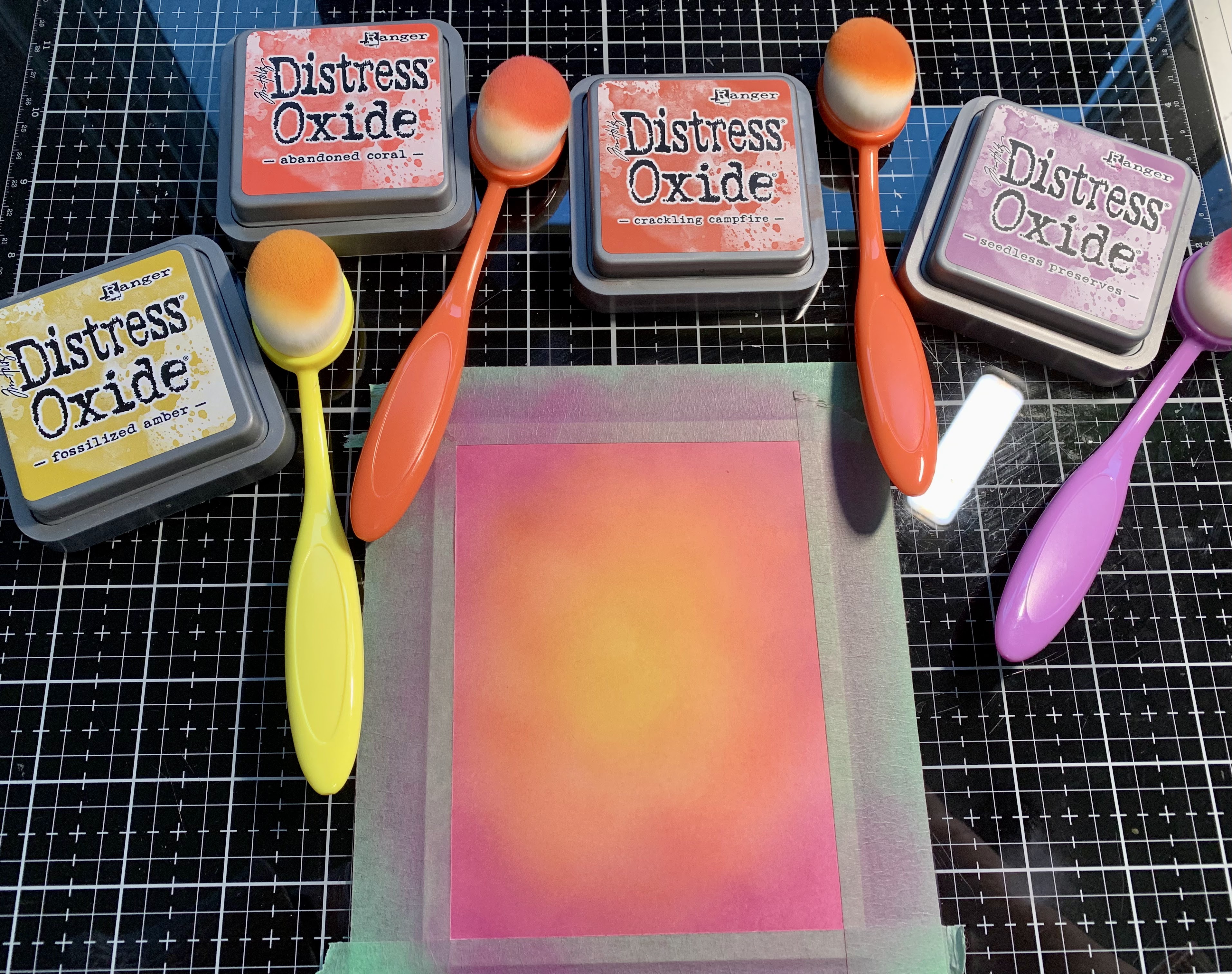
The background is a Kraft panel that was masked off with tape and then Distress Oxide Ink was added (Crackling Campfire, Abandoned Coral, Fossilized Amber and Seedless Preserves).  After splattering with water and some white ink and it was dry,  I ran the panel through with a pierced die.  I love the look it gives. It’s finished off with some patterned paper, inked die cut leaves and enamel dots.  


Have you been eating your Fruits and Veggies?  How about creating with them?! Come on in and join us at Power Poppy with a design using some form of Fruit or Vegetable in the card and Power Poppy stamps.  The Challenge is open for a month and you could win a gift card to the Power Poppy Store!   And to top it off, Marcy has discounted some of my favourite Fruit and Veggie themed stamps in the store if you want to play along!  

Here’s more Fruit and Veggie goodness from the Bloom Brigade playing along today.  Thanks so much for stopping by!  

and link your entry at the Power Poppy Blog!


Wednesday, September 7, 2022

TCP Get’s Cozy!


September!  Can you believe it?  And even as I type this, we’re enjoying a bit of a reprieve from the heatwave we’ve had.  Today I’ve got all my windows open and am wearing my worn and cozy jeans in my studio.  Glorious!  

As the calendar has turned to a new month, that means a brand new release at The Cat’s Pajamas to celebrate!  This month I’m playing with cozy designs and fun techniques.  

I have two cards to show you, starting with these cozy skating sheep from TCP called Melt My Ice.  I’m so taken with them leaning into each other on the ice rink, or as my hockey playing boys would say “ODR” (outdoor rink).  

Let me how you how I created the background.  


After taping a 4 1/4 x 5 1/2 piece of cardstock down, I sponged Distress Oxide ink in concentric circles.  I wasn’t especially worried about getting a completely smooth blend because I knew I’d stencil ink over top.  


Next up a retired stencil from TCP with a fun radiating pattern.  I sponged the lightest yellow ink, Fossilized Amber over top of the original sponging.  


Creating this fun blend where the yellow sits on top of the other ink and gives you a nice radiating warm pattern.  


After colouring my sheep couple with Copics, I placed it on the background and tucked in some die cut snowflakes, enamel dots and some white splatters.  


Such cuties!  

Next up is another cutie from TCP’s new set Let’s Bake.  I have to say there are some VERY cozy baking images in this set that you’ll have to check out.  


I think this little girl is so adorable!  Wouldn’t this be a great design to invite a friend for a baking day, or a niece or grandchild?  Our little baker is coloured up with Copics and placed on a fun patterned paper background that matches the colours really well.  


To tie in the colours I also sponged these multi-colour hearts in the background to coordinate, and tie in that little heart from the bowl.  


A simple accent of a smaller patterned plaid matching the larger plaid is added with a retired TCP swirl die.   


There’s so much more in store in the September Release!  Be sure to check it out.  And I’ll leave you with a peek at the digi-stamps I used today!   Thanks for joining me!  


Sunday, July 10, 2022

Outlining and Colouring With Stencils


Do you ever have ideas pop in your head about how to use a stamp set differently?  As I’ve been playing with Print Shop:  Spring Mix Stamp and Stencil from The Greetery I realized that I could use the stencil as a tracing element and create an outlined image that I could colour with Copics.  I layered the stencils step by step and carefully used my micron pen to outline all of the flowers and greenery.  I think it’s a great way to get more out of a stamp and stencil set.  Especially when you love to colour.  Here’s what it looked like before I coloured it up:  


Then I picked a colour palette I’d like and used my Copics to bring some life to the flowers.   


After colouring I added a interior frame to match the flowers and the sentiment from the set, as well as a couple of enamel dots.  

Thanks for popping in for my fun brainstorm!  

Monday, June 20, 2022

The Blossom Challenge: Glassy-Eyed


Welcome to our second The Blossom Challenge from Power Poppy!  This month we’ve got a fun theme called Glassy Eyed!  We’re going to be using sets from Power Poppy that show an image in glass or under glass, and showcase different ways to colour translucent glass.  So dig into your Copics, Pencils or watercolour...and any Poppy image that uses something in OR under glass, you could even be totally artsy and use a Power Poppy image and draw your own glass in!  


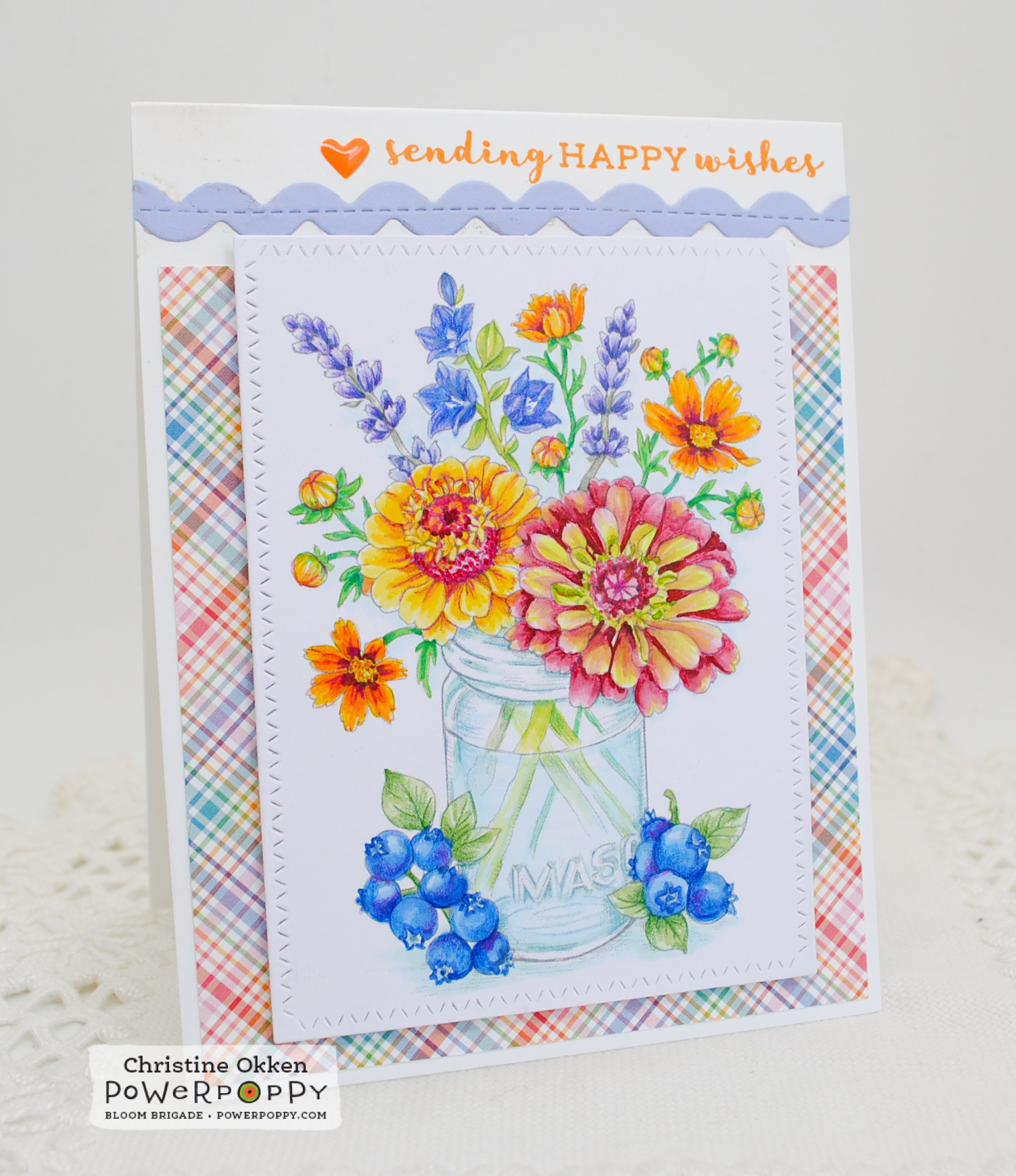
Today I’m using the NEW image from Power Poppy called Accentuate the Positive.  What a gorgeous array of flowers and fruit around this pretty mason jar.  I printed the image quite lightly for colouring and then used Copics and Prismacolour Pencils to brighten up the blooms.  One of my favourite varieties of zinnia is Queen Red Lime, they have such a nice fade between lime and rosy red, so I tried to give the flower on the lower right that treatment in my colouring.  

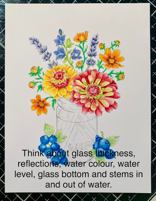
I’ll give you a short tutorial on what I think are important features of colouring glass.  These were all taken on my iPhone while I was colouring, but should give you an idea of features I use when colouring glass.  

Things I like to consider when colouring something in or under glass.  
  • Where the light is reflecting on the glass
  • The width of the glass for colouring, and the bottom edges (if in a vase)
  • Will the glass be coloured or clear
  • Will there be a water level be and will you define it
  • How stems refract and colour fades in water


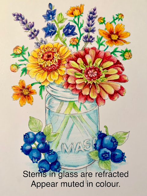
Here is my image without colouring the glass.  It’s a mason jar, so I’ve decided its going to be one with a blue tint to it.  


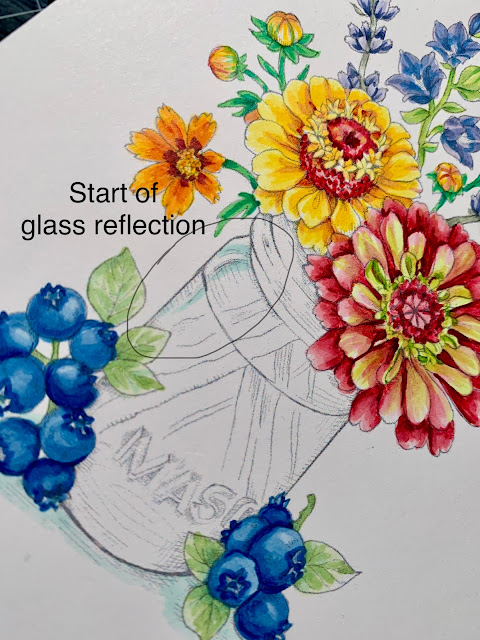
Glass always has reflection points where the light bounces off and refracts.  It is usually white or clear.  Marcy has illustrated a highlight point already in this design and I’ve given the light space some colourful edges so you can define it.  You can add your own reflections to images as well.  


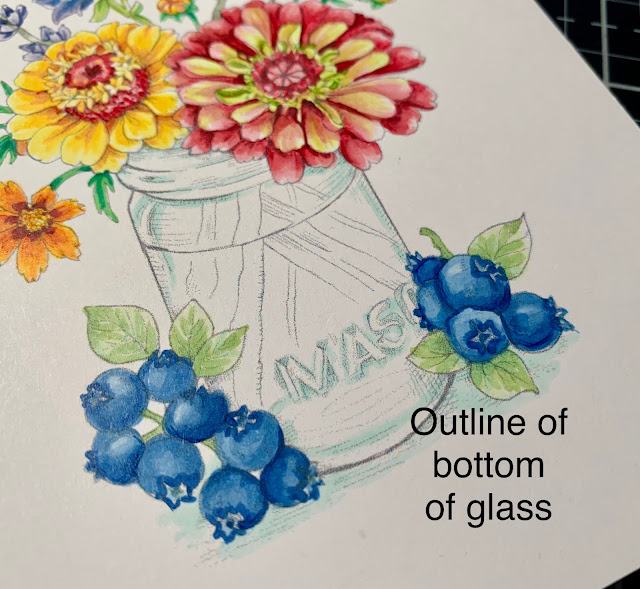
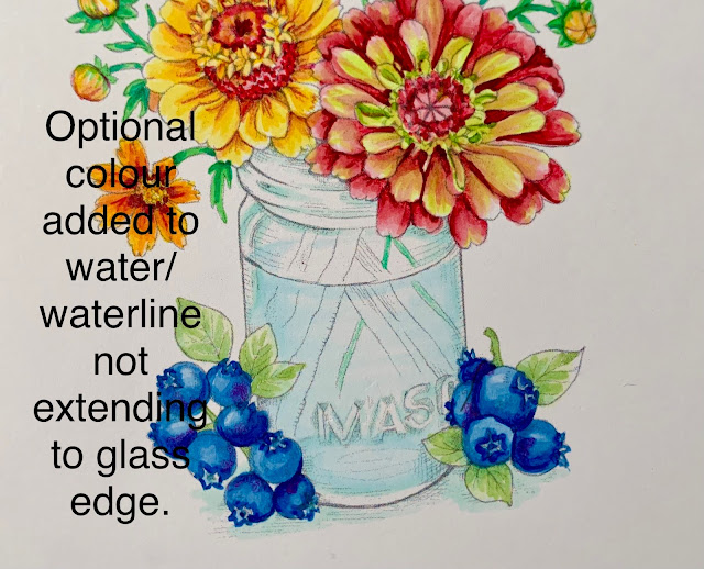
Colour “pools" in glass in certain areas, the neck of where the mason lid would fit, the letters spelling MASON and the outline of the bottom of the vase.  I added a BG10 to those areas to define them.  You can also see I didn’t colour right to the edge of the glass.  It has thickness to it where you don’t typically see colour.  So, I add colour inside of where I imagine that glass thickness to be.  This gives it more realism.  


Water is clear, but would like be slighly blue in a blue jar, so I’ve added a very light BG0000 to the water line front, and just a hint of th eback of the waterline.  Again, not extending to the edge of the glass.  


Stems in glass usually are muted or lighter in colour or because the water and glass have a refracted, mis-matched look from the stem above water.  I usually add a bluer tone to the stems and lighten them up.  


Here’s a peek at the close up finished vase.  I tightened up the outlines with a light blue/green prismacolour pencil to give it better definition.  


So that’s a simple but helpful way to up your glassy-eyed game!  I hope you can join us for the challenge this month and create something in or under glass with Power Poppy!  Link up your creation HERE.  

Remember: You must use a Power Poppy image somewhere on your design and this month Marcy has a number of images using glass on sale!  
Enjoy more gorgeous inspiration from The Bloom Brigade

Essie
and Me!