Showing posts with label The Blossom Challenge. Show all posts

Monday, March 20, 2023

The Blossom Challenge: Sponge Bath


Happy Spring friends!  Today I’m bringing you another fun "The Blossom Challenge” for the month.  I’m feeling especially Springy this month, and ready for all the fun colour that’s soon to come.  This month’s Challenge has the theme “Sponge Bath”, and its all about using your sponging tools to bring smooth inky colour to your designs.  

I’ve got two cards to show you today that showcase different ways to sponge ink.  


First off is this beauty from Power Poppy called Spring Border One.  I adore this image and its sweet border style of blooms.  All the flowers are coloured with Copics, and I stamped the large tulip twice so I could add it to the left of the arrangement to balance out my how the flowers appear in front of the arched die cut windows.  


For my sponging technique I used a simple background technique, using Tumbled Glass Distress Oxide Ink on the card base, splattering it with water, and then splattering again with white ink.  Such an easy way to add a background to a scene.  It’s one of my favourite properties of Oxide ink, when you see how great it reacts with water.  


Perfect for a little note for a friend.  
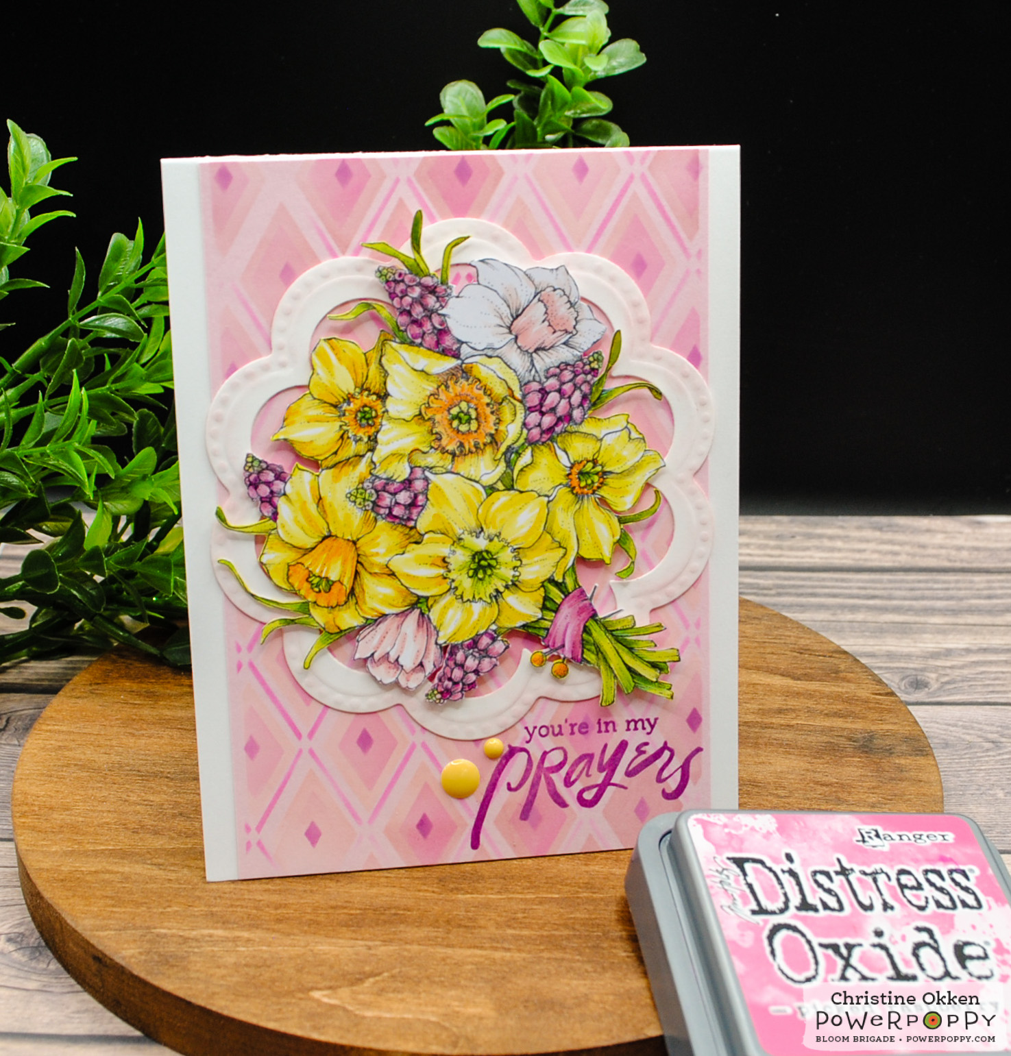
Next I’ve used another gorgeous Spring image from Power Poppy called Daffodil Bouquet.  


For this design I utilized a stencil to create a backdrop for this amazing bouquet of daffodils and muscari (grape hyacinth).  Once my bouquet was coloured with Copics, I used some pale pink cardstock and a diamond stencil with soft shades of peachy pink (Tattered Rose, Victorian Velvet, Picked Raspberry and Seedless Preserves).  Using coloured cardstock and stencilling over top gives you a base colour that you don’t have to add with ink.  


I also lightly sponged the embossing of the die cut frame which allows it to tie in to the colour and accents the embossing slightly.  The sentiment is from Power Poppy’s Peony Muse polymer set. 
 

Those bright pops of colour really shine!  

Want  more inspiration?  See what Barbara has to show you today!  


Now we’re extending the Challenge to you!  It’s Sponge Bath time!  Use your sponges or blending tools to add inky colour to any part of your design.  You could simply distress the edges of your paper with ink, blend multi-colour or ombre backgrounds, or use stencils to create a background or layer to your design.  All you need to do is use at least one Power Poppy image to be included in the challenge.  Link up HERE.  

Thanks for visiting today!  

Monday, February 20, 2023

The Blossom Challenge: Inspired by the Sea and Magical Powders


Welcome cardmaking friends!  Today I’m kicking off a brand new theme for The Blossom Challenge at Power Poppy!  

This month it is an Inspiration Challenge based on a photo from my recent trip to Northern California for work.  At a local friend’s recommendation we took a day off to head to the coast, through the Sonoma Valley wine country to a spot called Bodega Beach.  Its a sweet little coastal town with miles of beaches along the coastline.  It was such a stunning surprise with the cliffs, bluffs and pounding surf, you’d think for sure you’re in Cornwall, England rather than the Cali coast.  There was one spot called Bodega Head where you are high on the bluffs looking down at the rugged coast where I took this picture above.  In the foreground you can see the vegetation with the pop of pink.  These plants are succulents called Sea Fig, and the flowers bloom lots of different colours.  Its invasive in California, so they’re trying to control it, but it sure made for a beautiful picture!  

I’ve created two cards with this inspiration:  First up, a design inspired by the colours and plants in the photo.  


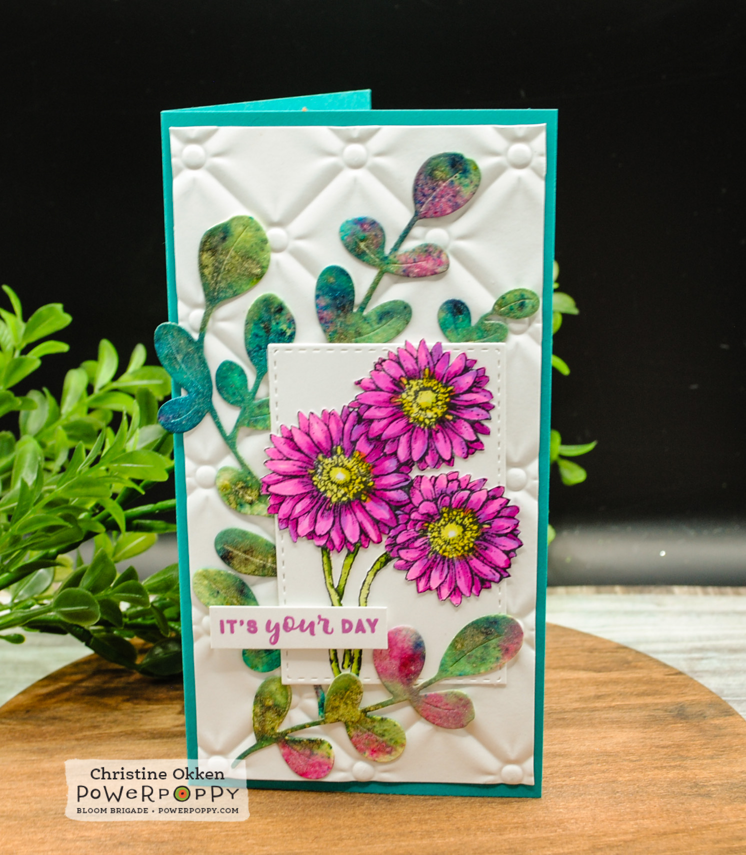
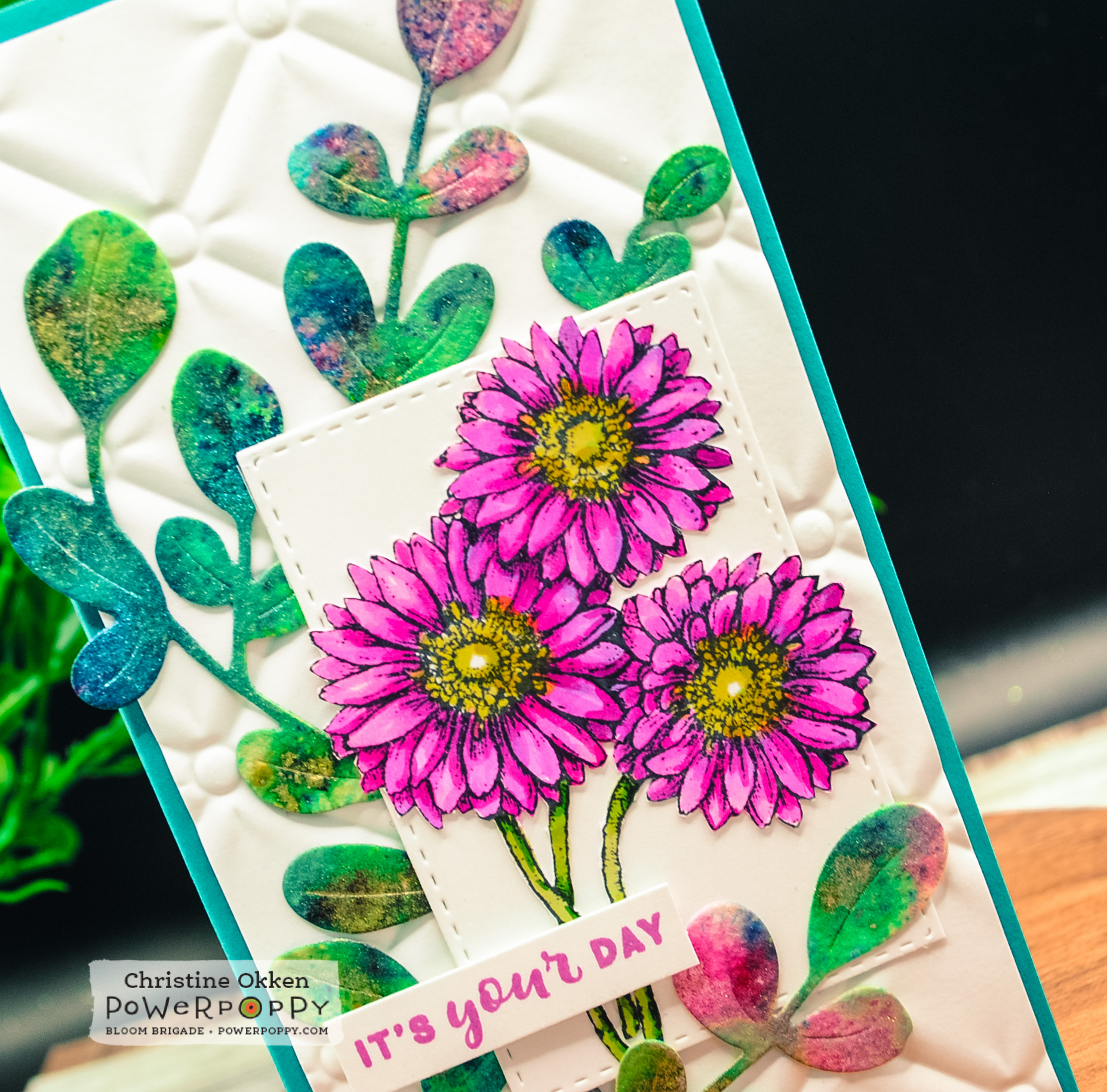
It’s a mini-slimline design using Power Poppy’s Gerbera Daisies Stamp set to mimic the flowers of the Sea Fig, colouring them in vivid pinks with my Copic Markers.  They are fussy cut and placed on a layered background with a die cut that I think imitates the sea fig vegetation.  A very FUN new find for me is the Lindy’s Magical Powders that I picked up which bring all the colour to that die cut!  These powders are dye based and activated in water, and result in gorgeous vibrant saturated colour and shimmer.  I think they really give the feel of the succulent vegetation and the colours of the sea.  


Here’s a view that helps you see how shimmery and shiny they are, and what awesome colour you are left with.  I’m going to be using them a lot in my future!  I’m using watercolour paper because it holds the moisture you need to activate the powders.  


The pretty little sentiment is from Power Poppy’s sentiment set, Nice Things to Say (in stock in polymer).  


Now I have a card that is very ocean forward.  


For this design I really took inspiration from the layout and colours in the picture.  I started with the background and used the same Lindy’s Magical Powders on watercolour paper to create sky, sea and ground with different powder colours, activited them with water and let them dry fully.  then I ran the background through an embossing folder I have that has the feel of the vegetation.  Next I brayered watered down white acrylic paint over the embossing to give the feeling of foamy waves and bring some highlight to the dimension of the embossing.  


For this beautiful sentiment I used one of my favourite Power Poppy sentiments M-Powering Words , embossed it with a metallic embossing powder in teal, trimmed it out and placed it on teal glitter paper and a layer of vellum.  Then, I accented the card with pretty dies from The Greetery Curio Summer Findings

I hope this inspiration has taken you on a lovely journey to the sea!  Join us in The Blossom Challenge this month!  You could win a Gift Code for the Power Poppy store!


Friday, January 20, 2023

From Our Nest to Yours


One of the most common birds found at our bird feeders are Chickadees and I enjoy watching them take shelter from the cold tucked in each day.  This little cutie from Power Poppy called My Little Chickadee is such a fun and easy one to colour up, that its perfect for the latest Blossom Challenge: Clean Slate theme for clean and simple cards. He’s ruffled up and on this winterberry branch ready to sing a song!  

I created a mini-slimline design with blocks of colour in patterned paper that coordinated with the colours I used with Copics.  


Some soft pointillism dotted blue-grey background is a soft touch, and the accents are simple die cut branches from The Greetery which I added mica flakes to, to simulate sparkly icy snow.  


You get a sense of the sparkle on this view, it’s really shimmery in real life!

I hope you can join us for The Blossom Challenge:  Clean Slate HERE!  

Monday, January 16, 2023

The Blossom Challenge: Clean Slate!


Welcome to a new year Power Poppy friends!  We’re starting off the new year right with a new theme for The Blossom Challenge!  January brings a lot of new starts, maybe even new creative goodies and creative juices, so we’re all about a Clean Slate this month!  Where you can show your best clean and simple designs that celebrate that simple yet graphic style that packs a punch! 

I love when Clean and Simple designs accomplish somethings really eye-catching in more simple ways, so today I pulled out a now retired polymer set from Power Poppy which showcases all sorts of fun mushrooms!  Parts of that set are also available in digi form as Mushroom Trio, Miraculous Mushrooms and Morel Standards.  I stamped the image on Kraft cardstock and then pulled out my Prismacolor Pencils because I always love how pencils look on Kraft.  


You can achieve a look that almost glows!  I always lay down a layer of white prismacolor for the rest of the colours to lay on and blend.   A simple snail die from The Greetery seemed like the perfect accent, and then a bit of ribbon adds another pop of colour but keeps it clean.  


Come and join us for this month’s Clean Slate!  All you need to do is create a design show casing any Power Poppy image and link it up to The Power Poppy Blog to be in the running!  

Did you know Marcy’s got a gorgeous freebie you can use too?!  Just in time for Valentine’s The Rose Digi is FREE!  It would be a beautiful clean design image to use!  More details on the Power Poppy Blog!  

Monday, September 19, 2022

The Blossom Challenge: Eat Your Fruit and Veggies

Hello!  I’m kicking of this month’s The Blossom Challenge at Power Poppy called “Eat Your Fruit and Veggies”, with two cards celebrating both gratitude and yummy fruit and veggie designs, something that Power Poppy does SO well!    


My first design showcases Power Poppy’s Cabbage Patch set.  Each of these cabbages or kale are coloured with Copic Markers and trimmed out.  

They are arranged on a mini-slimline background you’ll see more of in a sec, and I added some assorted green and blue-green sequins to accent. 


The sentiment is from the polymer version of this set, which is embossed in white and inked in black below.

You can see peek at the coordinated background I created for the card above, and how I did it pictured below.  After I sponged on lots of Distress Oxide ink (Mowed Lawn and Evergreen Bough) onto the heavy cardstock panel, I used my polymer stamps of this set and a paper towel soaked with water as my ink pad.  I used my Misti to “lift” off the ink with the water, because water reacts with Disress Oxide ink.  It’s a soft subtle effect and you’re left with a faded-sueded pattern.  By doing it in the Misti, I could stamp each cabbage several times with water to get  a more defined lift of colour.  Then, I dried it with my heat tool to complete the reaction.  


Next up is a card with one of my favourite fall sets from Power Poppy called:  Pumpkins and Pears.


Marcy always does little vignettes so well, and they are really delightful to colour.  

The background is a Kraft panel that was masked off with tape and then Distress Oxide Ink was added (Crackling Campfire, Abandoned Coral, Fossilized Amber and Seedless Preserves).  After splattering with water and some white ink and it was dry,  I ran the panel through with a pierced die.  I love the look it gives. It’s finished off with some patterned paper, inked die cut leaves and enamel dots.  


Have you been eating your Fruits and Veggies?  How about creating with them?! Come on in and join us at Power Poppy with a design using some form of Fruit or Vegetable in the card and Power Poppy stamps.  The Challenge is open for a month and you could win a gift card to the Power Poppy Store!   And to top it off, Marcy has discounted some of my favourite Fruit and Veggie themed stamps in the store if you want to play along!  

Here’s more Fruit and Veggie goodness from the Bloom Brigade playing along today.  Thanks so much for stopping by!  

and link your entry at the Power Poppy Blog!


Monday, August 15, 2022

The Blossom Challenge: Sentimental


Hello Friends and Welcome to the August edition of the The Blossom Challenge.  I’m bringing you this month’s The Blossom Challenge, and we’re Going Sentimental, focussing on Power Poppy’s beautiful selection of sentiments.  

Today I’m bringing you two inspiration cards with Sentiments as the focus.  

First up is a design I made for a recent wedding.  


For a lot of years my husband and I were youth pastors and it’s been fun to see our former students get married over the years.  This wedding was a delightful one with the bride from Indian-Canadian descent and the groom from British-Canadian descent, the mix of cultures and colours at the wedding was gorgeous.  This palette reflects the colours in the wedding of orange, pink, coral and red.  I’ve utilized two beautiful Power Poppy sets,  Hummingbird Paradise as the beautiful floral frame, and then one of my ALL TIME favourite polymer sets from Power Poppy Big Scripts.  Did you know that this set features hand drawn sentiments by Marcy?  I just love her scripty writing.  


To highlight the sentiment I embossed it on white cardstock, then sponged warm shades of Distress Oxide Ink, Seedless Preserves and Abandoned Coral around it, wiping the ink off the sentiment once it was done.  The floral frame is fussy cut out in a windowed design.  


Next up is a Clean and Simple design:


Dear friends of ours move away today to another city in the province.  We are going to miss them terribly.  Over the years we’ve watched them grow from a newly married couple to a family of four.  We’ve shared a love of creativity and the mountains, so this design is a bit of a nod to our friendship, and the fact that they are moving closer to the Rockies.  Similar to the first card, I created a background of a sunset sky using Distres Oxide Inks: Tumbled Glass, Wilted Violet, Abandoned Coral and Seedless Preserves, spashed some water on the background, then embossed this awsome encouraging sentiment from Power Poppy M-Powering Words (currently sold out in polymer) onto the beautiful colour of the background. 
 

I used a framed arch die to accent the sentiment, and then hand-drew in a silhouette of our favourite mountain range in Canmore, Alberta called the Three Sisters, filling it in with a black Sharpie, and added a punch-cut sparkly paper moon.  


You’ll definitely want to check out The Bloom Brigade’s creations this month, they are fabulous inspiration!  

And....Here’s a link to the Power Poppy Blog to enter your Sentimental Creation!  

Monday, June 20, 2022

The Blossom Challenge: Glassy-Eyed


Welcome to our second The Blossom Challenge from Power Poppy!  This month we’ve got a fun theme called Glassy Eyed!  We’re going to be using sets from Power Poppy that show an image in glass or under glass, and showcase different ways to colour translucent glass.  So dig into your Copics, Pencils or watercolour...and any Poppy image that uses something in OR under glass, you could even be totally artsy and use a Power Poppy image and draw your own glass in!  


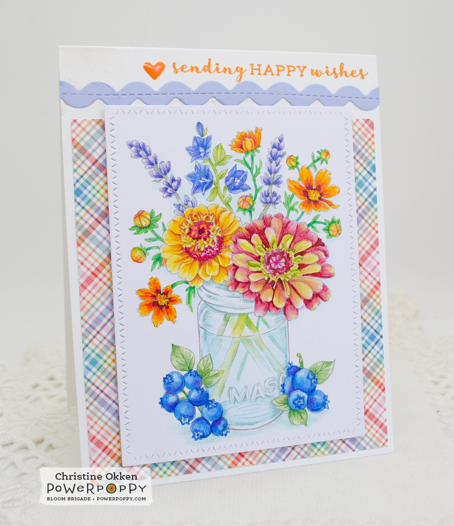
Today I’m using the NEW image from Power Poppy called Accentuate the Positive.  What a gorgeous array of flowers and fruit around this pretty mason jar.  I printed the image quite lightly for colouring and then used Copics and Prismacolour Pencils to brighten up the blooms.  One of my favourite varieties of zinnia is Queen Red Lime, they have such a nice fade between lime and rosy red, so I tried to give the flower on the lower right that treatment in my colouring.  

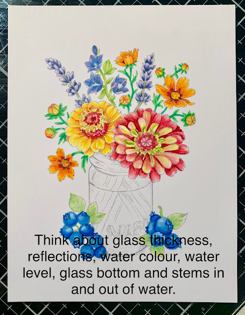
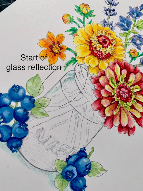
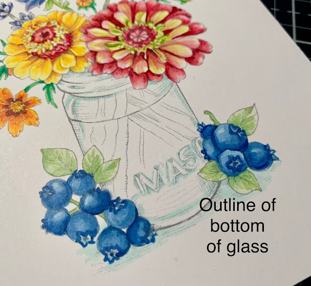
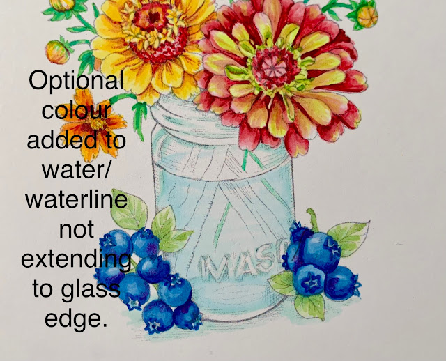
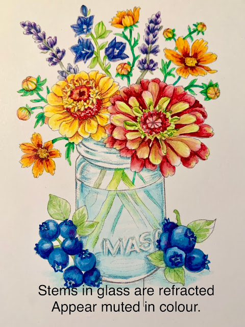
I’ll give you a short tutorial on what I think are important features of colouring glass.  These were all taken on my iPhone while I was colouring, but should give you an idea of features I use when colouring glass.  

Things I like to consider when colouring something in or under glass.  
  • Where the light is reflecting on the glass
  • The width of the glass for colouring, and the bottom edges (if in a vase)
  • Will the glass be coloured or clear
  • Will there be a water level be and will you define it
  • How stems refract and colour fades in water


Here is my image without colouring the glass.  It’s a mason jar, so I’ve decided its going to be one with a blue tint to it.  


Glass always has reflection points where the light bounces off and refracts.  It is usually white or clear.  Marcy has illustrated a highlight point already in this design and I’ve given the light space some colourful edges so you can define it.  You can add your own reflections to images as well.  


Colour “pools" in glass in certain areas, the neck of where the mason lid would fit, the letters spelling MASON and the outline of the bottom of the vase.  I added a BG10 to those areas to define them.  You can also see I didn’t colour right to the edge of the glass.  It has thickness to it where you don’t typically see colour.  So, I add colour inside of where I imagine that glass thickness to be.  This gives it more realism.  


Water is clear, but would like be slighly blue in a blue jar, so I’ve added a very light BG0000 to the water line front, and just a hint of th eback of the waterline.  Again, not extending to the edge of the glass.  


Stems in glass usually are muted or lighter in colour or because the water and glass have a refracted, mis-matched look from the stem above water.  I usually add a bluer tone to the stems and lighten them up.  


Here’s a peek at the close up finished vase.  I tightened up the outlines with a light blue/green prismacolour pencil to give it better definition.  


So that’s a simple but helpful way to up your glassy-eyed game!  I hope you can join us for the challenge this month and create something in or under glass with Power Poppy!  Link up your creation HERE.  

Remember: You must use a Power Poppy image somewhere on your design and this month Marcy has a number of images using glass on sale!  

Enjoy more gorgeous inspiration from The Bloom Brigade

Essie
and Me!  

Monday, May 30, 2022

A Crown of Daffodils


Hello Friends!  We’ve just come back from a week away visiting some of our US family for our niece’s graduation.   It was the first time some of our us have been out of the country in 2 1/2 years.  It was really fun, and now I have the typical mound of laundry, plants that need planting, garden beds that need weeding....and host of other things to do!  

But before I left I created this pretty design with a newly released set from Power Poppy!  It’s called Sketches of Spring Volume I.  Just look at what a beauty it is!  I’m growing in appreciation for daffodils in the past few years.  I’m generally a tulip lover, but the uniqueness and variety of daffodils that are now available are really gorgeous.  Marcy illustrated several different varieties here of narcissus and daffodils and paired them with Viridiflora Tulips and Pointed Petal Fritillary.  I coloured up the bouquet with Copics, and finished off the details with prismacolor pencils.  


I’ve added a little die cut “crown” as accent to the design.  Did you know the popped up centers of daffodils are called coronas?  And you are probably aware with the pandemic that corona means crown....I like this version of crown much better.   A couple of clear holeless sequins add a touch of sparkle.  The sentiment is from the Power Poppy polymer set Simply Camellias.  

This set is one of many on sale right now at Power Poppy in The Blossom Challenge Digis.  And you still have just over 2 weeks left to join us in the new Blossom Challenge going on at the store.  Be sure to create a design and you could win a prize to the Power Poppy store!  More details HERE!   

Appreciate your visit!