Showing posts with label Masculine. Show all posts

Sunday, June 15, 2025

Waffle Flower Wilderness on Father’s Day


This is the time of year when I always feel so grateful for my husband and the kind of Father he is to our kids.  And though our kids would all be considered young adults, he’s present, available, supportive, and a good leader that walks with them through this life, especially at this stage.  I love that we can honour him in this way.  

For his Father’s Day card, I pulled out the beautiful Forest Sunset Postal Collage Stamp, and the Postal Collage Die to create a rustic wilderness scene for him.  The sky has a bit of the look of an aurora borealis night that we often experience here in the North.  I’ve ink-blended the background and then splattered water, finishing with some detail “stars” with a white Sharpie.  All of the images are embossed in black to give some shine and lots of black contrast.  

I also incorporated the tiny postage from the Postage Collage Miniature Die and Stencil, using some of the small animal images from the stamp set to pull it together.  Those minis are especially darling.   


The background of the card uses the Sweet Plaid Texture Die from Waffle Flower, and the sentiment is an old one from Stampin’ Up!  The type and size is perfect.  


Thursday, February 20, 2025

Cozy Cabin with Concord & 9th


Hi there!  It seems our Winter deep freeze has finally broken!  Today the sun was out and the temperatures hovered at the freezing mark.  It felt glorious!  You do start to get a little cabin fever when its that cold don’t you?  Today I’ve got the cutest cabiny scene with products from Concord and 9th called By the Fire Bundle.  It is the CUTEST little Winter Scene making set!  As you can see it’s a number of dies and stamps put together to create a cozy little environment.  


I did some ink blending of some of the elements of the stove and cast iron pans, and then added a bunch of homey texture to the cabin by using the Wood Slat Embossing Folder for the walls, and then by using the Our House Embossing Folder and stamp from the Our House set to create a brick floor.  I love the fantastic combination it creates when pulled together. 

Aren’t all the tiny details amazing?  It is a labour of love kind of card, but I also found it really relaxing to make.  The perfect cozy card for a friend!  

Wednesday, January 8, 2025

Coke with Lemon and Concord & 9th


After 2 LONG MONTHS, where the postal strike in Canada was NOT kind to me, I finally received my Concord & 9th Order from November today!  I lickity split started a card after work with this ridiculously cute bundle from them called Soda-Lighted.  Anyone who knows me, knows I am a Coca-Cola girl.  Like I deeply love it.  Even just hearing a can open makes my heart happy!  So, of course my first card with this set had to be a coca-cola like can.  I mean, how cute is that!  


I started with the stamping of the can, used the dies to cut it out all in that quintisential bright red.  I layered the card over a die cut using the Postively Cut Card Front from Concord & 9th, to add to that red and white theme, and then just because Coke with lemon popped into my head I went ahead and grabbed the Citrus Crush Bundle from Concord and 9th and die cut the lemon as a citrussy accent.  How cute right?  


Finally I added in some soda bubbles with clear Dew Drops, and the hello diecut sentiment from the Soda-Lighted set.  Crisp and cute, just like my favourite drink!  

Thanks for joining me today!  

Tuesday, July 2, 2024

Family Graduation with the Greetery


We had some great celebrations going on last weekend, our older son and his girlfriend graduated with their undergrad degrees (with distinction!).  Both of them are heading to Masters studies this fall.  Today and tomorrow I’ll show you the cards I made for both of them.  Today our son’s card is up!  I’m just crazy about their Confetti Encore Suite of products!  For this design I used the Award Winning Die and the University colours (green and gold) to create this celebration ribbon.  A bit of gold shimmery paper really makes the sparkle come out in the ribbon and in the metallic stars.   The cardstock is Evergreen and Stardust from Concord & 9th.  


The background is foiled with the Ticker Tape Foil Plate and then I added the gold embossed sentiment with the Inflated Sentiments Stamp Set.   And to make it feel like even more of a party I also used the Curly Q Streamers, and some gold sequins.  


And my sweet sentimental son even told me how much he loved the card, and how happy he was to have it.  (swoon!) 

Here’s a couple of pictures of them from the day. 


Wednesday, June 26, 2024

Oh Buoy! With TCP


Ahoy Matey!  I can never resist a cute bunny design from The Cat’s Pajamas!  And pirate bunnies?!! What a treat! This cute new digi image from TCP is called Bunnies at Sea.  I printed and coloured the scene with Copics and coloured pencils with some wonderful saturated colour, which makes it so full of celebration!


To keep with the sea-faring theme, I make the card into a circular design, creating a circular buoy on the outside frame.  Easily done by using two circular dies together cut in the teal and then in white.  Then the white is trimmed into sections of the buoy.  Then I wrapped some baker’s twine around the frame, securing it on the back.   Then the buoy frame is popped up from the circular card base with foam tape.   


The sentiment is from another retired TCP set, but fits so perfectly for this design I couldn’t resist it!  

Here’s a peek at this cute set...


Thanks for joining me today! 

Tuesday, June 25, 2024

Tropical Wishes with Concord & 9th


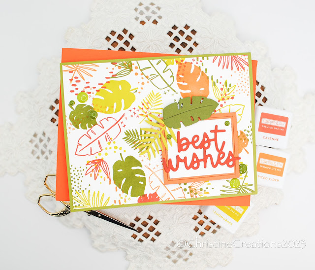
I always love a tropical theme!  When I made a bunch of cards for a friend she asked for a few masculine designs with the Best Wishes theme.  Where flowers can be more feminine, I think leaves can go both feminine or masculine.  So I pulled out this Turnabout stamp from Concord & 9th called  A Bit of Paradise.  And with the right colour palette it definitely leans more masculine.  The colours I used are Lemongrass, Spiced Cider, Cayenne and Avocado.  


I also used the coordinating A Bit of Paradise dies to add some accent to the sentiment.  The grame is from the coordinating die, and the die cut sentiment uses the Everyday Expressions Die.  


Now I think that covers all the retirement/best wishes cards I created for her.  It was a fun theme to work with which I don’t often create.  Thanks for joining me today!  
 

Monday, June 17, 2024

Ginkgo Love with The Greetery


In this life I have been so very blessed to have a husband who is such a good Dad.  All the things a kid hopes for in a Father are things my beloved exemplifies, and I thank the Lord for Him!  This was my card for him for Father’s Day, it incorporates the very beautiful Ginkgo Botanicuts from The Greetery, which I picked up on their recent sale.  Did you know ginkgo symbolizes resilience, healing and longevity?  Perfect for a card for him!    


I love that these leaves can be masculine in theme.  I started with Eucalyptus cardstock from Concord & 9th and ink blended both Eucalyptus and Rainforest ink onto the leaves to given them some depth and bring out the detail veins in the die.  Then I splattered them wiht Rainforest ink and white acrylic paint.  

Next,  I placed them onto a card base cut from Pebble cardstock which I had ink blended deeper mushroom ink onto.  Its a great earthy look.  Some leaves are glued down some are popped up slightly for a great sense of dimension and texture.  


The foiled sentiment is from Spellbinders, Must-Have Sentiments Glimmer, and it’s foiled in a gunmetal silver shade.  To keep it very simple since there is some much going on with the leaves, I added a few coordinating enamel dots.  

Sunday, June 16, 2024

My Role Model with MFT


Hello!  Today I’m popping in with our kids’ Father’s Day card for their Dad.  Since he sometimes peeks at my cards, I didn’t want to post it before the day.  Our kids are beyond blessed to have a Dad who is so loving, supportive, wise, sacrifical and hardworking.  100% they know they are loved and he is proud of them.  He is a leader and a servant heart and loves the Lord.  I am so grateful for him, and I know they are too.  

So this superhero themed card and the role model sentiment were perfect for him.  I was using a new set to me from MFT called Super Human and the coordinating dies.  These little guys are so adorable!  I coloured this little guy dropping in to save the world with Copics in my husband’s favourite colour - purple.  It was his HS and College colour and he still gravitates toward it.  


The background city scene uses another MFT set (Birdie Brown - retired now). I embossed the city in silver, and ink blended the sky in purples, adding in sparkle pen for stars.  I’m also playing along with this week’s MFT Sketch Challenge.  

The foiling uses a Spellbinders Foil plate called Hypnotic (seems to be retired), and then added an interior frame with a scalloped rectangle die from MFT.  


The sentiment is embossed for more silver touches, and now it’s adorable and heart-felt!  

Friday, June 14, 2024

Award Winning Retirement with The Greetery


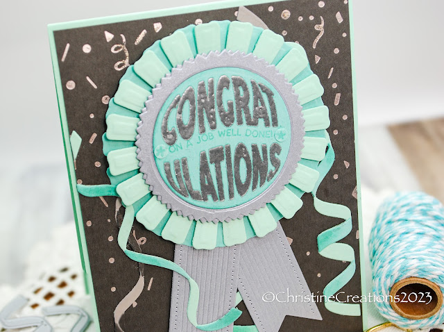
Hi There!  Today I’m bringing you another instalment in a seriew of cards I made for a friend to give to co-workers.  This one was designed for a man who was retiring, so I wanted it to have a bit more of a masculine feel.  I picked up my new goodies from The Greetery from their Confetti Encore Collection.  If it’s a celebration, this bundle of products is the perfect way to create great designs. 


I began with a fun colour palette (Concord & 9th Mushroom, Seaglass and Tidepool), and then went about foiling the Ticker Tape Hot Foil plate in silver on deep charcoal cardstock.  Next I added in layers of Curly Q Streamers Dies (they really make it feel like a party!), and then formed my fun Award Winning Die into a “blue ribbon” using the sentiment from the Inflated Sentiments embossed in silver for the sentiment.  Little touches like silver metallic cardstock add to the award winning feel of the design.  


I think it combines to make a really fun card that is full of celebration.  Also - perfect for masculine or feminine designs depending on the types of paper you use.  Thanks for joining the party with me!  
 

Thursday, June 13, 2024

All Star Dad with Power Poppy


Hi There!  With Father’s Day a few days away, I thought I’d pop in and show a design I created a few weeks ago for a friend to purchase.  This design is created with a retired Power Poppy’s set called Play Ball.  It has great elements of a sports theme, and you can get part of the set in digital still available as Baseball Vignette.  


I coloured all the designs with Copic in a spring green and yellow combo, trimming out the layers, and also incorporating a postage theme with the dies.  The herringbone parquet background is from The Greetery and makes a perfect backdrop. 


A few stars and enamel dots accent and tie the colours together in a fun way.  Thanks for popping in!

Wednesday, April 24, 2024

Too Old for Balloons? With TCP


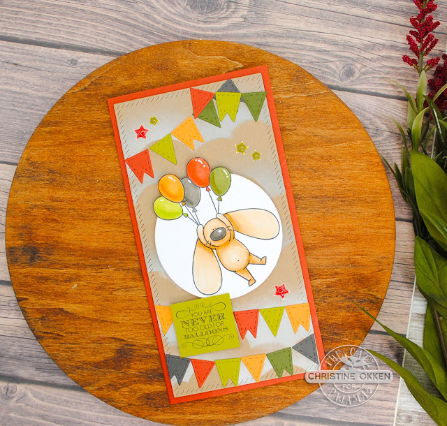
Hello!  I’m popping in today with a cute slimline Birthday card with TCP’s March set called Bunnies in Flight.  I think him being carried away by balloons is adorable!  After printing the digi, I coloured him up with Copics, and then trimmed out the edges of the balloons “out of the box” style, and then ran the image through a circle die.  


To create the background I used a retired TCP stencil and some white pigment ink to create the clouds in the sky, and then added a whole assortment of cute little banners from another retired TCP die in the colour combination to make it full of celebration!  
 

A few enamel stars finish the design along with a fun little sentiment for the Birthday person!  Thanks for joining me today for a little creativity!  

Tuesday, April 23, 2024

Foiling with Crafty Meraki Two Ways


Hi there!  It’s Tuesday and that means another week of guest posting for Crafty Meraki and this week our theme is foiling!  So, I’ve brought you TWO very different designs with foiling, a floral and a masculine style design.  

First up this gorgeous array of flowers from Crafty Meraki’s very beautiful Elegance Hot Foil Plate and coordinating Stencil.  It’s a large sized flower and makes a great statement on a card.  I foiled the image twice in gold, once on white cardstock and then a second time on the new Rainbow Canopy Paper Pack.    


After trimming the flowers out fussy cutting style, and stencilling in purples shades with ink, I carefully added in a few of the patterned paper leaves into the design paper by paper piecing.  Those little pops of colour and pattern are a fun touch.  I used some die cut octagons in the background in purple cardstock and pattern paper to die the colours and pattern papers together.  


The pretty sentiment is also foiled on purple cardstock from Crafty Meraki’s Handmade Love Hot Foil Plate and coordinating die.  These are fun scripty fonts to play with.  

Next up is a more masculine style (or maybe better said a more neutral design).


I’m playing with my favourite colour, green!  For this design I started with Crafty Meraki’s Evergreen Elegance EAP.  This is a type of patterned paper with images that are already coloured, it makes for quick card making, embellishing or an entire design as I created today!  I picked a few sheets of coloured leaves that I liked, trimmed them out (though they do have coordinating dies) and combined that with some Olive Leaf Meraki Para-Dies, cut on vellum.   Then, because this is a foiling focussed card, I foiled both the sentiment from Meraki Moments Hugs Hot Foil Plate and die Combo in green faceted foil.  


To add foiled Olive Leaf die cuts in the arrangement, I foiled a rectangle using a solid foiling plate, and then die cut the foiled olive branches out of that piece of foiled paper.  When I found an arrangment I liked, I spread some Press n Seal overtop to hold everything together while I created the background.  

The background rectangle is run through the Crafty Meraki Parisienne Mini Slimline Para-Dies for that beautiful impressed pattern, and then I spritzed that layer with water and sprinkled some Lindy’s Magical powders (Pondorosa Pines Olive) onto the layer, spritzed again and all this beautiful pigmented green starts to play!  


Then I assembled the card with lots of foam dots to create a good amount of dimension.  All that green is so wonderful!  A few enamelled dots complete the accents.

Sunday, April 21, 2024

Masculine Monday with Waffle Flower Postage


Masculine Postage Style Card

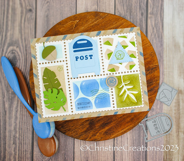
Hello out there!  Today I”m bringing you a little masculine inspiration with a number of company’s products, but all based around Waffle Flower’s Postage Collage Bundle.  Its such an ingenious way of creating cards!  This time I decided to go a little masculine.  If there is one style of card I’m usually lacking in its masculine!  

I’ve used TCP’s retired postage stamps, and dies (like that fun mailbox and acorn), then stencils from the Waffle Flower set, embossing paste (lower right corner leaves), and dies from Concord & 9th A Bit of Paradise for the tropical leaf dies.  


It makes for a perfect masculine design for a Birthday with the blues, greens and neutrals!  


Appreciate you joining me!

Monday, July 10, 2023

Shiny Birthday Confetti


I have really been enjoying playing with foiling on my cards.  It’s SO fun to see the magical reveal of the sparkle when you lift the foil, and I love the sparkle and impression it leaves.  This card uses products from Spellbinders and MFT for foiling, and I think they go nicely together.  

I started with the background layer using Spellbinder’s Slimline Confetti Background done in Speckled Prism and then ink blended the background with Distress Oxide inks to get a ombre effect.  This foil is an awesome one because it picks up the colours of what is around it, so it takes on the blue-purple tone of the ink-blending.  


One thing I really appreciate about foiling is that you can also use the leftovers of the “reverse” of the foil.  I don’t like wasting things, so this revelation was a happy one for me!  When Spellbinders had their big sale I purchased the Solid Rectangle Essential Glimmer Plate to be able to also add the reverse foil from the background to another piece of cardstock, and then die cut out the sentiment with MFT’s Happy Words Die-namics.  

For the cute candle accent I used MFT’s Wish Die  and then added some of the inner circles from the “a” and “p’s” in the sentiment as popped up confetti.  


Clean, simple and perfect for the next Birthday!

Thursday, June 22, 2023

Mod Thoughts


We’re back in the 70’s again!  I’ve got a couple of MOD designs for you today!  I’m playing with Concord & 9th’s Mod Turnabout Stamp and some fun colour combos for today’s cards.  One is a little more feminine, and one a little more masculine.  

For this design, I added some of the rounded squares popped up to give some extra interest and dimension.  I also only when for 3 passes of the stamp so it leaves some white space for the design.  This design uses Blueberry, Tidepool Sorbet and Nectar inks.  


Now for the more masculine design.  


Now on THIS one, somehow I must have misaligned my turnabout stamp and whew!  the pattern does not line up!  But I actually don’t mind it!  It makes it even more MOD :)  I’ve used Concord and 9th’s Tidepool, Spiced Cider, Midnight and Pebble, on Pebble cardstock.  It darkens the colours so that the cardstock almost looks a little light, but it’s really that grey colour of the cardstock that give it that deeper colour.  


To match the pattern, I took a die from PinkFresh Studios Rounded & Braided Rectangle Die, that I trimmed down to look more like a rounded square.  


Thanks so much for joining me today!