Showing posts with label Flourishes Friday. Show all posts

Thursday, June 7, 2012

10 Minutes to Wonderful!

Hi all! This time next week, Flourishes will be wrapping up its sneak peek week with three new beautiful sets being unveiled! So, to get ready for the big reveal….the DT is ushering in a fun-filled challenge to give you a chance to win each and every one of them! Mark your calendar — the fun starts NEXT WEDNESDAY!!

All you need is ten minutes and a dash of creativity to play in our latest Release Week Challenge! It's one that gives you a chance to WIN our entire release for June!


HOW TO PLAY: Let your creativity shine AND don't take a long time to do it! This challenge is all about those 10-minute creations. Clean and simple layouts that can be done in a jiffy is what we are looking for here! Entries must be in by June 15th by 5PM EST in order to be in the running for the entire June Release! If you upload to Splitcoaststampers, please use the keyword FLLCJUN12! Winners will be chosen at random but one lucky person will be chosen to have their card featured here on the Flourishes blog! Remember to link your creation below using our Inlinkz widget!

Now, it should probably be clear to you that 10 minute creations are not exactly my forte....but it's fun to do something out of your comfort zone sometimes!


What helped with the 10 minute time guideline (It's more of a guideline right?  Cause it was more like 15 minutes :)   was that I knew what I wanted to do already in my little noggin'.  I knew I wanted to create a central, soft pastel panel with the banners overtop.  And the banners are fast and super easy to do.

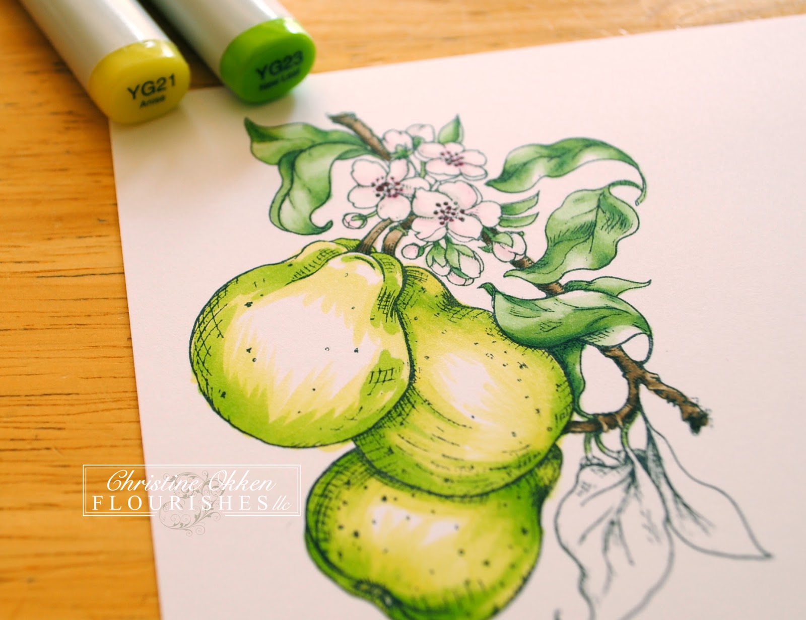
I chose the awesome Birthday Pennants set because it not only has the great pennants, but also wonderful smaller elements to the set that make for great backgrounds.  Which I then softened with my Letraset Blending Marker.  My dear friend Julie did this technique a while ago and I loved it, here's a pic of how it's done...


(Click on this picture to make it larger).  Take your waterbased inks, here I just grabbed some SU! ink, and stamp an image.  Use your Aqua Marker right away to spread the ink lightly around the image, it will pick up some of the ink and soften the effect of the color, spreading it out slightly.  It worked especially well with the green ink.  Don't spread too much for too long or your paper will start to break down.  Easy Peasy :)

While you are out and about hopping around, take a minute to see what our fine designers have created!

Barbara Anders
Christine Okken (you are here)
Danielle Kennedy
Julie Koerber  it's her Blog-A-Versary....and she has blog candy!
Sharon Doolittle 
Stacy Morgan 
Tammy Hershberger

So get those creative juices flowing — it could help you win some fantastic polymer! And… don’t forget to link up using our Inlinkz widget to be eligible! Happy Friday and Happy Stamping!

Stamps:  Flourishes - Birthday Pennants;  Ink:  SU!  Pear Pizzazz and Pool Party;  Paper:  Flourishes Classic White, Pool Party;  Accessories:  Big Shot, Spellbinders Pennants and Lacy Pennants Dies, Seedling - Art Nouveau Embossing Folder;  Basic Grey Buttons, Twine.  

Thursday, May 31, 2012

Strawberries


Welcome to Friday!  I have a DOUBLE post for you today :)  Flourishes Friday and a sample for Becky Fleck's new CardMaps Sketches!  Be sure to scroll all the way through!


Nothing more delicious than your own strawberries!  It's a spring/summer treat we love.  Our everbearing strawberry patch took a beating this winter, so we bought 6 more plants, and that will hopefully keep us supplied. 

This lovely Flourishes Strawberries set showcases some gorgeous strawberries, greenery and sweet sentiments.  Today I colored it up with Copic Markers and gave it that country feel with these pretty MME Rosy papers and lots of gingham, even in the ribbon.  Of course I forgot that I wanted to use this set with our other set Basketweave that pairs so well...oops!  I know the other girls remembered so you'll get lots of peeks at it.  

Spellbinder's Picot Edge Circles frame the image out, and some simple sewing to also frame it out.  


Someone asked me recently if I was going to give up Copics because I've some some watercoloring again....NOPE :)  I'm an equal opportunity colorist!  I love it all!  I love picking up different mediums for different effects, so copics, prismacolors, watercoloring...you'll hopefully see it all here.  
(Copics R81, R35, R39, G82, G94, G85, YG0000)

and now...some of us from the Flourishes Family had the privelage to design cards with this month's CardMaps sketches from Becky Fleck....here's mine...be sure to check out Becky's sketches this month by clicking on the CardMaps link on her site!


I used one of Becky's own sets she designed for Flourishes called Country Charm Labels, which works perfectly with the Spellbinders' grommet labels.  I've embossed the labels on graduated colors of cardstock and used the other elements from the set to stamp the background, pulling all the colors together.  A few Icing Sugar Candi act as the "grommets" and some lovely satin ribbon.  

Now please head on over to the rest of the DT to see their fabulous Basketweave and Strawberry creations.  Delicious!

Thursday, May 24, 2012

Cheerful Daisies


Just as the saying goes, April showers bring May flowers and at Flourishes -- we are watching the daisies sprout!   Just take a trip to see all of our Flourishes designers today and you're sure to be inspired as they show off our creations using our set Gerber Daisies
Here is mine....

What I love about Gerbera Daisies is the vibrancy you can find in some of their flowers.  So many colors and varieties and an abundance of color!  I wanted to give these that cheerful theme.  Coloring is done with Flourishes New Letraset Aqua - Watercolor markers.  I am having a lot of fun re-learning how to watercolor again :)  I'm a little out of practise!  But these markers are deeply pigmented and with such control because of the tips, and easy to blend with the blending pen.  

I used this months' SFYTT from Jen and just tipped the main panel because of the style of bouquet which shares a bit of that diagonal design.   The papers are MME - Howdy Doody.   


Some new ribbon in the store, and this awesome Prima Monarch Flower Center (on sale!).  


Now head on over to see what the rest of the Design Team has cooked up with these daisies this Friday!


And, if you like what you see on their blogs, you should know that today and tomorrow only - you can add this set to your collection for 20% off! Just use the code DAISY at the time of check out! 

Thursday, May 3, 2012

Home Sweet Home Challenge!


Here we are at the May Pre-Release Challenge from Flourishes!  And it's a fun one!  (and I even have a coloring tutorial for you :)  ) It's got a lot of pictures in it.  


Here's the theme:  Let your creativity shine by being inspired by something in your home - it could be the color scheme of a room, a painting, vase or floral arrangement - the sky is the limit on this Home Sweet Home Challenge! 


So, here was my inspiration, you might recognize it as one of my Project 365 Pics from a few weeks ago. 

It's a pretty bowl of pears on my counter.  The bowl is from our original everyday dishes we chose at our wedding almost 18 years ago.  Most of them are already broken, and we've chosen new ones, but I have a number of serving pieces left.  


And here is where the inspiration went!  I pulled out my pretty Flourishes Pears set and did some copic coloring (tutorial below).  What's lovely about pears is that you can give them a number of different color combinations, so I chose greens.  This card is 5 1/2 x 5 1/2.  It uses this great Spellbinders Ornate Artisan dies that I love so much, plus the Classic Bracket Edgeabilities, some pretty lime satin plisse ribbon, lime braided trim and Basic Grey's Picadilly Square papers.  


Here's the coloring tutorial:


This is a bit of how I start.  I've picked these papers from Picadilly and now that's the color palette I want to go with (and it matches my inspiration picture too).  I've already colored up a couple of the pears - partially with Flourishes New Leaves Collection  but the coloring is a bit rough yet (as in not very blended), and you can see that I've left areas of highlight with no color.  I used to color up my entire image all the time, but I've gotten into the habit of leaving some white areas uncolored.  You can always come back and add color, but it's harder to take color away, and this way in the very last blending I can add color overtop and it will remain the lightest shade.  


Here you can see the colors I've used to give the leaves definition.  Pistachio Collection from Flourishes.  Starting with the G40, adding in G43 and the G46 in the areas of deeper shadow, and blending with the G40.  


I've given the pear blossoms a really light hand with the W00, W1, RV0000 and then the RV00 and RV69 for the stamens in the blossoms.  


For the sections of wood I used mostly E43 and E44, with the lightest touch of E47 in the deepest shadows.  


Now for specifics on how I colored the last pear.  I start with some flicking strokes of the YG21 marker, leaving highlight on the larger part of the pear where the light would hit as well as the very top.


Now I'll add in some YG23 with the same types of stroke technique only in a smaller quantity of area.  Then I'll blend with that same flicking stroke with the YG21. 


Now I add in the deepest YG25 giving the pear that rounded appearance blending with both the YG23 and YG21, the same type of up-stroke technique.  


Now these 2 pictures above are the "extra touch" to make your pears look even more realistic, the pear that appears the most in the background (lowest center), is the pear you can add some blue or violet color to - so that it appears to receed, and gives it more realism.  Yellow or warm colors advance, and blue or cool colors receed.  So I've added some BG11, BG53 and B21 to that pear.  Then I've added YG21 to all of the pears to smooth everything out.  Those areas I left white take on the yellow/green tone and still look highlighted with the least amount of color.  I also added the E43 to the "spots" on the pear just like a regular pear would have.  


And the last touches are on the leaves, also adding some B21 to the areas where the darkest shadows or  depths would be.  It really works well with the papers and also gives more realism.  


And with a little B21 and B0000 I've added in some background that really makes the difference in the image "popping".   There you have it.  I think I still might have fussed a little with it smoothing out the coloring after this picture.  I tend to do that, till I think it's just right!

So we're inviting you into our Home Sweet Home Challenge!    Create something inspired by your home.  Please take a picture and show the inspiration piece in your post. Entries must be in by May 11th at 5PM EST in order to be in the running for the entire May Release!  When using online galleries please use the code FLLCMAY12.  Have fun!  

Please visit the rest of the team to see their home inspired creations!  I know you'll be wowed!

Thursday, September 1, 2011

Honouring Leslie


It's a bittersweet day for us Flourishes girls...today is the first Flourishes Friday without our team-mate Leslie Miller.  Leslie has been with Flourishes on the Design Team since the company began, so when she announced to all of us a few weeks ago that she was "retiring" from FLLC, we all felt pretty sad.  We all understand and support her - but I'll really miss her.

Leslie is one of the reasons I even considered being on a Design Team, and especially with Flourishes.  I wanted to do beautiful design work just like her!  Leslie's work speaks for itself.  She has impeccable design talent.  Her colouring is always flawless and it has a dreamy quality that I love;  she puts papers together beautifully, and embellishes with such a clean classy style.  I admire her work so much, and above all appreciate her.  She is supportive, fun, has a delightful sense of humour, she's an encourager, loyal and she is such a great team player - she is a great lady, and she always WOWs me when I come to her blog.

So...today we decided that we'd honour Leslie with a little CASE-work of our own.  Each of the DT girls playing today picked a card of Leslie's to CASE.  I had a very hard time choosing one, and had a whole bunch of cards I would love to CASE, but finally settled on this one.  HERE is the link to Leslie's creation....which knocked my socks off, and here is what I did.


I absolutely LOVED how Leslie made the three blooms of Zinnia's shine in her card, so I took out a different set - Sweet Nature with the Ranunculus blooms - which is a slightly larger flower, and gave them the same feel.  Coloring is done with Copic Markers - Tea Rose Collection, with some Evergreen Collection in the centers.   I loved how Leslie's card incorporated the neutrals as a base for the pop of pink in the flowers - so this Designer paper  Memory Box  - Valise  has a similar feel to the papers Leslie used but in a bit warmer colour palette.  The scale is different in my card than Leslie's with the larger flowers and leaves, but it has the same impression. 


I don't have the same punch Leslie used for her greenery- so I just used my Sizzix leaves die.  I also incorporated the new Edgeabilities from Spellbinders on the horizontal strip (soon to be in the FLLC Store) - oh my word I LOVE these new style of dies, and as soon as I can I am planning on getting more!   Then a little touch of linen ruffle ribbon and some pretty brads finishes it off.

Leslie, I will miss you on the team - so much!  But I wish you nothing but the best as you create at a pace that feels right to you, and still gives you time for all the things you love, including your beloved, your garden and your Wally too.  You've blessed my life greatly!

Now you can see some more CASE-work of Leslie at these DT girls blogs

Thursday, July 21, 2011

Vintage Ranunculus

Second post for today...please scroll down for my TSG post.

Well, as you're reading this I hope I'm going to be sleeping in!  I should be back from CHA and I hope to tell all of you all the great things I saw and people I met - another day! :)  But I do have something pretty to show you from the July Release at Flourishes.

Seeing as the Sweet Nature set is SO pretty, I couldn't resist having another card in a warm and vintage style for this set.


I watercolored these Ranunculus stems with reinkers and watercolor pencils and then over-stamped the text on the design washing it out a little with my brush.  I wanted it to have a faded antiqued effect.  Then I added some rich papers, a sponged doily and Fancy Tags Three Shapeabilities behind the design.  Plus some rich ribbon in gingham and pretty lace.


It's such a beautiful set with the text and different styles of the flower blossoms, plus such pretty sentiments.  Today is the last day that you can order the July New Release Bundle at a discount so don't miss out!  

Join the rest of the team showing off more from this release today:

Thursday, May 26, 2011

Flourishes Friday - Beauty Within

We're back to another Friday folks!  I have a weekend ahead with just me and my kids as my husband will be taking some students to a huge Youth Conference called appropriately... YC.  Big bands, big speakers, very loud - which is why he is going and not me!  :)  On Saturday I have both boys with ball hockey games at the same time in two rinks in the same arena...I'll be going back and forth between one side and the other!  At least it's not different arenas!

Today on the Flourishes Blog Cindy is focussing on some of our new and beautiful Copic Collections in the store, you'll definitely want to check it out.  One new Collection that I especially wanted right away was the Creamy Collection.  Being able to give a design that creamy value is really nice.  I pulled out a set that needed some ink again ....Beauty Within.  It has such a gorgeous stained glass effect, and I thought creamy roses against the deep turquoisey blue would look nice.  


The sketch is this months SFYTT... and I've used some pretty papers from Memory Box - Brioche.


You can also see that I added a little Ribbon Rose accent with Seam Binding ribbon.  It's really easy to make and I did a tutorial on it SEE HERE.  In fact it is consistently the most looked at post on my blog  :)   So hopefully it's something that you'll enjoy! 

Be sure to check out the beauties at the rest of the Flourishes Design Team today..

Thursday, May 19, 2011

A Wonderful Life

Happy Friday to all of you.  Its been a very busy few weeks for me, and honestly, I'm really grateful for the weekend ahead, and the extra day off on Monday!  We're here at another Flourishes Friday, and this week we're showing off more creations from the most recent release.  Today is the last day you can purchase the New Release Bundle of four sets at a discount...so hopefully you don't miss out on the savings on these great sets.


I have used the very lovely Wedded Bliss set from this release and created a very warm and vibrant card - either for a wedding or anniversary.  I thought it would make a really lovely sunset, outdoor summer wedding card, or say a 50th Anniversary card too.  

I stamped the couple in VersaMark ink on Flourishes Classic White cardstock, and then embossed it in black detail embossing powder.  Then I sponged in the deep colors of Rich Razzleberry, Riding Hood Red and Tangerine Tango using a Labels Twenty Nestabilities die to cut it out with my Grand Calibur.  The pretty border is cut with the Parisian Accents die, and then adding the sentiment with my Ribbon Borders die.  What you may not be able to see is that the Tangerine Tango layer is embossed.  


Now I'm sure you're going to LOVE heading to the other Design Team members blogs today to see their Flourishes Friday creations.  Have fun!

Barbara Anders  When you drop by...wish her a very Happy Birthday!

Thursday, May 5, 2011

A Word to Your Mother


Are you up for a challenge this week?  Flourishes has new releases next week and some fabulous fun for you!  Today kicks off our New Release Challenge where you can join in and possibly win the four new sets coming in next week!


This month's challenge is called "A Word to Your Mother", and it's all about:  The words that make your mother's day! Create by using a sentiment as your focal point and you'll be in the running to win Flourishes' entire May release! FLLCMAY11. Deadline is May 13th at 5 PM Eastern.  Here's a LINK to the Blog.  You'll also want to check out THIS POST on the blog today because there are some BIG Changes to Release week next week that are super exciting!  


As you've probably been around here for a while with me, you know that this challenge is a little out of my element.  My first words were "What No Coloring???".  Well, I'm sure you could color, but the sentiment is the focus right?  So I dug into my papers and pulled out some gorgeous paper to do the work for me.  This is from Pink Paislee - Sweetness and it is GORGEOUS.

I thought this would be a lovely card for the kids to give my mom for Mother's Day....she really is such a treasure to them and they love her very much.  She's the grandma who always has treats in her purse, always makes them their favourites, always treats them when she's with them, is always proud of them and celebrates their accomplishments.  


Now I think what really turns this card up a notch are the Spellbinders I used in my Grand Calibur.  I used Parisian Motifs for the center frame, cutting out the middle with one of the medallions from the Parisian Accents, creating a window, or frame.  Then I added the Parisian Accents around the designer paper to frame it up, and then some very pretty pleated ribbon along the bottom so the card would still stand properly, and then a double silk ribbon bow.   I've also added a blossom on too - I think it's probably a dogwood bloom - but we're pretending it's an apple blossom!


The Flourishes Team has some lovely Words to their Mothers to show you....head on over for some beautiful inspiration!