Showing posts with label Inktense. Show all posts

Tuesday, July 18, 2017

Orchid Hues


Power Poppy is back with another trio of colours to inspire you this week in our Hues to Use Challlenge.  This week we introduce our first guest stamper too!  You’ll want to check out the Power Poppy blog for the introduction.  I’m jumping in a day late with a pretty orchid design.  


I used the lovely set Orchids Rock, stamping it in brown ink on watercolor paper.  Next up, I pulled out my Inktense pencils and washed in some pretty pink colour onto the orchids, a bit of green on the leaves and some pretty buttery colour in the background.  After it was dry I added some definition with my prismacolor pencils to pair better with the Hues to Use Challenge.  


Lovely colours together aren’t they?  All from Marcy’s recent trip to the DC area.  


I flicked my waterbrush with some chocolate ink onto the watercolor paper and I sewed the layers together, adding some pretty pink designer paper to zing it up a bit.  The sentiment is from Power Poppy’s Potted Primroses set.  A tiny button and some twine accents the corner.  

So, come on over and play with this week's Hues to Use!  If your creation is chosen, you get to join us in a future week of Hues to Use and win a free Power Poppy Digi stamp too!

Thanks for popping by!


SaveSaveSave

Friday, December 23, 2016

Hollyberry


Hello and Happy Christmas friends!  It’s been a while since I’ve been able to get to my creative side,  this is a really busy time of the year for us in ministry, but I didn’t want the season to pass without at least one more Christmas design and my blessings to each of you!

Today the Bloom Brigade has a little bit more inspiration for your Friday to show off.  

I put together a design that’s a combination of digital and stamping showcasing Power Poppy’s Hollyberry digi set and the polymer set Holly Go Lightly.  The nice thing about this hybrid type of design is it gives you lots of versatility.  

I’ll be honest and say, I’m not sure if I stamped the larger holly image or printed it digitally because I did up a bunch of images to take along on a trip a few weeks ago to the mountains.  After I got home and it was already coloured, I couldn’t tell if it was ink or printed!  I used Copics for the showcased holly and then trimmed it out with a little border.  

Next on the background layer I used the digital image of the holly, resized it quite a bit smaller and placed a bunch of them together to create some background paper.  I really wanted to print it in green ink, but my printer must be running out of ink and it really printed quite gray....so I grabbed my inktense pencils and did some really loose watercolouring of the holly so it would look quite faded, and almost vintage.  

Once it was dry, I took a stencil and some embossing paste and added it to the background, so it combined with the pattern and added texture.  


I popped a little “ornament” into the holly stamped and embossed with the Holly Go Lightly set, tucking it in the greenery.   A little twine and an enamel dot finish it off.  

Have any spare minutes for some last minute creating and gifting?  Be sure to add your Sweet Treat creation to the link up and you could be in the running for a Power Poppy set of your choice!  


Blessings to each of you this most special season!  

Here’s the Power Poppy crew playing along today....


Allison Cope
Christine Okken

Julie Koerber
Katie Sims
Stacy Morgan


Friday, November 18, 2016

Jewel Toned Poinsettias


Bringing you some Christmas cheer again today with this gorgeous set from Power Poppy called Poinsettia.  I rarely used jewel tones together, but since we’re doing a Think Pink Challenge, I thought it would be fun to pull some pretty pink, purple, teal and green colours together.  

I stamped the image several times with a cool grey ink, and then coloured it all up with Inktense pencils and my water brush.  I used a thicker cardstock instead of watercolour paper, because for some reason I feel like it keeps more of its pigment on cardstock.  If you don’t use too much water, it still works great.  

After the layers were coloured I cut it out and layered it together using foam dots in-between.  


Here’s a closer look at the dimension between the layers.  I added some sparkly pieces in the pennants, some teal sequins, and teal piece of cardstock embossed with a pine embossing folder.  

So, now I’ll hand it off to the rest of the Bloom Brigade playing along today...

Christine Okken
Cindy Lawrence

Julie Koerber
Stacy Morgan
Tosha Leyendekker


Come on and join us in the Think Pink Challenge and you could win a Power Poppy set of your choice!


Friday, September 23, 2016

Well, Hello Dahlia


Well, hello there all you dahlia loving people :)  I coloured up another of Marcy’s gorgeous images and thought I’d pop in and show you.   Here’s Well, Hello Dahlia.  

I gave it bursts of colour using my Inktense pencils, a water brush and the lots of pops of white and black so those pretty red flowers would shine.  


I added some texture to the background of the card with embossing paste and a pretty Simon Says Stamp Falling Hearts stencil.  

Have you seen Marcy’s Power & Sparklette mini challenges this month?  They’re so fun and totally designed to stretch your creativity in ways that are fun and inspiring.  This week its all about colouring outside the lines


Be sure you check it out!  The prize is HUGE, the winner will receive every set in the upcoming 2016 Holiday Release!  Totally worth playing for!

Here’s the rest of the beautiful Bloom Brigade playing along today!  

Christine Okken
Cindy Lawrence

Julie Koerber
Katie Sims
Stacy Morgan
Tosha Leyendekker


Friday, September 9, 2016

Inktense Azaleas

 Another Friday has rolled around and we’re bringing you some new Power Poppy inspiration!


I realize it’s inching into Autumn, but I remembered a lovely spring card I had created a while back that I thought I’d show you today.  It’s with the gorgeous Azalea stamp set that I pull out every now and then because I love it so much and it’s great to colour.  This time I stamped it on watercolour paper and coloured it with my Inktense pencils, washing in the lovely shades of yellow flowers, green leaves and blue sky.   

In the background I stamped the sentiment “Azalea” in a soft blue ink for a subtle effect.


I’ve added some stitching around the layers, some stitched ribbon and a wee little bit of twine as accent.  

Now have you seen the fun new month of challenges at Power Poppy this month?  Take a peek!


Every week in September Marcy will issue a new challenge on Saturdays.  This week’s challenge is...

Power & Sparklette: Week 1
Share a favorite quote, saying, or verse that inspires you in the comments section of this blog post.

Marcy will pick one of the quotes and hand letter it into a free digital stamp!  Isn’t that cool?  Tomorrow Marcy will issue a new challenge too...so get in on the fun!

I’ve entered my quotes in the Power Poppy Blog, but I thought I’d let you see what some of them are.  I have a board on Pinterest of quotes so there’s a lot of wonderful ones here if you want to see them.  

My life verse is found in Isaiah 58, and here’s a portion of it:  “You will be like a well-watered garden, like a spring who’s waters never fail”.  

“Be brave enough to start a conversation that matters” Dau Voire

“The price of anything is the amount of life you exchange for it”  Henry David Thoreau

“Nobody can go back and start a new beginning, but anyone can start today and make a new ending” Maria Robinson

“It’s ok to be happy with a calm life”

“I have learned that faith means trusting in advance what will only make sense in reverse” Phillip Yancy. 

Hopefully those inspire you a little...make sure you add your favourite quotes on the Power Poppy Blog today!  


Be sure to pop by and see what the rest of the Bloom Brigade has to show off today...

SaveSave
Allison Cope
Christine Okken
Cindy Lawrence

Julie Koerber
Stacy Morgan


Friday, July 29, 2016

Step by Step Watercoloured Sunflowers


Did you see the beautiful digi that Marcy released a few weeks ago?  It’s called Sunshine of my Life.   What a gorgeous array of sunflowers in a vase.  I was really looking forward to giving it some colour, and decided to print the image on a lighter poundage watercolour paper to watercolour for a larger piece.  This took me several days to work on to get it finished.


I printed the image in a lighter rust-like ink to be about 5 x 7 inches.   At first I was thinking I’d split the image and create a couple of cards with it, but as I was watercolouring I decided to make it into a frameable piece instead.  I love sunflowers and it was worth all the time I spent colouring it to then be able to put it on a wall, or set it on the mantle.  

You can see that my printer was starting to run low on ink so there are sections of the image that printed more rust and some that printed pink.  It won’t matter because you’re really going for a no-line look and by the time it’s all coloured up you won’t be able to tell.  I kept it a pretty loose watercolouring style to keep that rustic look.  

The yellows and rusts of sunflowers go great with the contrast of darker blue so I washed in the background first using Inktense Pencils and my water brush.  Normally I work from left to right so my hand doesn’t lay on finished work as I’m watercolouring, but for some reason on this day those flowers on the right were calling my name first!  I really like Inktense pencils because once you’ve activated the colour fully and it dries, it’s permanent so it won’t reactivate again, so you can add layers of different colour without it getting muddy.  

I was imagining the light coming from the top left so the background is deeper on the right side, and the highlights in the flowers are on more on the top left as well. 


Here I’ve added some more colour to the leaves and a few more of the flowers as well as starting some blue and green shadowing around the vase and added some cast shadows for the lowest bloom on the right.  I gave the flowers different shades of yellow, orange, rust and brown to keep the bouquet interesting.  


Here’s the finished watercolouring, I added some warm tones for the vase, to tie in some of the colours in the flowers, and added some blues and browns in the shadows of the vase.   Then I trimmed it down to be just a bit larger than 5 x 7 inches, finished size.  


Today I found a simple navy frame at Michaels that was on sale, and thought the blue would pair nicely with the background...and the fake picture inside the frame when I bought it was a field of sunflowers, so it just called my name!  Sorry for the bit of glare on the glass, no matter which way you go when you’re photographing glass its really hard not to have some glare.  


A wee bit closer shot of the finished frame.  I’m no Van Gogh...but these sunflowers make me smile.  

The Bloom Brigade has more bits of lovely to show off to you today here:


Christine Okken (you are here)
Julie Koerber
Katie Sims
Stacy Morgan
Tosha Leyendekker


Friday, June 3, 2016

You’re Special


The happiest of Fridays to you!  Today we’re kicking off another month of the Power & Spark Challenge at Power Poppy.  This month Cindy is our hostess and she’s bringing us The Happy Mail Challenge! 


How many times have you created a card only to have it sit in a basket waiting for that perfect occasion? This time, let’s flip that around and create a card with someone in mind and then, slap a stamp on that baby and put it in the mail! Keep in mind, we want this to be a card “just because.” Sure special occasions are important, but we want this one to be about simply sharing the love – not for birthdays or graduations or anniversaries—a “just because you care” kind of card for someone you’ve had on your mind. The challenge runs through June 30th at 8PM EST for a chance at a Power Poppy stamp set of your choice. 


My card today shows off the hen and chicks image from Power Poppy’s Sassy Succulents set.  I stamped the main image onto watercolour paper in green and then used my Inktense pencils to watercolour the image in some vibrant greens adding in some fuchsia pink for contrast.  

On the background layer I embossed all of the hen and chicks images onto a 4 1/4 x 5 1/2 inch sheet of watercolour paper and also coloured it up with Inktense pencils.  After it was all dry I took a stitched rectangle die, using the largest die, cut out a tiny frame from the watercolor paper, flipped it around 180 degrees and attached it back to the card forming a frame.  


Then it’s just a little satin ribbon and some sequins.  The sentiment is perfect for a “Happy Mail” card.  I think we all need to hear we’re special sometimes!  This is going to a friend I know for know reason at all, just to tell her that I think she’s great.  

Here’s some more “just because” inspiration from the Bloom Brigade today.  We hope you jump in on the challenge this month.  It’s a win win for everyone!  You could win a Power Poppy set and someone special in your life is encouraged!  

Christine Okken you are here
Cindy Lawrence
Julie Koerber
Katie Sims
Stacy Morgan
Tosha Leyendekker


Want some other happy news before you go?


Today, Power Poppy is hosting a coloring free for all over at Rhea’s Passionate Paper Crafters & Friends. You just have to color up a Power Poppy image to be in the running for a $25 gift card from the Power Poppy Shop. 

And just in time for all this fun .... all clear & digital stamp Power Poppy sets will be 10% off you use the code MORECOLOR at the checkout!!!  For more info on all this great news see the Power Poppy Blog!


Monday, May 23, 2016

Colouring on Anything Other Than White!

Happy Monday people!

Today I’m over at the Power Poppy Blog with some inspiration for colouring on different types of paper  - just not white!  Hope you can drop by and check it out,  in the meantime here’s a couple of sneak peeks of two of the four designs.


Friday, May 20, 2016

A Splash of Geraniums


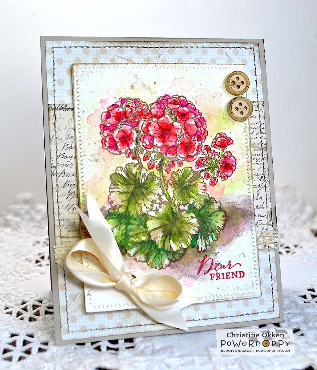
Happy Friday!  I think we’re on our way to the greenhouse today, I don’t need a lot of extras this year as my perennials are really doing well and take up most of the space now, but we need tomatoes and a few things for hanging plants and pots.  We go to a greenhouse just south of the city that has excellent plants and a better price than I can get locally.  I might be on the lookout for some geraniums to plant in my pots.  I am always looking for that bright bit of colour that will tolerate the sun and heat, and geraniums are great for that.  

This lovely geranium is from Power Poppy’s Geranium Take Two (back in stock soon!).  I wanted to give it a really warm and earthy look, so I added some spashy watercolouring with my Inktense pencils and a water brush in a really loose style, allowing for a little spash and splatter here and there. I love how it turned out!  

I’m such a girl for vivid colour, but this time I was smart and really played down the rest of the card with layers of neutrals, so the red of the geraniums really stands out. 


A little sewing, some ink distressing, a little lace and satin ribbon and some wood buttons complete the design.  


I did add a little on the inside with the other pretty trailing geranium from the set and another pop of red.  


I’m adding this to my May Flowers repetoire and the Power & Spark Challenge at Power Poppy.  Have you jumped in yet?     You could win a set of your choice from the store and stamp some new May flowers that won’t need watering, or weeding for that matter!

Here’s the Bloom Brigade gang playing along with inspiration for you today....


Allison Cope
Christine Okken (you are here)

Cindy Lawrence
Katie Sims
Stacy Morgan
Tosha Leyendekker


Friday, May 13, 2016

Dainty Hellebores


When we were in Victoria, BC at the end of March, one of the places we visited was the amazing Butchart Gardens.  It’s well renowned for its beautifully curated and landscaped gardens.  It was the perfect season to see them too as all the spring blooms were flourishing.  Often in the different gardens I’d spy little clusters of Hellebore or Lenten Rose blooming.  They really are a subtle little flower with their heads bent down.  I found some that had a mix of green and purple blooms, so today I thought I’d show you how I tried to recreate that on paper.  


This little digi called Hellebores that Marcy created is so lovely!  I love the little vase of flowers!  Hellebore are quite tiny, so though this looks gravity defying with that little vase, it’s really not, as the blooms are only and inch or two in diameter, and quite dainty.  

I pulled out the Inktense pencils again for the colouring on this one.  One thing I really like about Inktense pencils is that they are in fact ink.  When you add water you can blend them just like regular watercolours, but when they dry they are permanent.  So that makes creating a design like this with quite opposite colours - easy.  Once I had laid down all the green, I let it dry and then came in and added the pinky-purple colours.  I could blend them in without them getting muddy in the green.  That’s one thing I really don’t like when you’re watercolouring - getting muddy colour, so these work perfect when using opposing colours, all you need to do is let the layers dry in-between time.  


Finished off with some stitching, some pretty plaid and blue paper and some twine.  


So have you joined us yet for our May Flowers Challenge?  Just like Buchart Gardens, our Power Poppy store is blossoming, all you need to do is pick one of our floral designs and create, and you could win a Power Poppy set of your choice!  

Here’s the gang playing along today with more inspiration. 

Christine Okken (you are here)
Julie Koerber
Stacy Morgan
Tosha Leyendekker


Friday, May 6, 2016

May Flowers


Hello and happy Friday!  We’re back with a new challenge at Power Poppy this month and Katie is our hostess!  Here’s her challenge.....

If April showers bring May flowers, what kind of blossoms does this month of beauty deliver for you?  To play along with this challenge, simply reach for your favourite Power Poppy stamp floral and make it the centerpiece of your design.  Don’t have a Power Poppy floral?  WHAT?  Run over to the Power Poppy shop and grab yourself a new set or maybe an instant gratification digital stamps set and colour it until your heart’s content.  With the abundance of gorgeous florals drawn by the Power Poppy Peep-in-Chief - Marcella Hawley, you might actually have a tough time picking your favourite!  When you’re done, simply link it up on the Power Poppy blog and you’ll be in the running to win a Power Poppy stamp set of your choice!  

Of course, I’m thrilled with this theme!  It will be a very flowery month over here on my blog!  My favourite!


For today’s card, I pulled out the very beautiful digi Ranunculus.  Such a gorgeous arrangement Marcy drew here, don’t you agree?!  Printed on XPress It Blending card stock, then coloured up with Inktense pencils, finished by washing the colour in with a waterbrush.  As you’ve seen over the last week, I’m on an Inktense roll right now, experimenting with these pencils and all the ways I can colour with them.  It’s been really fun.  I’ll get back to my beloved Copics again soon, but I think that it’s a good way to learn how to use something new by giving it a lot of practise. I’m really loving the transparancy and vibrant colour you can manage by using these pencils and just a wee bit of water.  

Ranunculus are such a neat flower.  I love their tightly curled blossoms and the fact that they can come in such a lovely variety of colours too, including more than one colour in a bloom.  


I kept the layout really simple, stitching the background to match the stitched die and then adding some seam-binding and buttons.  I really should have steamed that seam-binding so it wouldn’t lay so funny, but this is how it worked out today :)  


Here’s the Bloom Brigade in action today!  I hope you can join us on the May Flowers Challenge, it runs all month long and you could win a Power Poppy set of your choice!  


Allison Cope
Christine Okken
Cindy Lawrence
Julie Koerber
Katie Sims
Stacy Morgan


Thursday, May 5, 2016

Mum


Today we have a brand new digi being released at Power Poppy!  It’s called Peony Love and it has a sweet Mother’s Day theme.  


Here in Canada like much of the world that has British ties we say Mum rather than Mom.  I don’t even know that we know we’re doing it, and we might even deny we say it that way, but we totally do :)  I call my mom - mum, always have. My kids call me Mum....ok, they drag it out and call me Moooom if they’re exasperated or something, but typically it’s Mum!  So Marcy was so sweet to create a special sentiment that has both versions of what we call our mothers for this set.  

I created a really simple design showcasing some of the single peony blooms that Marcy added to this set.  They were printed out on XPress It Blending card stock and then coloured with Inktense pencils (see I told you I was using them a lot).  I don’t think there are purple peonies, but my mum loves the colour purple....so that’s what I went with.  


I added them around the sentiment, popping a few of them up to create some dimension, and adding sequins, some purple seam binding and some twine to finish it off.  


Here’s what this beautiful digi looks like, and the alternate MUM spelling will be available as well!  

Pop on by to the Power Poppy Blog and also Cheryl and  Kathy’s blog to see more about this sweet set! 


Friday, April 29, 2016

Created to Create


I’m so excited to show you the new digi Created to Create from Power Poppy!  It just makes me happy!  I completely love how Marcy illustrated it with the beautiful flowers, notebook and the paint palette.   And the sentiment means so much to me!  I so agree with it!  I believe God created me and when I create I feel like I’m honouring Him.  That sense of joy and delight in creating really speaks to me.  

I played with a new medium today!  I bought a small set of Inktense pencils at the art store the other day when I was there with my daughter.  I’ve heard a lot about them and the rich pigment they give, so I thought I’d experiment a little.  Do I ever LOVE them!  Because this is a digi, I printed it out on XPress It Blending cardstock, thinking I would colour with Copics.  But, when I got the Inktense pencils I thought I’d see what would happen.  

Though the paper did warp a little bit, the pencils are so smooth and blend so well that I didn’t have any issues.  You really don’t have to add a whole lot of water to the paper to get a really nice effect, and the depth of the pigment is amazing.  Also, because they are actually INK rather than paint, once it’s dry it’s permanent so you can also add other effects/treatments overtop if you like.  

So...all that to say, I created a simple little frame that can hang above my desk and celebrate why I love to create.  I wanted it to really have that watercolor washy look with lots of vibrant colour.  


I cut the frame a few layers thick and put a backing on to give it some weight, and added some satin ribbon between the layers.  


And here’s what it looks like hung up at my computer at home!  


Here’s the gang playing along today...


Allison Cope
Christine Okken 
(you are here)
Cindy Lawrence
Julie Koerber
Kathy Jones
Katie Sims