Showing posts with label Home. Show all posts

Sunday, December 3, 2023

12 Days of Crafting with TCP - Christmas Placecards


Hello friends! Today I'm back for another day of The Cat’s Pajamas 12 Days of Crafting!  I thought it would be fun and festive to create place cards for our Christmas table.  For us, Christmas Eve after Church is all about our extended family, but Christmas Day is our family of 5, plus significant others if they are around.

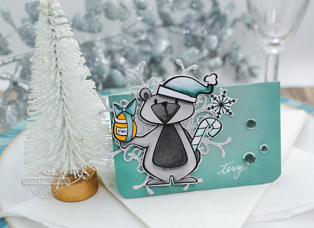
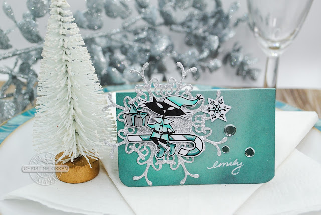
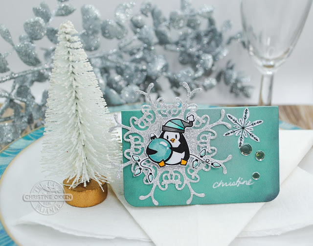
So, I created a set of place cards that will match our dinnerware and the ever cute and retro set Give A Little from the November Release.  


I began by printing the whole digi set on Copic XPress it paper, and colouring the images up with Copics in colours that would coordinate with what we had.  Then I trimmed out each image, die cut some sparkly snowflakes from a retired TCP die, and started to assemble simple folded place cards (2”x 3 1/4”) from cardstock. I ink-blended the edges of the cardstock to get a little more depth of colour.  

I tried to pick the image that matched something about the person, so since my husband is my honey, he gets our favourite bear PJ.  


Next up, for our son who grew up milling through the presents to see how many he had, it’s Poochie the pup.  On each place card I have some mirrored holeless sequins and their name written in white gel pen.  


Now for our other son it’s Poochie surrounded by presents and stuffies.  


Next, for our daughter, it’s Sprinkles the Cat on a candy cane. 


And finally, one for me.  And since I’m the shortest in the family, I get the ornament holding penguin.  

They make a sweet little set ready for Christmas Day!  Hope you’ve enjoyed the tour!  

Wednesday, October 4, 2023

Home for Christmas Cloche with Concord & 9th


Oh the Holiday Charm Release at Concord & 9th just did me in!  So many of the elements make charming cards that evoke the perfect cozy Christmas feeling.  Today I combined two of the new sets, the Christmas Cloche Bundle and the Over the Rooftops Bundle to create a sweet Christmas Cloche scene.  

 
Ok....these pieces are tiny, and it takes a little time to put it all together, but oh how precious does it all look together!?  I picked crisp blues and greens from Concord & 9th and made the house scene including little details like the Christmas trees in the upstairs windows, and the ornaments on the outside tree.  And just check out that retro car!  The background hill uses the die from the Over the Rooftops set


The plaid background uses the Plaid Cardfront Bundle tying all the colours together, and the sentiment (which I also used on my last card), is included in the cloche set.  A dreamy scene for the Season!  


Saturday, December 18, 2021

Sweet and Sugary Christmas from Power Poppy


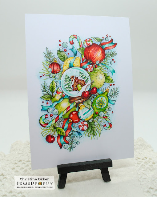
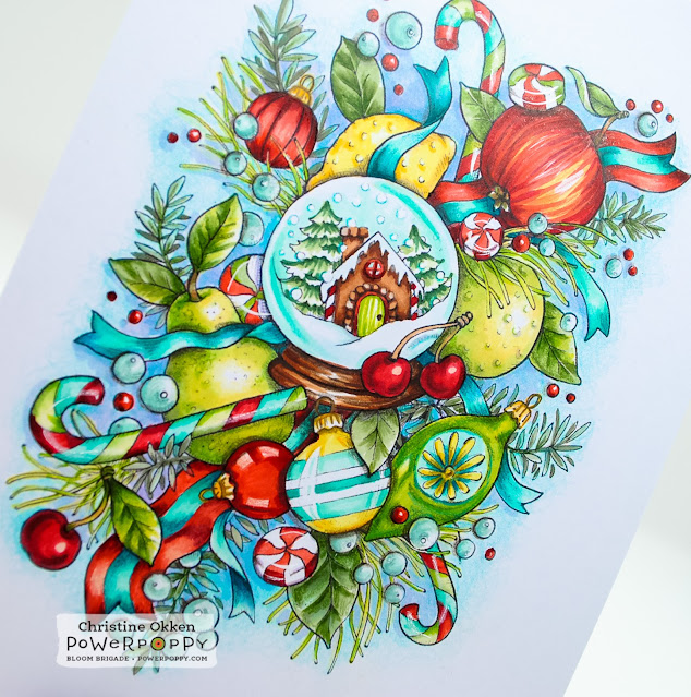
Sending Christmas Greetings to each of you!  Today I’m bringing you something new from Power Poppy!  It’s part of two new images from Marcy, and this one is called Sweet and Sugary Snowglobe and it’s a WOW illustration for sure!   

I’m off work for a couple of weeks, so I spent a few hours cozied up with this amazing image and my Copic Markers and Prismacolour Pencils.  So nice to have a few hours in a row to colour.  This image is really fun because it has so many textures....fruit, leaves, foliage, ribbon, glass, candy....lots to play with!   I printed the digi image to be 5 x 7 inches so I could display it for Christmas, but you could certainly make a card that size too.  


I picked a fun colour palette of red, bright green, and pops of turquoise and yellow.  I’ve added some white accents on the candy to give it cellophane wrapper reflection, but everything else is Copics with Prismacolour pencils for depths.  


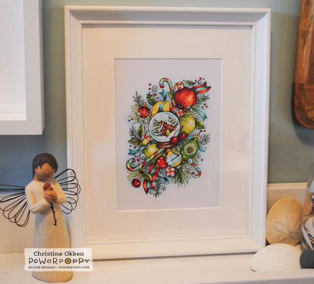
Here’s what it looks like framed and on the picture shelf by our front door!  A great design to celebrate the season!  

I hope you’ll pop on over to see this image and the second one from Marcy called Cozy Candlelit Sips

And pop on over to Stacy’s blog to see her creation with these images!  

Monday, September 28, 2020

TCP September Blog Hop!


Welcome to the September Blog Hop from The Cat’s Pajamas.  I know you’ve had a great week seeing all of the delightful inspiration for this outstanding Autumn release.  I hope you’ve come from Nancy’s Blog.  And if you get lost along the way be sure to pop by the TCP Blog for the whole list.  


Today I’m finishing up this great week with a very woodsy, whimsical design using the new Simply Blessed Stamp Set.  This cute little toadstool house really made me smile, and I knew it would be a perfect fit for some Prismacolor on Kraft.  I made use of the Simply Blessed Bundle and die cut out the mushroom, and placed it on the already coloured tree background, just popping it up.  


The sentiment is a very sweet one for welcoming someone new to the neighbourhood, or a thank you design, or even for Thanksgiving.  


I kept all the details very Clean and Simple. It would be an easy design to mass produce too.  

Now you’ve seen all of the September Release and you just want it ALL!  We’ve got a deal for you!  You can purchase the Kitty Kat Pack which includes all of the stamps and dies at a discount;  OR the Poochie Pack which includes all of the stamp sets at a discount.  

Want to see more?  Pop on over and visit Wendy’s Blog along the hop!  

Thanks so much for sharing all the fun with me this week!  

Sunday, May 17, 2020

Watercolour Giveaway on Instagram!


Hello!  A few weeks ago I changed up my Instagram account to have a profile for all my card creations and original artwork.  This account is public, so anyone can see it and then I can keep my family life and everyday photos on my private account.  

So, to celebrate I thought I’d have a GIVEAWAY on my Instagram Account ChristineCreationsArt.  

I did a little freehand watercolour wreath with Daniel Smith Watercolours, including this beautiful quote I found.  I really resonate with what it says:  “Where I create, there I am true”.  


Some pretty roses and grape hyacinth adorn the wreath.  It’s 6 1/2 x 6 1/2 inches.  It would make a nice little reminder in your creative space.  I want to spread a little sunshine out there

So, to ENTER TO WIN:  
1.  Follow me on my art account on Instagram:  ChristineCreationsArt
2.  Comment on this wreath post in my IG Account.  

You can be from anywhere on this blue planet, and I’ll draw from the followers and names on Instagram on Thursday May 21. 

I’ll only be drawing from Instagram...but don’t worry, I’ll give away something like this on my blog soon!  Thanks for joining me friends!  

Wednesday, March 25, 2020

Wash Your Hands


Hi Friends!  Hope you’re all tucked in and safe in your spaces.  A few days ago I posted my work in progress of this fun image on Instagram, so now that it’s finished and already on display at home, I thought I’d give you a look here as well.  It’s a brand new digital colouring sheet from Power Poppy called Wash Your Hands, and it’s a steal of a deal at $1.99.  I printed it up to be 5 x 7 and then gave it some colour with Copics and Prisamcolour Pencils.  It’s it a fun image?  I love positive messages right now rather than fear-producing ones  None of us need that.  So, it was totally peaceful to spend some time bringing this to life.  I love the colour combination as it seems so cheerful as well.  


Here’s another shot of it flat-lay that gives you a different view, just not showing as much contrast in the image.  In real life all the bubbles have tones of whatever colour is near them.  

So if you’re looking for something inexpensive, and positive to spend some time on...pop on by Power Poppy for this one...and lots more on an amazing sale too!  

Friday, December 27, 2019

The Weight of Heavy Things

Hello friends.  

Putting my heart on the page for you to read as we wind down 2019. 

Earlier this year, one of my favourite local artists, Crystal Drieger posted a picture of this painting she had just done.  The moment I saw it I gasped.  Something about it visually spoke to me in a deep way.    I love her work.  It can be both whimsical and realistic in a way that inspires me.  But this piece in particular felt like it symbolized 2019 for us.  As you can see, it depicts a coming thunderstorm on the prairies with vivid colours, texture, movement, power and peacefulness.  And though I couldn’t buy the original, I asked her right away if she’d be doing prints.  This month I bought a print which will be lovingly displayed in our home.  

Our year has been relentless.   I’ve not said a lot about it, but it feels a bit cathartic to write it down now.   At Christmas a year ago, my husband could not shake a brutally deep cough he had, and developed a fever.  I suspected he had pneumonia, which doctors initially thought as well, but when he continued to worsen, they hospitalized him and we waited weeks to learn he had a much more serious fungal pneumonia that required a heavy duty anti-fungal drug and treatment for at least a year to recover from. He was in the hospital for a month and off of work for 2 more months.  We had excellent care, but I juggled days at the hospital, and home with the kids and work trying to keep everything moving.  We experienced a great deal of love and support from our family, friends and Church that was so encouraging and helpful.  

Fast forward a few months, and the Doctor who is treating my husband's fungal pneumonia, can’t explain why some of his blood results are dipping.  She diligently researches and consults with other Doctors, and eventually lets us know she thinks the cancer my husband was treated for 12 years ago is back.  Tests confirm this.  Hairy Cell Leukemia has returned.  A big blessing is that this cancer is very treatable and it is also likely the reason he contracted the fungal pnemonia in the first place.  It causes a lowered immune system.  So, this fall, my husband had treatment October through the end of November.  Again, we were surround by prayers and support from such amazing people in our lives.  Our faith in Jesus powerfully sustains us in the deepest places.  The demands have been pretty heavy, he needed to be hospitialized again during part of treatment and there was a lot of up and down. He has been on medical leave from work since October and I’ve been juggling all of the extra pieces once again.  

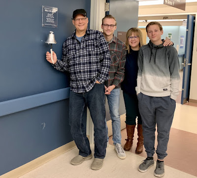
My husband's last day of treatment was also his Birthday.  At our treatment centre they have a tradition that you ring the Bell of Hope to celebrate your last treatment.  Unknown to him,  I had planned for many of our friends to surprise him for the bell ringing to celebrate his recovery.  


As he was just beginning his last treatment we got the phone call that his Dad had just passed away.  We were heartbroken.  He had fought dementia for a number of years, and now he was gone.  Though we rang the bell of hope, we cancelled our celebration party, and gathered our family to head to ND for the funeral, which my husband did, as we are both pastors.  It was a day filled with sadness and joy, tears and celebration all rolled together.  

Just a week after Dad’s funeral, my husband’s mom became ill and within a few weeks her health became grave.  Less than four weeks after Dad passed away, Mom also breathed her last on earth.  There was no way we could have seen this coming.  So, even as I write we will be back in North Dakota with family to say goodbye and celebrate her life.  

That’s a lot.  Maybe you can relate to it too because of storms in your own life.  

Throughout it all, we have felt very carried by God.  We’ve been very supported and loved.  We are learning and growing even in the midst of this, and even as we grieve.  We are even closer as a family, and closer to our friends.  However, I have begun to realize that 2019 has taken a great deal out of all of us.  All of these events have held heavy weight and we need to pay attention to that.  I have not cared for myself well this past year, as I’ve spent most of it caring for my husband and children.  So, I’m going to be taking some time away to pay attention to the weight of what 2019 has been, and how I’m being called to live because of it in the years I’m blessed with ahead.  

I’ve asked for a leave of absence from my design teams and they’ve graciously given that to me (they are such good women - so thank you Marcy and Alma).  My creative spirit has left me, and I want the Lord to restore it, along with many other things in the weeks ahead.  

That lovely painting shows the dark storm coming; but it also shows light and vibrant green in the center of the field, which will be further watered by that approaching storm.  Letting God water me and restore me and bring growth is what I’ll be investing in over the next weeks.  

Look forward to all that this will bring when I catch up with you again.  With love and blessing.  

Christine

Friday, August 10, 2018

Home Inspired


Greetings friends!  We’ve just returned from a few weeks away, and I wanted to pop in before week’s end with a creation for this month’s Power & Spark Challenge, Inspired by Home.  I think it’s a fun idea to look around you at what you already have, what speaks of home to you, and create from that inspiration.  

We’ve spent a lot of time doing different projects around our home this spring and summer that have freshened it up and made it more inspiring and comfortable for us all.  So for this creation I chose to be inspired by our newly painted living room, and a new coffee table my husband made for us.  He did such a beautiful job with it.  


So this is the lovely rustic table made by my husband.  I love the deep stain, the criss cross pattern on the side (you can see a cozy blanket tucked in there).  We have our old and comfy leather couch, some new pillows I sewed, and then the triptych canvases from Ikea of some pretty cherry blossoms.  


In my card I utilized the beautiful Planning for Magnolias stamp set because it has a similar feel to the branches on the canvases.  I also used those same sepia tones with some W00, 02, 03, 05, 07 Copics.  

To mimic the criss-cross on the table and wood planking I used some strips of deep brown designer paper that has a brick or chevron pattern in it.  

Taking my cues from the texture of my pillows, I added the burlap and inked it a little with some Early Espresso ink (SU) and some white craft ink.  Fresh and simple, and a wee bit rustic/beachy which is what our room looks like.  


So, we hope you join us in the Inspired By Home challenge too!  Pick anything from your home to be inspired by, and then be sure to show us a picture of what you’re taking your cues from, and your creation!  You could win a $50 Shopping Spree to the Power Poppy Store!  


Christine Okken
Cindy Lawrence

Stacy Morgan
Tosha Leyendekker

and Marcy at the Power Poppy Blog

Friday, January 19, 2018

Rosé All Day Completed!


Earlier this week I showed you my initial progress on an art piece with Power Poppy’s new set, Rosé All Day.  Well, it’s complete!  I put some more time into it on Wednesday night in front of Season 2 of ER.  Man I loved that show!  Honestly it was a little challenging to decide what to concentrate on - the show or my colouring :)!  

The piece is just over 6 x 6 inches finished sized, and I placed it on my mini easel and for now it will go on our mantle.

It is primarily coloured with Copics, and I finished off some of the shading and line work with prismacolor pencils.  Even though most of the shades are in the RV copic family, I didn’t skimp, and used a whopping 46 markers on this design, so I’m not going to even attempt to take a picture of them.

I wanted each element to have it’s own “feel” and distinct shade of colour so you could differentiate between the elements of the design, but I also wanted it to have an overall cohesive aspect as well.  I tried to accomplish this by bringing some colours from other areas into each other so they would tie together.

For instance, in the roses, I used RV00, RV02, RV04, RC09, but I also added shadows with BV00 and BV02, plus a wee bit of B63 so that it tied into the more purple tones of the cyclamen and coloured pencil crayon (which I did with RV00, RV52, RV66 and B63).  The Redbud and ribbon are done in RV63, RV66, RV69.  Then, because I had some blue tones going on in the flowers, I did my paintbrush in B63, B66, B69.  It adds contrast, but takes on the tones of the shadows in the flowers.  No-line colouring has some challenges because you gradually start to lose your reference lines as you colour.  You can manage this by having another reference piece nearby to refer to, and in colouring you do need to add some definition in with your markers or pencils to your outer areas so you can see the shadows and a bit of the outline when it’s finished.


The leaves were fun to do, particularly those amazing varigated cyclamen leaves, I did them with a combo of G21, G24, G28 with some B10, B11 and B66 for the shadows.  This was one spot I added prismacolor pencil at the end giving the depths some blue-green and the highlights some yellow-green so that they tied into the more yellow green of the stems.  Super fun project to work on. Sometimes you just need a bigger piece to stretch you.  Thanks for enjoying the journey with me!  

Be sure to stop by the Power Poppy Blog to see what Marcy has in store today and also my Bloom Brigade sisters playing along with inspiration.  Don’t forget that our weekly Hues to Use Challenge is going on, as well as our monthly Power & Spark - Grab a Map Challenge.  You could win anything from a guest spot on the blog to a $50 gift certificate to the Power Poppy store!  

Christine Okken (here)
Julie Koerber
Katie Sims
Stacy Morgan

and Marcy at the Power Poppy Blog

Wednesday, December 6, 2017

A Christmas Pom Pom Garland


Hello there! It’s Christine here and I am excited to be joining in on Power Poppy's December Power & Spark Challenge with our Twelve Days of Christmas twist! As visions of sugar plums dance in your heads, is the paper still flying in your crafting spaces? If you love to put a colorful and personal spin on your holiday creations, we love to hear it and we’re here to help! For the next week and a half, get ready for Power Poppy’s festive and fun take on the 12 Days of Christmas – a time to get inspiration to deliver that homespun charm not only to your loved ones but around your home as well. Each day the Power Poppy designers will be sharing ideas on all kinds of projects from home décor to accents for your holiday dinner table to ideas on how to package up those holiday goodies with style!

And guess what? If you play along with us during any one of the 12 days and try our project at hand, link up your creation right here and you’ll be in the running for our Power & Spark 12 Days of Christmas Challenge winnings! You’ll  have 12 ways to enter. Play along once or try all 12 days for more chances to win a....

 $50 shopping spree to the Power Poppy Shop!

Here on DAY SIX, I’ve chosen to create a garland for Christmas to decorate a mantle.  As I was dreaming up some ideas I decided to make my garland a little whimsical and add some homemade  pom poms to the garland as accents, which I’ll also show you how to create on the Power Poppy Blog.  

Here’s a peek at what you’ll find there, using the lovely new Winter Wonderland set.  I’ve taken a couple of pictures of the garland outside, where the light was a little better and then where its hung underneath our mantle on the fireplace where the lighting isn’t as good, but it gives you the idea of how it can be used.  


Here’s a peek at what the letters look like close up.  


I took a Tim Holtz Stencil (Flourish), some embossing paste and glitter and added some pretty sparkly dimension to the letters, giving it some time to dry.  Funny story, in all my years of creating I’ve never spilled too much glitter, but on this project I accidently dumped a whole container of glitter everywhere.  Let’s just say, “sparkle for days’.  

I gave each letter a border of Rich Razzleberry paper to give them a little more stability. 


For the O, after adding the sparkly dimension, I placed the spray of flowers on the left hand side of the letter attaching using foam dots.  


These next photos give you a bit of of better look a the colouring and the dimension in the spray.  


As beautiful as the stamp looks coloured, it’s equally as lovely stamped in a single colour because of how detailed it is.  I also think it helps the garland from becoming too fussy by only adding one coloured up image.  


On the Power Poppy Blog I show you how to create the little pom poms between the letters and how I pulled it all together.


Wishing you great JOY this season!  

Monday, September 26, 2016

Autumn Home


Have the cooler temperatures reached your area if you’re in the Northern Hemisphere?  We’ve had some beautiful days but I can sense that more crisp air is coming.  We have the perfect challenge this week at The Cat’s Pajamas and it’s all about using fall colours.  


I pulled out TCP’s set Home for All Seasons for the pretty house with the front porch (still a dream of mine!) and stamped it in a pretty burgundy shade (Memento Rhubarb Stalk) and then coloured in the house with some E43, E44, E47 markers.  I added the pretty autumn tree from the set, stamping the foliage in Cantaloupe ink and then adding in the other colours for the leaves with dots of Copic markers.  Next I added some of the cute little pumpkins around the tree, a bit of grassy wisps and then framed it out with one of our TCP Dies Stitched Fly, just cutting out the inside parts of the die cut so it makes a frame. 

 Next I stamped the pretty background leaves from the Wreath Building Kit set,  accenting the design with some TCP die cut leaves, and Bitty Banners, and some twine and a veneer heart.  


The background is a nice herringbone design that adds texture but still gives you that cozy fall feel.  


Here’s the inside of the card with the sentiment from TCP’s Besties set.  I thought it fit perfectly!  

Here’s how you can jump in on the Fall Colors Challenge:  

  1. Every other Tuesday a new challenge will be posted on The Cat’s Pajamas blog and our Facebook page.
  2. If you want to play along you just upload your design to The Cat’s Pajamas blog page using the InLinkz button by the Monday, 11:55 EDT before the next challenge.
  3. You are not required to use a Cat’s Pajamas stamp or die but if you have them we would love to see them.
  4. On the following TCP Tuesday, the winner will be chosen from the previous challenge and will receive a Cat Cash Voucher for $10 or $15 if a TCP product is used.  
Now here’s The Cat Pack in action....

SaveSave Brenda Nakandakari
Christine Okken (you are here)
Deborah Anton
Nancy Thomas
Wendy McGaffey
and Alma at the TCP Blog!


Friday, May 29, 2015

The Good Life


I really love birdhouses and today at A Day for Daisies we’re showing off some lovely Bird Watching designs that will tickle your birdie feathers.  They all have a dreamy sort of quality.  

As I was rifling through my papers the other day I found this lovely sheet from a 12 x 12 kit I bought from Echo Park and I just love the pretty floral pattern so that’s how this all came together.  I wanted to fill up the whole sheet with the floral, sewing it down, and then giving the design some of the colours from the sheet with Copics.  


For the sentiment I took a strip from one of the sheets of designer paper in the pack and cut it into flags for hte sentiment and then accented with clear sequins and glittery enamel dots.  


Here’s the Copics I used.  


Here’s the rest of the ADFD Team today....


Christine (you are here)


Thursday, May 21, 2015

Birdhouse Condominiums

We’re back with Day Four of the fabulous sets from The Cat’s Pajamas!  Today’s set is such a sweet combination of stylized birds and birdhouses that will really spark your flights of fancy!  Introducing Take Flight.  


What’s so fabulous about this set....and you’ll see it today if you hop around with The Cat Pack, is there is such a range of possibility.  The stamp set also pairs with two new CutUps dies, dies for the birds and dies for the birdhouses....so you can cut and stamp a million different ways.  


I went a little color/pattern crazy creating a fun “birdhouse condominium”, stacking the birdhouses in a vertical line.  I did a combination of stamping and paper piecing to creat this one....but I’ll tell you a little secret, this card with all it’s little pieces from the dies and intricate details is made EASY with a product in the TCP store, iCraft Adhesive.  It’s seriously awesome.  All I did was cut out the birdhouses with my dies onto paper and the iCraft Adhesive and it made putting together my paper piecing/stamping puzzle really easy.  All those little pieces and insets sit perfectly.  

The red stripes on the top birdhouse and the green dotted/stripes on the bottom birdhouse are stamped and the rest of the pieces are done with the dies.  I thought the owl paper in the background was a fun whimsical play on the birdhouses....gives it a bit of a folksy feel too.  


So cute to welcome someone home!  


Here’s a peek at the dies and the stamp set I used.  A really fun set to play with!  


Now you too can win this set by hopping along to The Cat Pack playing along today and commenting!  Here’s whose playing....


and.....dont forget the party coming on Monday!