Sunday, September 28, 2008

Soft Sweet Silhouettes

Happy Sunday! It's not often I stamp on Sunday's but today's Featured Stamper had me interested. It's TERRORE3's day, and she has a wonderful extensive gallery...and I saw a card that I've had up all day on my computer beckoning me to CASE! It's so pretty. I love her use of the brads and ticket punch and sponging. Her original is this one: http://www.splitcoaststampers.com/gallery/photo/599888?cat=500&ppuser=17031

And I just loved the pink and green combo and the sweet simplicity of the set. I need some cards for my students so I had some time to jump in this evening.


Here I've used the new set Pocket Silhouettes, stamping it in Pink Pirhouette and then using a Stampin' Write marker on the stamp in Chocolate Chip to give me my stems. I sponged the main Vanilla piece with Kiwi Kiss and Close to Cocoa. I changed how the sentiment looked and used the punches with one end cut off of the Designer Label punch for a neat effect. I also though this punch mirrored the ticket corner's and scallops too.


I seriously love this card. I'm going to hopefully do a few more in this theme to make a set.
Recipe: Stamps: Pocket Silhouettes, Fancy Flexible Phrases Papers: Chocolate Chip, Sweet Bella Papers, Very Vanilla Ink: Pink Pirhouette, Close to Cocoa, Kiwi Kiss Accessories: Ticket Corner Punch, 3/4 inch Circle, 1 inch Circle, Scallop Edge Punch, Designer Label Punch, Sponge, Vintage Brads, SW Marker, Dimensionals, Kiwi Kiss Satin Ribbon, Piercer

Friday, September 26, 2008

Paint Palettes Inspiration

I pulled a muscle in my back (oh ouch) and was laying in bed looking at my wall color and my drapes...they really look a lot like Baja Breeze...hmm maybe I like this color more than I thought, maybe that would make a good color pallette someday....So, with a sore back you can never stay in one position too long, and later I looked at the Inspiration Challenge and look at that...it's a paint inspired pallette for rooms. How fun!


Here's the inspiration room I chose.


And I put together a quick card with the new set Eastern Blooms that hadn't seen ink yet.


I stamped the main branch of flowers with Chocolate Chip to mimic the photo on the wall. I added extra flowers in Sahara Sand and Baja Breeze and pierced some of the chocolate chip flowers. I wanted to get the feel of the geometric bedspread so I added the DP in Urban Garden and also stamped the flowers on the Sahara Sand layer in a geometric pattern. Some pretty ribbon, a felt flower and piercing. To give the feel of another layer on the sentiment (from Fresh Cuts), I ran the Sahara oval through the CC ink pad. At night it's so much harder for me to get a good picture so I took one from each side.


Here's a closeup:

Alright...sore back again, time for a new position not sitting at the computer!

Thanks for stopping by!


Recipe: Stamps: Eastern Blooms, Fresh Cuts Ink: Chocolate Chip, Sahara Sand, Baja Breeze Paper: Baja Breeze, Sahara Sand, Whisper White, Chocolate Chip, Urban Garden DSP Accessories: Oval Punches, Felt Flower, Vintage Brads, Piercer, Dimensionals, Scallop Edge Punch, CC Ribbon, Baja Breeze DS Wide Grosgrain

Thursday, September 25, 2008

My New Teams!

A couple of months ago Beate asked me if I would like to be on the Product Review team over at Splitcoast. I happily said an enthusiastic "Yes!". If you receive the "Weekly Inkling" newsletter over at SCS you'll see a link to this months' Product Review of the Scor-it Tool, or you can link to it here: Scor-it Review . As well, the girls on the team created some fabulous projects with the Scor-it and you can view them here: scoritpf . I just don't want you to miss out on some great ideas and creativity. My team members are all stellar girls: my sweet friend and fellow DD alumnus Jodi Collins, Silke Ledlow, Mary Brown, another DD alumnus Jami Sibley, and the wonderful Beate Johns.


Box Template: As well, some of you have asked me for the template for my Advent Mantle Boxes I made on Tuesday's post. I don't have any fancy schmancy software for this, so I just drew it out for you. It really is an easy box. Sorry for the empty top and side lines, those are the edges of the paper, so imagine solid lines there! It's on a 8 1/2 x 11 sheet. Yesterday I mistakenly said the box was 2.75 x 2.75, it's actaully 2.5 inches x 2.5 inches x 2.5 inches. This way it all fits on that regular sheet of cardstock. Solid lines mean CUT, dashed lines mean score. Basically you are cutting out a cross shape and scoring it into sections to make your box.

The bottom of the "cross" there's a piece that says DISCARD, that's the tiny piece you're left with once you cut after the .75 inch section that folds in to attach your box together (use sticky strip). (Don't discard that .75 inch section! You'll need it! :) just discard the tiny piece after that...hope that makes sense - let me know if it doesn't!) If I can figure out how to attach it as a PDF I will later.


The 1/2 inch sections at the edges of the "left and right sides of the cross" are the folded in lid which does not get sticky strip on it, and the folded in section that makes the bottom of the box that does get attached with sticky strip.


I'm a Great Swaps Girl!


In January when the amazing JulieHRR asked me to be on the Dirty Dozen I was overjoyed. It was like the floodgates opened and two other great Swap teams also contacted me about joining their very amazing groups, that are a real honor to be a part of. I knew I couldn't juggle it all, so I had to say - thank you but no. The tough part is that you have to keep being chosen for the Dirty Dozen team a secret for a month before your reveal...so I couldn't even honestly explain why!

So after my DD term was over, I went back to one of those teams and said, remember way back when you asked me to join the swap group? Do you still have room? Well, these sweet girls had saved a spot for me. So, I'm a new Great Swaps Girl. Such fabulous women! Here's a link to the Great Swaps Girls blog too.

Here's a swap I did for the new Catalogue. It's always nerve wracking for me when I do a swap with a group...especially like this one, for the first time, I second guess myself all the time thinking....is this good enough???? So hopefully it was :)


I really think that Bella's Bloom is one of the under appreciated sets of the new catalogue. Not only is it inexpensive but very versatile and classy and it goes really well with Bella Rose paper. But here I paired it with my favourite Urban Garden in rich shades of Kiwi Kiss and Not Quite Navy and White for some crisp contrast.

I inked up the flower in Not Quite Navy SW Marker and Old Olive on the horizontal (the shade is a deeper tone of Kiwi Kiss so it works here). Then I added the sentiment and it just fits inside our new large oval punch. I added a little piercing on the sentiment and then started layering the paper and scallops and ribbon. On some swaps I used White Taffeta ribbon, but ran out about half way through so I used the Kiwi Kiss Satin ribbon just on the green side (because that Vanilla side really would not work here). And I really love the rich look it gives. I did a lot of sponging on each layer that you can never really see unless its in front of you, but it gives the paper edges rich color. I added the simple floral circle in a 1/2 inch circle punch with brads as accent.


Next week I'll show you my Christmas Mini swap once the girls are starting to receive them. And if you're in my stamping clubs you'll get to see all the Great Swaps Girls Swaps in person! What I love about something like this is getting a card in person from another designer that you really respect. Such a cool thing!

Recipe: Stamps: Bella's Bloom Ink: Not Quite Navy, Kiwi Kiss Paper: Not Quite Navy, Kiwi Kiss, Whisper White, Urban Garden DSP Accessories: Large Oval Punch, Scallop Edge Punch, 1/2 inch Circle Punch, Earth Elements Brads, Piercer, Dimensionals, White Taffeta Ribbon, Kiwi Kiss Satin Ribbon, SW Markers, Sponge

Tuesday, September 23, 2008

Toonie Tuesday - Totally Terrific Projects


Two great projects for you today!

Sample One: Advent Boxes for your Mantle


I have a project I've been working on for a few days that I'm really proud of. I have a brand new toy, a Scor It Tool that I've been playing with. It's been so fun, so I've been thinking up all kinds of projects that are possible with the embossing/creasing ability you have with it.

Here is an Advent Decoration I came up with. It was designed for my children for the 12 day's before Christmas. Like and Advent Calendar, in each special little box will be little surprises and I think verses that will remind them of the truth of what Christmas means. They are so excited about using it this Christmas. I think I will hang it on our mantle. It's such a difficult project to photograph because it is so long, but I'll show you numerous shots.

Each box measures 2.75 x 2.75 x 2.75, and each box can fit on a sheet of 8 1/2 x 11 paper. I made my own template and then used the Scor It to make all the creases. Perfectly sharp for a box, and all the attachment pieces. Sticky strip is used to hold it together, and my husband suggested using eyelets to run the fishing line through each box so that it will be long lasting. (smart man).

Here I've used the reverse image of the letters for Joy, just adding the center of the O too.


Sorry this picture is a little blurry I was playing with the size....I'll try and fix it later!
I ran the Scandanavian Wheel with each box's color ink over the bottom and the lid of the boxes and then decorated each of the three sets with Advent words of truth, HOPE, JOY and PEACE (12 letters - get it?). I used old SU chipboard letters, punches and new Ski Slope DSP to decorate and new ribbons to give it some festive but simple embellishment.


To link the boxes I used old clear beads I had bought in bulk from Michaels, 3 between each box and 14 between each word with a Felt Flurries Snowflake threaded over top. The Felt Flurries were my idea from the beginning but I had the hardest time trying to figure out how to have them between the words without them crushing in on each other when the boxes were hung. With all the clear beads in between now, and the snowflake threaded overtop it holds the boxes apart firmly. Here you can also se the H box slightly open.


I seriously LOVE it. Is it Christmas yet? Can I hang it yet???? Any thoughts on some of the surprises I should put into each box? They can't be too heavy....and it needs to work for 3 kids each day - they do know how to share so it can be one thing too. But I want it to be special and symbolic of the celebration of Jesus' Birth.


Project Two: Bella's Vanilla Kiss

Mmmmm, doesn't that sound yummy??? I have a thing for Vanilla. In fact I wear Victoria's Secret Vanilla Lace lotion every day, sorry too much information??


This is for today's color challenge hosted by Cindy today, Very Vanilla, Kiwi Kiss and Baja Breeze. I know Cindy loves this Baja Color. I didn't to start with, but paired with the right colors and it's totally growing on me.

I used my Hat pins in my Pretties Kit for the first time (can you believe it?!) It sure makes it over the top elegant - but you wouldn't be able to mail it in a regular envelope.

Here Bella's Bloom is inked in both Baja and Kiwi (carefully) and stamped on Vanilla, as well as the sentiment. I stamped the main bloom a 2nd time and popped it on top. I cut it out with my Coluzzle, used my Scor It to score some lines around the sentiment (a row over and under the sentiment) and added piercing. Then I punched out several of the large ovals and layered them behind the main image oval as accent.


I also used the Scor It for the embossing along the edges of the card base (isn't that snazzy?) and added Urban Garden DSP inside the embossed area. The pretty hat pin is embellished with the pearls and beads and the gorgeous Kiwi Satin ribbon.

So pretty. Stamping just makes me happy.

Hope your day is filled with Vanilla Kisses too !
Recipes:
Project One: Advent Boxes: Stamps: Scandanavian Wheel Ink: Chocolate Chip, Kiwi Kiss, Riding Hood Red, Baja Breeze Paper: Chocolate Chip, Kiwi Kiss, Riding Hood Red, Baja Breeze, Ski Slope DSP Accessories: Oval Punches, Chipboard Letters, Sanding Block, Scor-it Tool, Alpine Felt Ribbon, Chocolate Chip Grossgrain, Double Stitched Riding Hood Red Grosgrain, Kiwi Kiss Satin Ribbon, Baja Breeze Double Stitched Ribbon, Felt Flurries Snowflakes, Clear Beads, Fishing Line, Silver Eyelets, Mono Multi Adhesive, Sticky Tape
Project Two: Bella's Vanilla Kiss: Stamps: Bella's Bloom Ink: Baja Breeze, Kiwi Kiss Paper: Baja Breeze, Kiwi Kiss, Very Vanilla, Urban Garden DSP Accessories: Colluzzle, Scor-it Tool, Piercer, Dimensionals, Large Oval Punch, Pretties Kit, Kiwi Kiss Satin Ribbon

Saturday, September 20, 2008

Where Did all the Layers Go Dirty Girls?

That sounds like such a funny title when I read it! Each month on the 20th the Dirty Dozen and Dirty Dozen Alumni girls at SCS are invited to participate in a challenge. This month's theme is Where Did All the Layers Go? We were to create a no layer card of any size - but the card base is the only cardstock you can use. Required Element: There has to be some element of masking on your card. Restricted Element: No Pink.


So here is my submission for our challenge today. I find no layer cards to be extremely challenging. I'm just not a Clean and Simple kind of girl....I like the look of CAS, and I so appreciate those designers that can create a stunning look without layers....but I'm not one of them!


But I had an idea pop into my head, and when Jami issues a challenge you just have to play, that's what a challenge is for right? To stretch you!


On this base of Whisper White Cardstock (it really is white...not pink - honest!) I masked an open large rectangle with large Post-It notes. (I cut a rectangle out of the center of the Post-It note and stuck it to the card). I also cut out a Word Window Punch piece of Post-It note and placed that in the lower right as a 2nd mask. Then I took my new Winter Post snowflake and with VersaMark stamped all over the open masked area and over top of the masked Word Window punch area. Then I carefully took off the masks and embossed with Irridescent Ice EP for some really pretty sparkle (but it's really difficult to photograph, especially because it's white on white). Imagine really sparkly and shimmery. And the card isn't bent as it might appear...it's just the shadow of the ribbon behind the card.


This left me with a *window* mask to stamp the sentiment in from Warm Words in Riding Hood Red. I added the gorgeous new Riding Hood Red striped ribbon from the Winter Mini (it has really nice texture and softness), added scoring lines on the opposite set to mimic the striped feel and some piercing to frame it. Here you can see the white and detail a little more closely. Hmm, now that I think about it, I really seem to be on a Red kick lately.


Here's some other RED we've been enjoying this weekend.

This rose is from one of my graduated girls, she wanted to give it to me to encourage me. She is the most thoughtful and rare young woman. And she's getting married to one of our graduated guys in less that a month...our first youth kids to get married. This rose is one of the most perfect ones I've ever seen and it opened so beautifully!

And here are are Strawberries from our backyard. I picked them last night and honestly the kids and I ate the whole bowl within a few minutes! The are SO sweet. They are everbearing so they don't ever get really large....but oh the yummy taste!


Be sure to check out all the other Dirty Girls/Alumni submissions HERE or by searching the Keyword: DCNL908 at SCS. Thanks for stopping by!

Recipe: Stamps: Winter Post Ink: VersaMark, Riding Hood Red Paper: Whisper White Accessories: Riding Hood Red Striped Grosgrain, Piercer, Scoring Blade, Irridescent Ice EP

Friday, September 19, 2008

Inspired Christmas Dishes

I was looking at my lonely Winter Post set....so new....so pretty....so un-inked....so lonely. So I challenged myself tonight that no matter what the Inspiration Challenge would be at SCS I'd used Winter Post. Well, surprise surprise....the Inspiration Piece is not remotely Christmassy...it's a really pretty set of dishes, but the colors were really cool, so I incorporated the colors into this Christmas themed card.

Here's the IC picture. Neat dishes aren't they? I bet there will be some really creative cards from this one.


So here is what I came up with. I love the combination of soft brown, bright greens and the bluey hues, with the gold added. So I pulled out Kiwi Kiss, Close to Cocoa, Baja Breeze DP from the new Winter Mini Christmas Paper and some Kraft.


The Sketch is from Beate's Weekend Sketch Challenge, which I haven't been able to do in FOREVER...and it's a cool sketch too (as always).

Card size is 4.25 x 4.25. I basically pieced it all together based on the sketch deciding how I wanted the colors to look, then added the stamping. That's the nice thing about a set like this...lots of versitility. A little scalloping...some overstamping...and little sponging, some gold brads, some really pretty Kiwi Kiss Satin Ribbon and new Snow Flurries Felt Snowflake. A very different but unique Christmas card.


Stay tuned, I'll be back tomorrow morning with our Dirty Dozen monthly challenge.


Recipe: Stamps: Winter Post Ink: Kiwi Kiss, Close to Cocoa, Baja Breeze Paper: Kiwi Kiss, Close to Cocoa, Kraft, Ski Slope DSP Accessories: Gold Brads, Dimensionals, Kiwi Kiss Satin Ribbon, Snow Flurries Felt Snowflakes (small), Piercer, Sponge

Wednesday, September 17, 2008

Silvery Season

Hmmm....where've I been? It's been awhile....


A million places - much like you I would guess.


- Staining a new fence before the fall rain (which looks SO good now)

- Cleaning some of my flower beds, planting poppies and 60 tulips...can't wait to see you in spring!

- Trying to finish swaps (note to self - do not choose to do a watercolor image for next swap...1/2 hour minimum watercoloring x15 swaps + construction time = too much to do!....but I look forward to showing them to you next week)

- Making some decisions about our fall ministry with our youth groups

- Juggling kids and school and homework and piano lessons and blah blah blah

- Trying to take care of me

- And maybe needing a little break from stamping. Anyone else ever feel that way? It's my greatest creative love...but sometimes you just need to take a step back and breathe. So thanks for your patience.

Well, here's my combination sketch challenge card and color challenge card for today. I really love how it came together...and it actually was a very quick card to make. What I love most about it is that it's very eye catching and has warmth and shimmer all rolled up together with the combination of really warm colors and also the silver embossing.


The sketch called for smaller pieces patched together in essence. So I went for my patterned paper (new Riding Hood Red DP) and old Artichoke Prints. Once cut to the right sizes I added embossed sections on the green with the stamps from the set or the wheel. When I see this set, I think crisp embossing.

Just color on color stamping on the red sections so it isn't too overpowering and the main image is embossed on Whisper White and lightly watercolored with reinkers. New felt snowflakes combined with Filigree brads for a pretty accent. I really love it.

Recipe: Stamps: Scandanavian Season and Wheel; Ink: VersaMark, Riding Hood Red, Always Artichoke; Paper: Riding Hood Red, Basic Gray, Always Artichoke Prints, Riding Hood Red DSP, Whisper White; Accessories: Silver EP, Felt Snowflakes, Filigree Brads, Reinkers, Aqua Painter, Riding Hood Red Grosgrain, Dimensionals, Rectangle Punch, 1/16 punch

Tuesday, September 9, 2008

Toonie Tuesday - To Grandmother's House We Go

Alright Emily's color challenge this week had me a little stumped. Riding Hood Red (love it), Green Galore (hmmmm) and Going Gray....let me go check...I usually have at least a little of every SU color....searching, searching....nothing, not a scrap, not a smidge, not a teeny tiny piece. So, time to get creative. I have Basic Gray - one of my favourite colors to pair with anything and I have vellum....so we had to make it work.

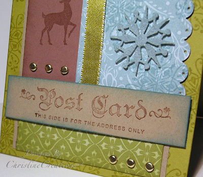
Here is Sample One: To Grandmother's House We Go


Really the title came from the Riding Hood Red name, it's what it always makes me think of. I tried out my new set, Pocket Silhouettes, a really pretty set that just happens to be on sale right now that gives you a sweet botanical feel. I stamped these field flowers in Riding Hood Red and omitted the stems, then added the stems with my SW Marker. (There's the green). I also used that same stamp in Riding Hood Red on the main background for a subtle look.


On the next layer I used a piece of Ginger Blossom DP over stamped it with Canvas to get a deepr Riding Hood Red color and distressed the edges with ink. Layered it on Basic Gray and Vellum.


The main panel Basic Gray layer is stamped with the grass from Inspired by Nature and the Vellum layer is also stamped with the grass in Craft White. Going Gray look - without going gray! Some piercing as accent around the large ovals gives it some pretty detailing and a pretty greeting and some tailored ribbon treatment. Simply done.


Sample Two: Golden Autumn


Here is a card I made months ago in fall colors with some glitzy gold. Maybe a little over the top actually. But I wanted to give the feeling of a fall array of leaves scattered in front of you. It really is a most beautiful part of the season.
Here I stamped With Gratitude several times in several ways with a lot of masking and layering. I used Craft Ink and Clear Embossing powder and also Gold Embossing Powder all on Kraft paper using an out of the box technique. Once I got the look I liked I watercolored some of the leaves with some rich colors and also bleached some of the leaves too. (Cool effect isn't it? I hardly ever do it just because bleach is so smelly and messy...but it always looks cool). Some leaves are also cut out and popped up and the greeting is as well.
The ribbon is dyed with SW markers to get that deep burgundy color and it's layered over Chocolate Grosgrain.


Here is a closeup where you can see more of the ribbon detailing and the gold shimmer. Lost more detail on this one, and more time invested...it's for those really special occasions. Thanks for looking today!

Recipes: Sample One - Grandmother's House: Stamps: Pocket Silhouettes, Inspired by Nature, Canvas Bk Paper: Riding Hood Red, Basic Gray, Vellum, Whisper White, Ginger Blossom DP Ink: Riding Hood Red, Basic Gray, White Craft Accessories: Silver Brads, Large Oval Punch, Word Window Punch, Riding Hood Red Wide Striped Grosgrain, Dimensionals, Piercer

Sample Two - Golden Autumn: Stamps: With Gratitude, Weathered, Sincere Salutations Ink: Bravo Burgundy Craft, VersaMark Paper: Bravo Burgundy, Kraft, Chocolate Chip Accessories: Gold Brads, Taffeta Ribbon, Grosgrain Ribbon, Embossing Powder, Oval Punches, Circle Punches, Bleach

Thursday, September 4, 2008

Death by Forms

Does anyone else feel this way the first week of school? I've signed a gazillion forms for my kids all who started school this week. And cheques! Oh my goodness the money you dole out for 3 kids in school. Whew! But they've all made good adjustments to their classrooms/schools.


No time for stamping recently, but I have a couple of photos you might like to see.


Here is a precious one I really love. It was from our recent vacation. We were trying to get set up for a family photo shoot. That's a test of patience right there. Getting 3 kids to look at the camera, not make goofy faces and try and get them to understand that this is something that matters to their mother.


So this is me and my little guy. They have staggered entry in Kindergarten so he went the other day with a smaller group of kids, but his first real day with the whole class is tomorrow. I love this sweet shot though. My baby is growing up!

And this is our family photo.....let me tell you that we took about 20 shots to even get one that looked half way normal.
I hope to be back later this weekend with some thing creative for you. I'm working on some swaps this week that have to be mailed out by Monday.
Thanks for stopping by!

Tuesday, September 2, 2008

Toonie Tuesday - Monochromatic

Late post today - a big day in our household a daughter starting Junior High, a son starting grade 4 and the little guy starts Kindergarten tomorrow.


Sample One: Bloomin Blues: Emily's challenge to us for the Color Challenge over a Splitcoast today was to create a monochromatic look. All one color. So I've created two, one in blues and one in greens


This lovely blue card is for my daughter. I have a new journal and Teen devotion book for her for when she gets home today and I want her to grow and enjoy these next three years, even when they will mean tough times, or tough adjustments. She's a blessing and I'm so proud of her.


The flowers are watercolored on watercolor paper and cut out. Each layer is sponged and the blossom saying is stamped behind the flowers. The bee is cut out and popped up. Ribbon is colored with a SW Marker. I hardly ever use blues like this but you can never go wrong with a blue monochromatic.


Recipe: Stamps: Bloomin Beautiful Ink: Bashful Blue, Brocade Blue, Ballet Blue Paper: Old SU DP, Bashful Blue, Brocade Blue, Watercolor paper Accessories: Blue Brads, Dimensionals, Sponge, Taffeta Ribbon, Blue Striped Ribbon, SW Markers, Aqua Painter

Sample Two: A Beautiful Life

This sample has a very organic botanical feel to me. I love the look of different greens together. It's totally how our Maker created it. So here is a blend of Mellow Moss, Old Olive and Always Artichoke.

Lots of overstamping here on the DP, and layering of stamps and color on the main image. The dragonflies are stamped popped up and glitter added. I freehand cut around the main circle and added lots of piercing for pretty accent. *beautiful* is handwritten.

Stamps: Enjoy Life Organic Grace Ink: Mellow Moss, Always Artichoke, Old Olive Paper: Always Artichoke, Old Olive DSP, Mellow Moss Accessories: Circle Punches, Piercer, Dimensionals, Glitter, 2 way Glue Pen, Brads, SW Marker

Monday, September 1, 2008

Life Shared with a Friend

Today's Technique Lover's Challenge over at Splitcoast is called Black Magic and uses Prisma color pencils, a blending solution, light colored craft ink, and a dark background paper. By coloring with these pencils and blending solution (Odourless Mineral Spirits) on the dark paper you get a pop of color. It's a new technique for me, but I think it's really pretty.

So these Flourishes coffee mugs are stamped in white craft and then the colors are dipped into the odorless mineral spirits and added to the black being careful not to color over the white stamped areas.

For my sentiment I changed the first word from *Coffee shared with a friend* to *Life shared with a friend*. Life is hand written with a fine point marker and I tried to get it to look like the fonted script on the lower part of the sentiment.

I'm trying to create the right card for my very good friend's 40th birthday. So this is one possibility. She and I met each other at camp in Junior High, became friends, did some things together in junior high and then lost touch. We both grew up and started our careers and began raising a family. 10 years ago we moved back to Canada from the States and started looking for a church. One of our first Sunday's after we had said the church we call home now was really *HOME*, we sat behind this couple; she looked at me and I looked at her...and we realized who the other was. It was so funny. We joined a small group with them as our leaders, each had two of our three kids within months of the other and have shared much of life together. So, turning 40 together (I'm just about 8 weeks behind her in the end of October)...is pretty special. We've walked through a lot of life together in these 10 years in particular. I'm blessed to call her my friend.


I also added a little scalloping on the edge of the red layer of the large oval punched piece to distinguish it from the white and to give it a little pop. Pretty layered ribbons and rhinestone brads for some pizzazz.

Recipe: Stamps: Flourishes - Coffee With Friends, SU Polka dot Background Ink: White Craft, Basic Black Paper: Whisper White, Real Red, Basic Black Accessories: Organdy Ribbon, Wide Grosgrain Ribbon, Black Gingham Ribbon, Scallop Edge Punch, Wide Oval Punch, Ticket Corner Punch, Fire Rhinestone Ribbons, Dimensionals, White Gel Pen, SW Marker, Prismacolor Pencils, Odorless Mineral Spirits.