Showing posts with label Templates. Show all posts

Monday, August 12, 2024

You’re Otterly Fintastic with TCP


How’s your Summer going?  That is, if you’re in the Northern Hemisphere.  Mine has gone far too quick for my taste!  Today I’m bringing you some delightful tastes of Summer and the Sea with August New Releases from The Cat’s Pajamas.  We’ll kick it off with another FINtastic mermaid from the Be a Mermaid set.  I just love the illustration on this set with all its wavy sketchy lines, and the creatures have such personality!  I have two fun designs to show you! 

I printed the digital stamp onto Copic XPress It Blending cardstock, and then coloured the design with Copics, then die cut it out, with the addition of a few starfish from the Doodled Shells set.  


Next, I created a background on watercolour paper using shimmery Lindy’s Magical Powders and a water stencil.  I moved the stencil several times to get the reflection of water on the paper in purply blues and teals to coordinate with my mermaid.  I also added in additional sparkle with a Jelly Roll pen on the mermaid’s hair and on her fish buddy.  


I applied the same treatment to the sentiment and added some iridescent sequins to accent and mimic the bubbles in the design.  

Next is an Otterly adorable Bendy Card design!


This little water scene utilizes a new template from TCP called the  Portrait Bendy Card Template, combined with the cutest little otters!  This set is called Otterly Amazing, and it comes in a line drawn set, as well as a SVG Cutable .  I’m always about the colouring, so I chose the line drawn otters, coloured them up with Copics.  I think they are darling!  


I fussy cut the otters and starfish, and then built the Bendy Card shape after cutting it with my Silhouette machine.  It’s very simple to put together!  I added in some turquoise paper waves with a TCP retired die, and stencilled “waves” with blue and white ink and a retired TCP Stencil.  Finshing off the colouring with some white gel pen bubbles.  These otters are perfect for this style of card because you can create a 3D scene. 


A few holeless sequins give a touch of sparkle, along with the cute sentiment.  Thanks for your visit, here’s a peek at the items I used today from the August Release.  They are TOO cute! 


Wednesday, June 11, 2014

TCP - Card in a Box with Simple Blooms


There are TWO fabulous sets being introduced today from The Cat’s Pajamas.  I think I’ll save the second card I made for the Blog Hop coming up, but I do have a treat with today’s other set Simple Blooms.  It’s a beautiful silhouette style set with classy wildflowers that I think you’ll really love.  


I put together a Card In A Box for this set (SO FUN!) with the Cut File that Alma will have available; proceeds going to Cat Packer Julie Masse’s family Adoption Fund.  I hadn’t really seen a lot of Card in a Box styles and yet now that I have the template, I’m seeing them everywhere (just check out Pinterest).  The template makes it SO easy to put together.  I’m glad I didn’t have to do the measuring, scoring and cutting on my own.  Well worth the investment.  

As soon as I saw this set I had the idea of making a really vibrant wildflower-garden-in-a-box.  I enjoy giving silhouette style stamps multiple layers of colour to give them a different feel.  First, I cut the shapes for the blooms with the Cut file also available for this set and then inked the blooms and stems/leaves with my ink pads separately so I could get multiple colors onto the blooms. After stamping I added extra color and dimension with some thin markers, so it almost looks like a 2 step stamp.  

Then it was just FUN putting together the box.  I have lots of pictures to show you of the different sides of the project.  


Here is the back of the box above....simple stamping of the silhouette image to give you the feel of what it looks like just inked and stamped.  The papers are Echo Parks Summer Bliss, and the inks I used were a mix of Memento (Pear Tart, Bamboo Leaves, Rose Bud. Canteloupe, Tangelo) and SU (Pool Party).  


Here is the view looking down at the box from the top.  You can see that I added butterflies from the new die that will be available (Butterflies) onto little strips of clear card stock, so they really have the appearance of flying.  


Here is another view of the front from the other side showing the label from the set on the front of the box, as well as the larger butterflies I added to the box sides.


And above is the really COOL part.  The whole box folds down and fits in a standard envelope!  How awesome is that?  

Here’s a peek at this beautiful set.  


Here’s the new die I used.  You know what’s so great about it?  The tiny butterfly is embedded inside the medium sized butterfly.  So smart!  

I know you’ll see fabulous things with The Cat Pack today and the two sets we’re showcasing, so be sure to drop by The TCP blog to check them out!  

Tuesday, November 10, 2009

Pretty Packaging - Gift Tags & Holder

I have another fantastic set to show you today illustrated by Lauren Pope.  It's called Christmas Borders and it celebrates the whimsy and design of an old fashioned Christmas with the candies, presents and ornaments. 

Do you ever find yourself getting to the stage of wrapping all the presents only to find you don't have any tags to label them?  I was thinking that a really nice and practical gift for someone would be a set of fancy tags, you could even add the wrapping paper to match as part of the gift.  How practical would that be for a Teacher or Hostess you're visiting during the Christmas Season? 

Well, here is my inspired Gift Tag Holder closed.  You can see all the ribbons from the inside collected together on top. 


and here it is open:  (if you click on the picture it will give you an even larger shot).


I used a Timeless Template from Lauren Meader (Recipe Wrap-up) for the  Tag holder, and then filled each pocket with a couple of tags.  I colored each of the Christmas Borders with Copic Markers.   I added various ribbons on the different tags for variety, satins, ginghams, organdies, twine, grosgrain...all intermixed together. 

I really like this last picture.  Instead of a 6th pocket on the far right, I added an acetate section to the panel and then added smaller gift tags attached with glue dots so they can be lifted off and used.  I used my Nestabilities to cut the tags into pretty shapes. 


And here is a closer picture of the coloring on the front. 


So would you like to see what all the other Design Team girls have designed for you with this set? 

and to win this set today be sure to check out the Flourishes Newsletter!

Recipe:  Stamps:  Flourishes - Christmas Borders, Fancy Labels;  Ink:  Memento Tuxedo Black Ink, Kiwi Kiss, Garden Green, Real Red;  Paper:  Close to Cocoa, Garden Green, Kiwi Kiss, Real Red, Flourishes Classic White Paper, Basic Grey Mistletoe DSP;  Accessories:  Big Shot, Fancy Labels Nestie, Labels 8, Labels 2, Borderabilities, Scallop Edge Punch, Kaiser Rhinestones, Various Ribbons, Glue Dots, Sticky Strip, Brads, Slit Punch

Thursday, September 25, 2008

My New Teams!

A couple of months ago Beate asked me if I would like to be on the Product Review team over at Splitcoast. I happily said an enthusiastic "Yes!". If you receive the "Weekly Inkling" newsletter over at SCS you'll see a link to this months' Product Review of the Scor-it Tool, or you can link to it here: Scor-it Review . As well, the girls on the team created some fabulous projects with the Scor-it and you can view them here: scoritpf . I just don't want you to miss out on some great ideas and creativity. My team members are all stellar girls: my sweet friend and fellow DD alumnus Jodi Collins, Silke Ledlow, Mary Brown, another DD alumnus Jami Sibley, and the wonderful Beate Johns.


Box Template: As well, some of you have asked me for the template for my Advent Mantle Boxes I made on Tuesday's post. I don't have any fancy schmancy software for this, so I just drew it out for you. It really is an easy box. Sorry for the empty top and side lines, those are the edges of the paper, so imagine solid lines there! It's on a 8 1/2 x 11 sheet. Yesterday I mistakenly said the box was 2.75 x 2.75, it's actaully 2.5 inches x 2.5 inches x 2.5 inches. This way it all fits on that regular sheet of cardstock. Solid lines mean CUT, dashed lines mean score. Basically you are cutting out a cross shape and scoring it into sections to make your box.

The bottom of the "cross" there's a piece that says DISCARD, that's the tiny piece you're left with once you cut after the .75 inch section that folds in to attach your box together (use sticky strip). (Don't discard that .75 inch section! You'll need it! :) just discard the tiny piece after that...hope that makes sense - let me know if it doesn't!) If I can figure out how to attach it as a PDF I will later.


The 1/2 inch sections at the edges of the "left and right sides of the cross" are the folded in lid which does not get sticky strip on it, and the folded in section that makes the bottom of the box that does get attached with sticky strip.


I'm a Great Swaps Girl!


In January when the amazing JulieHRR asked me to be on the Dirty Dozen I was overjoyed. It was like the floodgates opened and two other great Swap teams also contacted me about joining their very amazing groups, that are a real honor to be a part of. I knew I couldn't juggle it all, so I had to say - thank you but no. The tough part is that you have to keep being chosen for the Dirty Dozen team a secret for a month before your reveal...so I couldn't even honestly explain why!

So after my DD term was over, I went back to one of those teams and said, remember way back when you asked me to join the swap group? Do you still have room? Well, these sweet girls had saved a spot for me. So, I'm a new Great Swaps Girl. Such fabulous women! Here's a link to the Great Swaps Girls blog too.

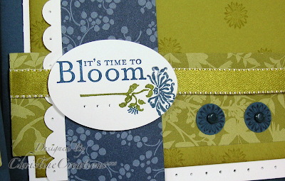
Here's a swap I did for the new Catalogue. It's always nerve wracking for me when I do a swap with a group...especially like this one, for the first time, I second guess myself all the time thinking....is this good enough???? So hopefully it was :)


I really think that Bella's Bloom is one of the under appreciated sets of the new catalogue. Not only is it inexpensive but very versatile and classy and it goes really well with Bella Rose paper. But here I paired it with my favourite Urban Garden in rich shades of Kiwi Kiss and Not Quite Navy and White for some crisp contrast.

I inked up the flower in Not Quite Navy SW Marker and Old Olive on the horizontal (the shade is a deeper tone of Kiwi Kiss so it works here). Then I added the sentiment and it just fits inside our new large oval punch. I added a little piercing on the sentiment and then started layering the paper and scallops and ribbon. On some swaps I used White Taffeta ribbon, but ran out about half way through so I used the Kiwi Kiss Satin ribbon just on the green side (because that Vanilla side really would not work here). And I really love the rich look it gives. I did a lot of sponging on each layer that you can never really see unless its in front of you, but it gives the paper edges rich color. I added the simple floral circle in a 1/2 inch circle punch with brads as accent.

Next week I'll show you my Christmas Mini swap once the girls are starting to receive them. And if you're in my stamping clubs you'll get to see all the Great Swaps Girls Swaps in person! What I love about something like this is getting a card in person from another designer that you really respect. Such a cool thing!

Recipe: Stamps: Bella's Bloom Ink: Not Quite Navy, Kiwi Kiss Paper: Not Quite Navy, Kiwi Kiss, Whisper White, Urban Garden DSP Accessories: Large Oval Punch, Scallop Edge Punch, 1/2 inch Circle Punch, Earth Elements Brads, Piercer, Dimensionals, White Taffeta Ribbon, Kiwi Kiss Satin Ribbon, SW Markers, Sponge