Monday, March 27, 2017

Drywall Dust and Renovations

Hi there friends!

Right now we’re in the middle of a bathroom renovation.  We gutted the basement bathroom to renovate it this week because it’s a week of vacation for us.  So, you can imagine me right now with drywall dust clinging to my eyelashes.  We really hope to have it all finished by the end of this week, but everything takes so much longer than you’d like it to, thus, my creative time is lacking right now!

In the spirit of the “renovation” theme,  I thought I’d show you a collection of cards that have been sitting in my photo files, but I’ve hesitate to show them to you.  They are creations I made where something isn’t quite right about them to me.  I’m hoping that maybe you have those off days too in your card making too.  Maybe these cards also need some renovation!  :)


First up is this pretty flower by Power Poppy from the set, Prairie Cheer.  I love echinacea, or coneflowers!  I love their pretty deep pink blooms, and earthy centers.  I had wanted to use my Prismacolor pencils for a change, so I pulled them out to colour this design.  I like elements of the card....I like the layout, the fun pennants and the buttons, but there’s something funky about it to me.  I think maybe I shouldn’t have coloured up the sentiment (but it’s such a sweet one right?), or maybe it’s the pink and yellow combo that makes me unsure, or how the flower looks perched on the outside edge like that....  


Regardless...reno or not....it’s still a thoughtful card :)  So, I’m sticking with that.  

Next up some MFT for a masculine birthday.  


I’ve loved these cute cows from the MFT set, The Whole Herd, and I knew I wanted to do a grouping of them to work with the cute sentiment from the set.  I masked a number of them together like they’ve come over to say Happy Birthday!    I like elements of this card too, the fun dots in the background to mimic their dairy cows spots, and I like the more neutral palette, and yet something feels off to me about this one too.  I think it’s the addition of the green grass and yellow hay paired with the black and white, and despite my best efforts, my colouring with black Copics always looks too sharp to me, like I haven’t blended well.  


They are so cute though aren’t they?  Below is the inside of the design with a few more cow spots.  


This one used a ton of Copics to colour...


And finally, a really simple design for a sympathy card.  


This card design uses Power Poppy’s set Soothing Sympathy.  I actually really do like this card , but it is very CAS, and sometimes I wonder if it’s “enough” to show you, know what I mean?  I like the embossed layer, the colour palette, and the pretty additions of the vellum.  It’s soothing I think.   

So, now I’ll get back to the reno’s downstairs, and catch up with you soon, I hope! And, hopefully, with no drywall dust in sight!  Thanks for your visit!


Save

Friday, March 24, 2017

Branches of Dogwood


Has Spring sprung in your corner of the world?  We’ve seen glimpses of it here and there, and then it creeps back to more of a wintery mood with chilly winds and bits of rain and snow.  At the warmest part of my flower beds I noticed that tulips are just peeking their tips out, but I think they should stay in the ground a little longer till all the snow melts!  

I have a sweet breath of spring today with this lovely Power Poppy Digital image called Graceful Still Life.  I printed the image quite large but softened the colour so that I could keep the colouring more pale too.  

I love the look of pink dogwood, so that’s how I coloured it up with Copics, then I did some out of the box cutting and tucked the stitched die in underneath so that the blooms could stick up and the die cut the rest of the rectangle below.  


I paired it all with a sentiment from Power Poppy’s new set, Burst of Kindness in Memento Pear Tart Ink, and then some pretty green and pink papers, and a bright green baker’s twine bow.  That way I could play along again with our Power & Spark Challenge to Go Green!  There’s just one week left in the challenge and you could win a Power Poppy set of your choice...with 8 new sets to choose from it’s great incentive!  


Here’s my Bloom Brigade sisterhood playing along today....thanks for popping by!

Save
Allison Cope
Christine Okken
Cindy Lawrence

Julie Koerber
Katie Sims
Stacy Morgan
Tosha Leyendekker


Monday, March 20, 2017

TCP Easter Treats


Well hello again!  I’m back today with more Sneak Peek goodies from our surprise March Release at The Cat’s Pajamas!  All of these pretties will be available in the store!  And if you by them together, you get a lovely discount.   I have 3 cute Easter designs to show you with the new release items today.  


One of our favourite activities each Easter is to get the kids together and dye eggs.  It’s always fun to dip the eggs in the dye and see how they’ll come out, or use some type of resist (like white crayon) to create a design.  When I saw the awesome Easter Bunny egg dies that Alma made for us I decided to try and mimic our own dyeing of eggs at Easter. 


I started with the larger plain egg shape from the die, and cut a few out from watercolor paper.  Then I used some reinkers in yellow/orange, green and turquoise and added some colour to the paper.  I washed in some water first, and then let the reinker bleed where it wanted to from my brush.  This is what they looked like as they were drying.  They’d just be cute on their own hey?  But, why not take them the next level?!  You can add the outer design layer of the eggs by combining the more intricate inside die with the outer die.  It creates this pretty white layer of the design below!  


I layered all the pieces together placing the eggs in our TCP basket, cut from Kraft paper, with a bit of copic colour to give definition.  Next I framed the scene up with our County Fair die cut from green cardstock.  I added some pretty patterned paper to the flags and a strip to anchor the scene, and all that was placed on a white layer that I used some crazy stitching rows on, and a few buttons to match.  


Here’s the inside of the design using a sentiment from the Easter Bunny stamp set.  

Next up, I have a really fun idea just using the inside of the egg die on a layer of white with pretty patterned paper showing underneath. 


It’s so easy to create a really CAS Easter design with this Easter Bunny die!  All you need to do is cut the inner part of the patterned egg die on paper three times.  This leaves you with the inset egg, and you can pick what you want to show through from underneath.    

For fun I added some tiny eggs from the Easter Bunny set and using the tiny egg die from the Eggs in a Basket CutUps.   


I used the pretty ribbons from the Easter Bunny set for the eggs, some very springy plaid paper and then a few enamel dots to finish it off.  

Ok, now for the last little treat, you need to know that I love Easter Chocolate!  It’s hard for me not to sneak the eggs from my kids’ basket!  At Easter when we were kids, we’d get one big solid chocolate bunny and then other chocolate eggs too.  When I saw this great big bunny die from this release I thought about those big chocolate bunnies, bedecked with their little gingham bows, and recreated them in paper.  


This design is super easy!  Just cut two of each of the bunnies, score the ears of the back bunny and adhere them at the top part of their ears.  That way they could be used as a card, or even a place card for Easter dinner.  A wee bit of gingham ribbon and a tiny tag lets you know who they belong to.  Kathy Racoosin did an Easter place card recently with a bit of a similar style so I have to say credit goes to her for sparking my imagination!  


Here’s a peek at the new release items I used today!   


We’re also kicking off our newest TCP Tuesday Challenge....Spring!  It’s your chance to create with us with a Spring theme, and you could win TCP Cat’s Cash to the store!  


Pop on by The Cat’s Pajamas Blog for more inspiration from this release and then check it all out in the store!   Thanks for celebrating our surprise Spring Release with us!  

Sunday, March 19, 2017

An Easter Release at The Cat’s Pajamas!


Welcome to our happy March surprise at The Cat’s Pajamas!  We’ve got some wonderful goodies - made just for Easter, and we couldn’t wait to show them to you!   I’ll have sneak peeks of these new items today and tomorrow, but you can purchase them in store HERE.    

So, let’s jump right in!  


I’ll start off with the very sweet new set called Happy Easter.  It contains a great big adorable bunny with a Happy Easter greeting embedded inside.  I stamped it using my Mini Misti, and some inks from Altenew (Coral Berry).  This way I could stamp my bunny twice to get really good coverage with the ink and polymer, and you get perfect placement.   A Misti is so perfect for this type of image.    After he was stamped I trimmed him out with a wee little border.  

Next I used one of our already released dies from TCP, Eggs in a Basket CutUps, because the little eggs from that set are especially designed for the stamped eggs in this set!  So I have some sweet little eggs for my bunny.  


You can see on the background layer, I stamped some really pretty flowers from the set in soft pinks and greens and created my own patterned paper.   I cut out a little layered tag from card stock, added some green grass with the TCP CutUps die, Grass.   It’s all finished off with some pretty scalloped green ribbon and some pink baker’s twine.  So sweet and springy!                       

Now another design with the same colour palette...


Alma gave us a gorgeous new Spring Wreath, to play with in this release that is so sweet!  It’s really delicate feeling and so classy!  So here I’ve made a little 4 x 4 card.  

I started by die cutting the main wreath and some extra flowers and apples (or cherries depending on how you see them).  Next, I added colour to the wreath by stamping with elements from the set, and then, for some of the items, adding a little definition with some markers.  I layered all the pieces together tucking in extra apples and flowers.  Then its all finished off with some white eyelet ribbon and enamel dots.  

Here’s a peek at the items I introduced today.  Tomorrow I’ll show you a few more new things!  Hope  to see you back here then!  


SaveSave

Tuesday, March 14, 2017

Spring Fling Release Hop!


It’s been a power packed weekend with Power Poppy and we’re thrilled to bring you one more amazing stamp set in our Spring Fling Collection and let you know that all these sets are now available!  Plus....those brand-spankin’ new coordinating dies are available for pre-order too!  

We’ve loved sharing them all with you and I want to say a special thanks for all the kind words and comments.  With recovering from pneumonia, the last 3 weeks I’ve not had much steam!  So, you’ve all been a lovely encouragement to me. 

Alright, we saved the biggest splash for last....here’s Tiger Lily XL!  

This fab set is something new for us... it’s a new SIZE! The "XL" line - is a 5 x 5" stamp canvas, as opposed to 4 x 6" like all of our other sets. This Tiger Lily is a little over 4" wide. It's HUGE! You can totally get in and color this up to create a highly detailed work of art. Two leaves allow you to give this guy a beautiful background. One big sentiment rounds it out.  


I can’t wait to really colour this one up, but for today, I wanted to show how spectacular this set looks  embossed on coloured card stock with a wee bit of watercolouring thrown in for some definition.  So, on some lovely orange card stock, I embossed the flower and leaves in gold several times over the panel and then using my reinkers, added in the touches of orange watercolor in the depths of the flower.  It’s really subtle, but just enough to give you the feeling of shape.  


I made use of some mirrored gold paper to layer the image and add accent to the gorgeous sentiment, also embossed in gold, and ala the amazing Katie Sims, edged with some Krylon 18K gold pen to seperate it from the main card.  Isn’t it a beauty?  And such an easy CAS card to complete.  

And now I have one last little design to showcase the final set that I didn’t have a chance to play with earlier in the week, it’s with our dreamy Burst of Kindness stamp set.  


When I look at this little scene it makes me think of a storybook page.  I stamped parts of this beautiful bouquet onto Copic XPress It Blending card stock, and then coloured it up with Copic markers.  I carefully cut a little frame around the coloured images, adding it to this Pool Party card stock with some popped up dimension.  This made room for me to stamp the sentiment on the main card base.  


There’s a sweet wee little bee in the scene that just had to get in there.  I stamped the bee in Pool Party ink on the card layer, then added the coloured bee popped up overtop.  This way the bee’s little flying lines are visible underneath him.  A few rows of ScorTape and glitter and some sequins complete the card.  


Alright friends, there’s one last round of beautiful inspiration today from the Bloom Brigade and they we invite you into shop!  

Allison Cope
Christine Okken
Cindy Lawrence

Julie Koerber
Kathy Jones
Katie Sims
Stacy Morgan
Tosha Leyendekker


Monday, March 13, 2017

Peony Muse and Artful Display


Day Four of our Spring Fling Releases at Power Poppy!  Hasn’t it been fun?  I think today’s sets just might be my favourite, but when it’s this good how do you choose a favourite right?  But today we bring you Peony Muse and Artful Display.  

I’ll start off with Peony Muse because I’m just a little bit infatuated with it!  

Oh this gorgeous set will be a staple for you if you love big bold flowers!  What I really love about the direction of a lot of the sets Marcy has given us this month is that they are very “buildable”.  Meaning, you can take different parts of the sets and contruct your own arrangements, going different directions every time.  This one is gorgeous!  


I really love the soft look of watercolor paired with white embossing that is very popular right now with a lot of card makers.  I began by drawing out on paper what I thought I might like for an arrangement, stamping it on scrap paper in ink just to see if it would work, and then pulling out my watercolor paper, some Eclipse masking tape, White Craft Ink and embossing powder, and building this gorgeous arrangement.  What’s really cool is that once it’s all stamped, the colouring is actually really easy because you’re only colouring those areas without detail lines.  

It’s also helpful that I had stamped the image in ink on scrap paper first, because with the white embossing on watercolour paper, sometimes you need a bit of a guide to refer to so you know what you’re colouring.  

I used some Letraset Aqua Markers for this one, giving the peonies some soft coral and rosey tones.  


I kept everything very simple here, a little vellum behind the focal layer, the beautiful handlettered (by Marcy) sentiment washed in slightly to mimic the watercolouring and then some clear sequins for a bit of reflective shine.  

Now for something completely different!  Hold onto your hats for Artful Display!  


Marcy has given us something so unique in this set, there is nothing like it that I’ve seen in the stamping community.  It showcases groupings of decorative objects that you can play with to create "room scenes" with dishes, platters, and even a vintage Oyster plate. The Staffordshire Dog figurine and bouquet of Ranunculus can be used with or without the plates.   These little displays are making a big comeback in decorating, and Marcy thought it was perfect timing to finally bring this set to life!  

Marcy gave us the wise advice to go to Pinterest and look up "Decorative Plate Displays” to inspire us, there are so many creative ideas out there!


For this design I’m pairing some of the inspiration I found on Pinterest for plate displays, and my love of Joanna Gaines from Fixer Upper, calling this one “Plates on Shiplap”!  It was SO fun to put together.  

I actually started with the plates, stamping many of them several times in Navy and bright green ink onto regular card stock, then I took my waterbrush to the plates to soften the lines and watercolor the edges a bit.  I cut out each little plate and arranged it on my desk in a way I thought looked fun.  I took a little picture with my phone of the arrangement so I’d have something to refer back to.  I really like the plate displays that have a bit of a clustered off center look to them.  


Next I took strips of white card stock 4 1/4 x 1, to 4 1/4 x 1 1/2 and sponged up the edges a bit with Distress ink in Pumice Stone.  Those are adhered to the card base like shiplap on a wall, and then plate by plate is added to the design.  Much like the plate displays, they’re tucked into each other and some are popped up.  

It was a really easy card to put together once I had the design in my head.  A cute little sentiment finishes it off.  Pretty awesome set don’t you think?  

The gang’s all here and playing along again, you’ll find amazing inspiration again from these talented ladies today!  

Allison Cope
Christine Okken (you are here)
Cindy Lawrence

Julie Koerber
Kathy Jones
Katie Sims
Stacy Morgan
Tosha Leyendekker

and be sure to pop by and see what Marcy has to say about these awesome sets...you don’t want to miss it:  Power Poppy Blog


Sunday, March 12, 2017

Loving Tulips and Sweet Peas


We’re back to reveal two gorgeous floral sets for you from Power Poppy!  Introducing the very beautiful Loving Tulips and Sweet Memories!


Today I have a card from each set to show you.  So first we’ll start with Sweet Memories....You may remember that Marcy illustrated a digital version of sweet peas not too long ago.  It showcases a big cluster of sweet peas all tucked together, but this new polymer set allows you to mix and match individual sweet pea sprouts and wee pea pods together with swirly tendrils, to create something totally unique.  You could do borders or single stems, clusters or an arrangement...it’s full of possibilities.  

Here are my first Sweet Memories ...


I loved putting these trailing blooms together in an interesting way, and then with the addition of those fun pea pods, I think it gives the design something so fun!  I decided to split the focal piece a bit so that it has the feeling of borders to the card.  I cut some of the flowers to have that “out of the box” style of cutting, hanging over the middle.  Then, I popped up the inside layers, in-setting the middle where I located the white embossed sentiment.  There are several really sweet sentiments in the set, including some like this one, that are perfect for Mother’s Day.  


I added a fun embossed element to the lower half of the card.  I thought this embossing pattern looked a lot like the swirls of the sweet peas.  A few enamel dots finish it off.  

I used a lot of different Copics for this one too, so I just listed them here for you.  BV01, BV02, B60, B63, B66, B69, G0000, G00, G02, G05, G07, RV52, RV55, RV66, V12, V15, V17


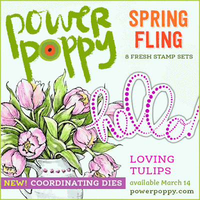
Now, I hope you’re up for a Spring Fling with Loving Tulips!  

One of Marcy’s most popular digital images is called Tulips in Hobnail Pitcher and by popular demand it’s become one of the pieces of this creative polymer set.  It’s paired with some really uniquely styled sentiments and decorative elements that use a polka dot treatment. It also contains a pretty single French tulip which is what I used on my card today.  


I started by stamping the four single french tulips from the set, using Memento Gray Flannel ink and then after colouring them with Copics, I trimmed them out carefully.  I created a framed window in the barnboard patterned paper that perfectly fit the gorgeous splashy hello sentiment.  I love how these polka-dots look embossed in silver!  Then I just tucked in the tulips around the opening.  


I’ve added some silver string, and silver sequins.  The Copics I used are below.  You’ll see that I have a lot of warm grays in there.  I started out thinking I might just colour the leaves and stems in grays for a more neutral palette, but I just didn’t like how it turned out, so I added the greens overtop and it feels much fresher, but the gray undertones really give them nice contrast, and warms them up to match that barnboard paper.   


So how about some more gorgeous flowery inspiration from the rest of the Bloom Brigade!

Allison Cope
Christine Okken (you are here
)
Cindy Lawrence
Julie Koerber
Kathy Jones
Katie Sims
Stacy Morgan
Tosha Leyendekker


Catch you again tomorrow with two more amazing sets!  Thanks for popping by!


Saturday, March 11, 2017

Succulent Singles


Hello Power Poppy fans!  We’re back with our second day of Spring Fling releases, and today we’re going to show you two beautiful sets, Burst of Kindness and Succulent Singles.  I’ve got a sweet little design using Succulent Singles.  This stamp set is perfect for creating fabulous little mix and match groupings. The size and scale lends itself to layering and punchy visuals!  Plus with it you’ll find  a few fun sentiments.  It’s such a fun, whimsical and dreamy set!  


I love the shades of blues and greens and purples that some succulents come in.  So that cool palette is what inspired this card design.  When I started card making, I often watercoloured, so for this card I went back to my roots and did some loose watercolouring.  I started with the largest of the succulents and my Mini Misti, along with watercolor paper, some Eclipse masking tape, water based ink (mostly Stampin’ Up inks), and then put it all together piece by piece. Each time I’d stamp a succulent, I’d take my waterbrush and wash in some of the ink from the stamp and soften the lines.  I also added a little ink from reinkers to bring some more colour to some of the succulents too.  Then I’d do some masking and layer another little succulent in there.  So, little by little the scene was formed.  

Once the entire image was stamped, I used some of my dies, stitched ones and scalloped frames to cut into the watercolour paper to give the card some dimension.  


Here you can see I popped up the inner scalloped layer to give some dimension, and then at the end, stamped a second large succulent image, watercolored it, trimmed it out and popped it up.  With it being a very simple design, those little touches of dimension help give it some interest.  

I added a pretty sentiment, embossing it onto some Baja Breeze card stock with a couple of enamel dots to finish it off.  

Here’s the Bloom Brigade in action with these two awesome sets today....

Allison Cope
Christine Okken (
you are here)
Cindy Lawrence

Julie Koerber
Kathy Jones
Katie Sims
Stacy Morgan
Tosha Leyendekker


Friday, March 10, 2017

Garden Gate with Natural Beauties


We’re so delighted to welcome you to the Spring Fling at Power Poppy!  The next five days the Bloom Brigade is going to wow you with 8 new release sets in polymer that we think are really going to knock your socks off!  Marcella has really stretched her already amazing talent into bringing you brand new stamp designs that are so beautiful, and very unique.  

Today we bring you Natural Beauties!

I always think its fun for you to hear what Marcy says about the set, so here’s how she introduced it to us:  

"I envisioned this one as two spring borders, one a more traditional garden border (featuring Primroses (this particular species is known as Cowslips; then Daffodils, more Cowslips, and Tulips), and then another more of a woodland spring border. Well, I couldn't fit both of them on the same stamp canvas! So we have the bulb border is set up as a strip, and then the other one has been chopped into three images, but if you piece them together, they actually fit all nestled in next to one another. (Order is: Lily of the valley, then Starflower, then the Trillium with mushrooms!). Of course, you can use these however you'd like!! Use the images separately or together. Fun for little notes just to say hello! Featuring several of my favorite spring flowers.

Now doesn’t that sound lovely?  


When I saw all the pretty stamps together I thought how much it looked like a little spring garden, and then I got thinking about how cute it would look with a little white picket fence....and then the idea of a little garden gate came to me, so that’s what I was trying to create with this design.  Come on throught the sweet little gate into my little spring garden!  

I stamped the larger single strip of the daffodils, primroses and tulips onto Copic XPress it Blending Cardstock, cut it into a card sized panel with a stitched die, and then coloured it all up with a soft blue sky with Copics.  Then I also stamped two of the smaller parts of the set separately, coloured them up and trimmed them out with a wee border.  


I found a cute little picket fence file for my Silhouette Cameo and cut the little fences out with the machine.    Next, I took a 4 1/4 x 11 inch piece of blue cardstock scored it at 2 3/4 from each long end to form a gate fold.  I placed my picket fences on the right and left front of the cardstock, adding my little flowers overtop and then carefully trimmed out around the image and fence on each side.  So above is the left side, and below is the right side pictured.  

Now what’s really cool is that VERY soon you won’t even have to make little cut outs around your images for a number of these sets because......<SURPRISE ALERT HERE!>  This month, Marcy is introducing some of our brand new sets with dies!!!

These will be our die offerings this release:  
Natural Beauties
Succulent Singles
Loving Tulips
Peony Muse

So, die sets will be available for pre-order when we have our Power Poppy Hop on Release Day March 14. So, stay tuned for news on special pricing if you buy the stamp set and the coordinating die as a bundle!   It’s SO EXCITING!


I also added some picket fence inside the card as you can see in these pictures above and below.  


I think it’s really sweet how it almost invites you in :)  


And here’s a bit of a closer look at the inside of the spring garden.  A sweet little friendship sentiment finishes it off.  I used a LOT of Copics for this one, too many to take a good picture, so I’ll list them for you.  

Sky:  B0000, B000, B32
Ground:  E43, E44, E47, E49
Daffodils:  Y11, Y21, Y23, Y35, YR23, YR15, YR18
Primroses:  B60, B63, B66
Tulips:  BV02, B04, BV08
Greenery:  YG21, YG23, YG25, G20, G21, G24, G28, YG61, YG63, YG67

And there you have it!  You’ll want to take a look at what the rest of the Bloom Brigade has to show off for you today with this set.  It will totally get you in ready mode for spring!  


Allison Cope
Christine Okken
 (you are here)
Cindy Lawrence
Julie Koerber
Kathy Jones
Katie Sims
Stacy Morgan
Tosha Leyendekker


Back with you tomorrow for a sneak peek at TWO more fabulous new sets!