Monday, May 31, 2010

Christmas in June

Can you believe it's June??  Just six months till December, and we're almost half way till Christmas.  You may remember last month that Stacy Morgan has begun a new challenge at Flourishes.  Each month on the 1st she issues a challenge helping us get our Christmas projects done a little at a time before crunch time in December :)  .  The challenge lasts the whole month long and a winner is chosen each month.  Winners are able to select a Flourishes Christmas set of your choice!  Fantastic all the way around! 

So this month's challenge is an Inspiration Challenge and we have a beautiful room to show you all decked out for Christmas.  Beautiful isn't it?  


And here's something simple I created:


I used Jen Del Muro's SFYTT, because I thought all the different panels and pieces could be used as different inspiration from the room.   Parts I picked out are the colors of red and cream, the poinsettias, the toile types of patterns on the pillows and rug and the striping in the tea set and blanket on the ottoman.    I've used three Flourishes sets, Fanciful Flourishes for the damasks, Poinsettia and Boxwood, and Holiday Greetings, and I used Barn Door from Ranger for my ink.  I also added some touches of sparkle with some Tattered Angels Glimmer Mist in Pearl.  Below you can see the shimmer it gives. 


So, use this great room as inspiration for one of your creations, and you can upload to SCS with the code FLLCNOEL2, and you can link at the Flourishes Forum on Splitcoaststampers HERE. 

Recipe:  Stamps:  Flourishes - Fanciful Flourishes, Holiday Greetings, Poinsettia and Boxwood;  Paper:  Riding Hood Red, Confetti Cream, Riding Hood Red Patterns DSP;  Ink:  Ranger Distress - Barn Door;  Accessories:  Big Shot, Octagonal Nestabilities, Martha Stewart Rings Punch, Silk Ribbon (Cream), Poinsettia Embossing Folder, Word Window Punch, BG Pearls, Sticky Strip, Glimmer Mist, Dimensionals, Waterbrush

Sunday, May 30, 2010

The Creative Process - Coloring Three Ways

Wow, what a busy weekend we had, with the wedding, our son's birthday, responsibilities for my husband and I at Church on Sunday and a meeting Sunday night.  It didn't leave much time for creating :)  But, it was a beautiful wedding, it really was such a privelage to be a part of, oh our girl looked absolutely RADIANT too, they were such a happy couple.   I have no pictures for you though!  Since we're up on stage DOING the wedding, I can't really take pictures LOL!     Anyway...we're all a little tired today from all the activities and excitement.   

So....today for The Creative Process I have a project that I worked on a while ago, but it will be new to you.  I enjoy creating sets of cards that give the example of three different styles of coloring.  My three favourites mediums:   watercolor, prismacolor pencils and copic markers. 

Here is the set of three cards.  I used Flourishes Thank You set, one of my all-time favourite, all purpose sets, the papers are Basic Grey June Bug DSP


The first card showcases Prismacolor Pencils for coloring. 


I also added some sponging inside the Nestability template to tie in the colors to the papers. I kept the accents on all the cards simple and tried to keep some of the detailing similar to tie all the cards together.  With prismacolors I add my different shades and blend with a blending stump and sometimes also use Odorless Mineral Spirits to help the colors "slide" together better. 


The next card showcases Copic Markers, and is a 5 1/2 x 5 1/2 inch square card.  You can see the more vivid, deeper color that copics give to an image.  I believe I used the Fuschia Copic Collection from Flourishes for the reds in this image.   I also sponged the image to keep that consistent focal image look. 


I love the contrast between dark and light in the image.  To create the highlight I used a blender pen in the red petals to pick up color and give more of a light-colored highlight after I'd colored the whole image. 


And the last card uses Watercolor as it's medium.  I think the colors turned out great in this one.  And I love the rounded and square corners that alternate with the rounded edges in each of the focal images.  Sponging always turns out so great on watercolor paper too.   It soaks up the ink just right with such even distribution. 


The patterns on the paper are so fun together too. 


To me what brings life to coloring images is the contrast between shade and dark and light.  A flatly colored image just doesn't jump out at you and carry the realism of a true to life image.  So, in each of the mediums I've worked hard to give that illusion of depth and highlight in the coloring.  With each medium it means different techniques.  In future Monday's I'll focus on each technique specifically to give you some tips that have worked for me. 

Have a great Monday everyone!  Hope to see you tomorrow!

Recipe:  Stamps: Flourishes Thank You;  Ink:  Memento Tuxedo Black, Stazon, White Craft, Night of Navy;  Paper:  Prism Papers (Red), Night of Navy, Basic Grey - June Bug DSP, Flourishes Classic White, Flourishes European Watercolor Paper;  Accessories:  Big Shot, Dotted Embossing Folder, Labels 11, 12 and 13 Nestabilities, Scalloped Ege Punch, Corner Rounder, Navy Sheer Ribbon, Red Rhinestones, Dimensionals, Copic Markers, Prismacolor Pencils, Reinkers, Stampin' Write Markers, Waterbrush, Sponge

Saturday, May 29, 2010

Some Stars and Stripes


Happy Memorial Day Weekend to my American Friends!  Hope you have some good plans for the days ahead.  Today is our middle son's eleventh Birthday!  We're so proud of him, he's such a gifted, warm and loving kid!  But we won't be celebrating till later this week because we're performing a wedding for one of our graduates today.  It's such a special day, she's just so precious to us, and we've come to really love and appreciate her soon-to-be husband too.  It's really quite amazing to be a part of some of these life changing events in the lives of our "kids"....

So...now onto what I have for you today.  Since it's Memorial Day weekend for many of you our ODBD Shining the Light Challenge for this week is to create something with Stars and/or Stripes in it, and I have a little of both!


I took this tool-filled tool box from the set Happy Father's Day and colored it up richly with Copic Markers...a ton of them, and I didn't even photograph which ones!  Sorry!  I wanted it to have the wood-grain look throughout so you see many variations of stripes of color in the tool box and wood (table?) below.  I added stripes in my woodgrain embossing with the Texturz plate and also in this fun paper from Basic Grey which is new and called Max and Whiskers.   I used this past weeks' SFYTT from Jen Del Muro for my layout, and got my STARS in with the star studded brads within the circles.  Aren't they perfect for the "hardware" theme?


A sentiment banner, some distressing and some frayed twill and it's all done!  

So, add some stamping time into this weekend or week ahead and join us in the Stars and Stripes theme!  You could win ODBD Gift Certificates or be eligible for the Shining the Light Award for using ODBD stamps.  Its great fun all around!  Link up to ODBDSLC15 at the ODBD Blog

Now head on over to see the other fabulous Stars and Stripes creations:  America, Chris, Francie, Natalie, Patter, and Sabrina

Recipe:  Stamps:  Happy Father's Day;  Ink:  Memento Tuxedo Black;  Paper;  Chocolate Chip, More Mustard, Soft Suede, Dusty Durango, Flourishes Classic White, Basic Grey Max and Whiskers DSP;   Accessories:  Big Shot, Woodgrain Texturz Plate, Twill Ribbon, Star Studded Brads, 3/4 Circle Punch, Dimensionals, Copic Markers. 

Thursday, May 27, 2010

Oh...Let's Go Here!

A little taste of summer for you today on Flourishes Friday.  Danielle has a Friday Focus on all things summery over at the Flourishes Blog, and since I'm feeling a longing for summer and all things WARM I thought I'd create a dreamy summer scene today.

Doesn't this look like a place you'd like to spend a lazy summer day?   The set is called Beach Life from Flourishes and I stamped it with Memento Tuxedo Black on Flourishes Classic White cardstock, especially designed for copic markers.


I used several different types of marker strokes to create different parts of the coloring with my Copics on this one.  Some side to side streaky color on the sky, and some pointillism on the sand and grass.  I love the really rich and deep colors.  I matched the print from the SEI paper (Jocelyn) to the Morrocan Screen CB folder and then added some beautiful Basic Grey square shaped gems from Flourishes, aren't they just delish?  And they go perfectly too and capture that decadent vacation feel.  I can almost feel the wind and spray from the ocean!


Here's a pic of the markers I used, because there were so many, if you have trouble reading the numbers, just click on the picture and you can see them larger. 


Want to see some more beautiful Flourishes inspiration today? 

Check out these fabulous girls:  Cindy, Danielle, Dawn, Julie, Laura, and  Leslie
Recipe:  Stamps - Flourishes - Beach Life;  Ink:  Memento Tuxedo Black;  Paper;  Intense Teal (Prism), Tempting Turquoise, Green Galore, Flourishes - Classic White, SEI Jocelyn Designer Paper;  Accessories:  Big Shot, Labels Eleven Nestabilities, Labels Ten Nestabilities, Oval Punch, Dotted Scalloped Border Punch, Basic Grey Square Rhinestones, Polka-Dotted Sheer Ribbon, Copic Markers, Moroccan Screen CB Folder, Dimensionals

Monday, May 24, 2010

The Red Lighthouse

Tonight when I saw the Challenge Colors for the SCS Color Challenge I remembered that I made an extra card for the most recent release at Flourishes that I absolutely LOVE, but I hadn't posted yet.  And Mr. OKKEN, HUSBAND OF MINE....don't read any further as this will be your Father's Day card and I don't want you to spoil the surprise....ok....just to make sure I'll leave a little space :)


Betty's colors are Real Red, Bermuda Bay and Kraft, and here's what I created.


I watercolored this gorgeous lighthouse scene from A Guiding Light with reinkers and markers and cut out with the Long Deckled Nestabilities.  The paper was actually my total inspiration.  It's from Webster's Pages - the Triple Pack Collection , isn't it perfect? 

I kept the details simple, a little piercing, a little punch edgework, and some frayed ribbon along with the criss-cross along the brads detailing, tied with some linen thread.   


Just YUMMY I think!    Thanks for stopping by again today! 

Sunday, May 23, 2010

The Creative Process - Wet Watercolor Bleed

Hi Friends!  I'm back for another round of The Creative Process - my Monday opportunity to share with you aspects of how my creativity comes out.  Today I thought I'd try something new with you, so we're learning together  :)  !

Normally when I watercolor (which I'll show to you another Monday) I use a pretty dry/damp brush and move my color gradually.  Some people use a much more wet brush and allow the color to bleed.  I've never had a lot of success with this technique, but I thought today I'd exaggerate the style into a bit of a technique, so I'll call it Wet Watercolor Bleed.

I began with an embossed image, this time the gorgeous Cherry Blossoms from Flourishes that I love so much!   I knew I wanted an Asian style design so I chose a light pink and deep pink color of reinkers. 


Once you have your image ready, you want to spritz it heavily with water.  I used my new and AWESOME Mini Misters made by Ranger from Flourishes, looks like they are out of stock right now but I'm sure they'll be back again.  I was SO excited when I saw them!  They are just perfect for crafting.  You can also see in the picture below that I have my dots of reinkers ready for coloring in the lid. 


I begin by taking the lighter color (Pretty in Pink) and picking up some of the color with my waterbrush.  And adding it to my wet paper, the color will puddle and move around a bit, and bleed over the edges.  This is good :)


Then I take my darker pink (Melon Mambo) and pick up some color with my waterbrush and add it into the centers and tiny blossoms of the flowers.  Where you would find the deepest concentration of color.


I wasn't getting enough bleed so I spritzed the image again to make the water-spread even more exaggerated. 


The longer you let the color sit, the more it will *stain* into the paper.  I didn't want the color to sit too long so then I took a small square of folded paper towel and set it over-top of the image and allowed it to soak up some excess color and moisture. 


I still wanted more bleed and for my color to extend beyond the image so I spritzed it again and then used my wet waterbrush to spread around some of the color.  It takes on a lovely impressionistic look.


At this point you can dab it off again with a paper towel or add more color, or even different colors.  I would suggest staying with complimentary colors because if contrasting colors bleed into each other you'll just get mud color which is not what you want. 

You could create a gorgeous background like this as well.  The color can have a mind of it's own as you spread it out too.  Let your image dry before creating your card. 

Here's the finished card.  As I said I wanted to create an Asian Style, which I knew this image would work for.  I added some extra texture to the already textured paper, by adding the strips embossed with the Herringbone Cuttlebug folder.  I've added some silk ribbon and gold brads to accent the embossing. 


Here's a closeup....


So a bit of an experiment but I like the effect...it's soft and yet it has a real pop to the design, and really lends itself to an Asian feel. 

Thanks for stopping by and I hope you try something out like this too!

Recipe:  Stamps:  Flourishes - Cherry Blossoms;  Ink:  VersaMark;  Paper:  Melon Mambo Textured, Soft Suede Textured, Pretty in Pink, Floruishes European Watercolor paper;  Accessories:  Big Shot, Herringbone Cuttlebug Folder, Ranger Gold Embossing Powder, Heat Tool, Reinkers, Ranger Mini Misters, Waterbrush, Paper towel, Large Oval Punch, Dimensionals, Silk Ribbon (Rose from Flourishes), Glue Dots,  Bow Easy, Gold Brads.

Saturday, May 22, 2010

Strong and Courageous

Well, I hope your weekend is off to a good start.  Our daughter had Friday off so we did a little girl-time shopping together, and now we have Monday off (Victoria Day here) and the boys have Tuesday off too, so it's long weekend time for us.  We've had 3 days of beautiful rain too, that's been so needed, it will be so wonderfully green when the sun comes out, and all the annuals I planted and the perennials will love it too! 

Today the Our Daily Bread Challenge Team has a new challenge for you.  This one is all about the sentiment.  The challenge is to make the sentiment the focus of your card - and that's so easy with ODBD stamps and the beautiful verses and sentiments.  I used the Scripture Collection 3 and the Vine Borders for my focal image on Basic Grey Green at Heart paper, with gold embossing.  Such a powerful and encouraging verse too isn't it?   I have some wonderful *eye-candy* inspiration for you too, from Amy Atlas Events website for today's IC challenge over at SCS too.  Link is page 49 a Moroccan table spread of yummy goodies. 


I also did some rolled ribbon flowers to accent with some die cut branches.  At this angle below you can see the verse better. 


So, come on and join us!  Use a verse or sentiment as your focal point on your creation.  Keyword for online galleries is ODBDSLC14, and link to the ODBD Blog post

Visit the other girls to see their sentiment creations too:  America, Chris, Francie, NataliePatter and Sabrina.

Recipe:  Stamps:  ODBD - Scripture Collection 3, Vine Borders;  Ink:  VersaMark;  Paper:  Rich Razzleberry Textured, Old Olive, Always Artichoke, Basic Grey - Green at Heart;  Accessories:  Gold Embossing Powder, Razzleberry Ribbon, 1 inch punch, Sizzlet Leaves die, scalloped corner and edge punch, dimensionals, 1/2 pearls. 

Thursday, May 20, 2010

Listen With Your Heart

Last week we Flourishes DT girls were chatting about how beautiful the Beauty Within set is that was just released last week.  And Laura challenged us to show you again how beautiful it is and to also show you that though it is designed for use with Spellbinders Labels, you don't have to have the labels to still use it to its full potential.  We thought we'd give it a little extra love today. 

There are some beautiful smaller flowers in the set that still have that stained glass feel, but are stand alone images.  I combined them for this card today.

I took the roses and the iris smaller images and embossed them on watercolor paper and then watercolored each of them.  I cut them out and set aside.

I added Basic Grey Kioshi designer paper to the Celery cardstock, and then used the Deckled Ovals Nesties to cut out a window in the center.  I added a layer of white with a wider window cut out in the center and then put the pretty flowers to frame the oval.  I kept the layers really minimal to focus on the flowers not the layers. 

Here's a closeup of the irises.


And here of the roses.


Inside the card I added another white oval stamped with the large roses image in Regal Rose, with the sentiment attached.  I twisted and wove the ribbons throughout the card and added some pretty pearls as accent.

Here's a link to the Flourishes Gallery of Gorgeousness on the FLLC Blog with this set Beauty Within.

Now check out my DT sisters for their creative ways of using Beauty Within.  Remember the Discount on the NEW RELEASE Bundle on this month's release ends TODAY!  Don't miss out!


Recipe:  Stamps:  Beauty Within;  Ink:  VersaMark, Regal Rose;  Paper:  Certainly Celery, Basic Grey Kioshi, Whisper White, Flourishes European Watercolor Paper, 1/2 pearls, Big Shot, Deckled Ovals Nestabilities, Ranger Gold Embossing Powder, Sheer Ribbon, Dimensionals, Stampin' Write Markers, Waterbrush. 

Who's Got the Button?

We've got a fun new challenge as Dirty Girls and Alumni today.  Each month we issue each other a challenge as a fun little mini-reunion.  This month Bev has challenged us to pull out our buttons and use them on our creation.  Restriction - no black!    So I have a little lace and buttons for and the challenge today. 

I used the pretty set from Flourishes called Lace Edges, all stamped in Baja Breeze ink and sponged with baja ink too.  A little pretty satin ribbon underneath and crochet lace overtop, with corduroy buttons and linen thread and it's a pretty and yet simple card.  You could do a whole set of this type of card easily in different colors too. 


Quick post today, I'll be back again tomorrow for some more!

Recipe:  Stamps:  Flourishes - Lace Edges, Tag Lines;  Ink:  Baja Breeze;  Paper:  Very Vanilla, Confetti Cream, Baja Breeze;  Accessories:  Corner Rounder, Baja Satin Ribbon, Crochet Ribbon, Baja Corduroy Buttons, Linen Thread, Glue Dots, Oval Punch, Sponge, Pinked Hearts Border Punch

Monday, May 17, 2010

The Creative Process - From Chaos to Card

Recently I gave away some fun blog candy and I asked you the readers for input on some things you'd like to see in the year ahead.  I really enjoyed reading your answers and it perked up something I've been thinking about for the last six months....many of you asked about my Creative Process, what it looks like for me to do certain techniques, or how I get from the idea stage to the completed card.  So, I've decided to start a series on that, and I'm calling it The Creative Process.  So, look for this special feature on Mondays.  I won't say it will be every Monday, cause life is just life and I want it to also be fun for me - and you!   So we'll just call it a regular feature, sound ok to you?  I'll look at lots of different topics related to creativity, or design principles I've learned along the way. 

And I'll add my disclaimer up front.  I'm not an expert by any means.  This is about what my creative process looks like, and that might look different from you, and I'm still a learner too....so I hope we can learn together. 

Today I thought we'd start by how I most often make a card, which is one of the most asked questions.  How do you go from Chaos to Card? 


How I most often start a card is with a stamped and colored image.  This one from Just-Rite (Autumn Blessings and Borders).  I colored it actually months ago just for fun with copic markers.  (sorry because it was several months ago I'm not even sure what markers I used!). 


I'm not *most typically* a person who starts with grand ideas in my head or a set plan, or even colors or papers I might use.  Generally I just start coloring - because that's my first love of stamping.  So, this cute image was sitting in my stamping cupboard for all these months begging me to take some time to finish the card. 

So, what do I do next?  I usually go through my papers, and find a color palette that will work with my stamped and colored image (which tells you I have tons of paper :).  For this card I wanted to pull out all my pretty Webster's Pages and some 7 Gypsies papers, all from Flourishes


Then I went through the paper pads and pulled out some papers that I thought might work.


What I often do from this point is *fiddle* :)  I know that's such a technical term!  But I pull out the papers in different ways and try and get a picture in my head about how they might work in a layout.  Today though, I knew I wanted to use a sketch, so this was my jumping off point.  Jen Del Munro's SFYTT.  Love my scribbling?  You can tell I've used this one as scratch paper before. 


At this point, because I already have a great sketch, I can determine which papers I might want in which sections to fit the sketch.  And I just love the patterns in these papers! 

I knew I'd be deviating from the sketch somewhat because my focal image was a horizontally oriented oval.  I could have flipped the sketch, but I thought I'd just go for it this way.


So, I knew at the point above that I'd have to add another oval layer running the vertical direction to fit the sketch, and I knew I needed a little more neutral in the card to tie it together a bit more.  I also nixxed one of my red papers because it was "too" red (too blue-red if you know what I mean), and I didn't need the distraction of another pattern with the sketch.  I also knew that I wanted to use the beautiful vellum from Websters' diecut and vellum pack as my horizontal stripe, it has the color and pattern, but with a transluscent quality.  You can also see how I added the focal basketweave as interest to match the sketch and match the apple basket.  It's made with linen thread wrapped around the vellum strip and tiny strips of chocolate cardstock woven through it. 


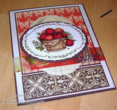
I knew by now I could quit and leave it without a sentiment....or work it in somehow.  I decided to keep going and thought that a neat idea would be to add a banner in a half oval on the bottom.  It would add weight to the card on the bottom.  Which if you're making a card is where your *weight* looks best.  Sort of like us girls, more pear shaped than apple!  (LOL!)

So I took two oval Nesties, the deckled and the straight small ovals and cut them into a 1/2 oval.


I took one of the sentiments from this Just-Rite Set and inked it with my Ruby Red marker and stamped on the oval I had cut.


I like how it sort of rounds-out the card.  Then to match it on the top of the card I gave the illusion of another oval with the 1/2 pearls.  I did not want the distraction of any ribbon or other embellies and kept the design more clean looking. 


Here's a close-up of the weaving and of the coloring. 


So there it is - chaos to card.  Hope you enjoyed my Creative Process today!

Recipe:  Stamps - Just Rite Autumn Blessings and Borders;  Ink:  Memento Tuxedo Black, Ruby Red;  Paper:  Chocolate Chip, Confetti Cream, Flourishes Classic Ivory, Websters' Vellum and Diecuts pack and Triple Pack Seaside, Garden Gala and Nature's Storybook;  Accessories:  Big Shot, Deckled Ovals Nestabilities, Small Oval Nestabilities, Copic Markers, BG 1/2 Pearls Dimensionals, Linen Thread.

Saturday, May 15, 2010

Those May Flowers

We've been having beautiful weather this week.  All my perennials are growing and it won't be long before they are blooming.  Today finds us at a wedding of 2 of our former students marrying one another, so it will be a joyful spring day with weddings and flowers.  The Our Daily Bread Designs Challenge Team has another challenge to invite you into this week too.  We want to see how your April Showers have turned into Flowered May creations! 


I took this beauty - Mom from Our Daily Bread Designs and stamped it twice with Memento Tuxedo Black ink.  I colored with copic markers (YG91, 93, 95, 99;  R00 R01, R11, R12, R14;  and R29, R39 and R89).  Then cut out and extra Wild Rose Blossom to pop it up. 


I trimmed it in an Out of the Box fashion with Labels 10 Nestabilities, and then added Ultrafine Flower Soft in Sage


I repeated the flower design by overstamping it around the sentiment in Ruby Red, and paired it with some great designer paper Jocelyn by SEI

So please join us by showing us your flowers this week at ODBD.  The challenge is ODBDSLC13 for linking at Splitcoaststampers and be sure to add your link to the ODBD Blog.  Each week there are prizes! 

For more deets see the ODBD Blog

And see more floral beauties with the Challenge Team:  America, Chris, Francie, Natalie, Patter and Sabrina

Recipe:  Stamps - ODBD Mom;  Ink:  Memento Tuxedo Black, Ruby Red;  Paper:  Ruby Red, Gina K Pure Luxury White, Jocelyn by SEI;  Accessories:  Big Shot, Labels 10 Nestabilities, Floral Accent Shapeabilities, Dotted Sheer Ribbon, Chenille Dots Ribbon, Dimensionals, Copic Markers, Large Oval Punch, Red Rhinestones, Flower Soft, Crystal Effects, Bow Easy 

Thursday, May 13, 2010

Let Your Light Shine


The beauty of a stained glass window absolutely shines in this set today.  Becky Fleck created a BEAUTY with this set Beauty Within don't you think?  And the fact that this fabulous set fits perfectly in Spellbinders Nestability Labels Eleven and Thirteen is just the icing on the cake. 

I have two pretties to show you today.  One COOL and one WARM


I'm just SO taken with the stained glass feel in this set, it's just made for coloring but would also be equally powerful embossed.  I had so much fun coloring the different stained glass sections with Copics (Spruce Collection and Hydrangea Collection and Meadow Collection).  I love how the Spruce matches so well with Not Quite Navy cardstock.  I layered with the Labels Eleven Nestability, and then added the Labels 10 in Amethyst behind.  I added some fancy piercing with an Ornare template and added silk ribbon ruffled behind the main image. 
Here's a detail on the piercing.


and here's a detail on the ruffled ribbon. 


Now for the WARM design


I aligned the card horizontally on this one and gave it hot pinks and yellows.  Also colored with Copics (Peony and Sunflower Collections).  I added the beautiful trim from the Victorian Borderabilities (cutting it down to frame the sentiment), and the Labels Six Nesties behind the image. 


Ribbon is Boutique Cuts (Hot Pink Linen and Sheer Polka Dot in Maize).  Papers are SU Razzleberry Lemonade and Pink Flamingo. 

You'll see much more beauty with the rest of the Design Team: 


Cindy Lawrence    Danielle Kennedy    Dawn Burnworth    Julie Koerber     Laura Fredrickson    Leslie Miller     Stacy Morgan  and   Sharon Doolittle  and some of the Spellbinders Blog Team have joined us today as well:  Beth Pingry, Margie Higuchi, Holly SimoniHeidi Blankenship and Terre Frey


To enter to win this fabulous set today see the Flourishes Blog.   And you can place your order for these great sets today!  The new release bundle is available at a discount for the next SEVEN days ONLY!  Don't miss out!