Showing posts with label The Creative Process. Show all posts

Sunday, August 17, 2014

Inspired By...


A few weeks ago my dear friend Julie Koerber nominated me on her blog as someone who inspires her.  That is incredibly kind and really touching to me.  Julie is one fabulous lady with so many inspiring gifts that I have come to love and appreciate.  Above all she is loyal, faith-filled, savvy and has lived out leadership in joy and in challenges, and I am so grateful for her. You can read her Inspring Post HERE).  She is a gem and you definitely want to check out her beautiful work.

So here are my questions:


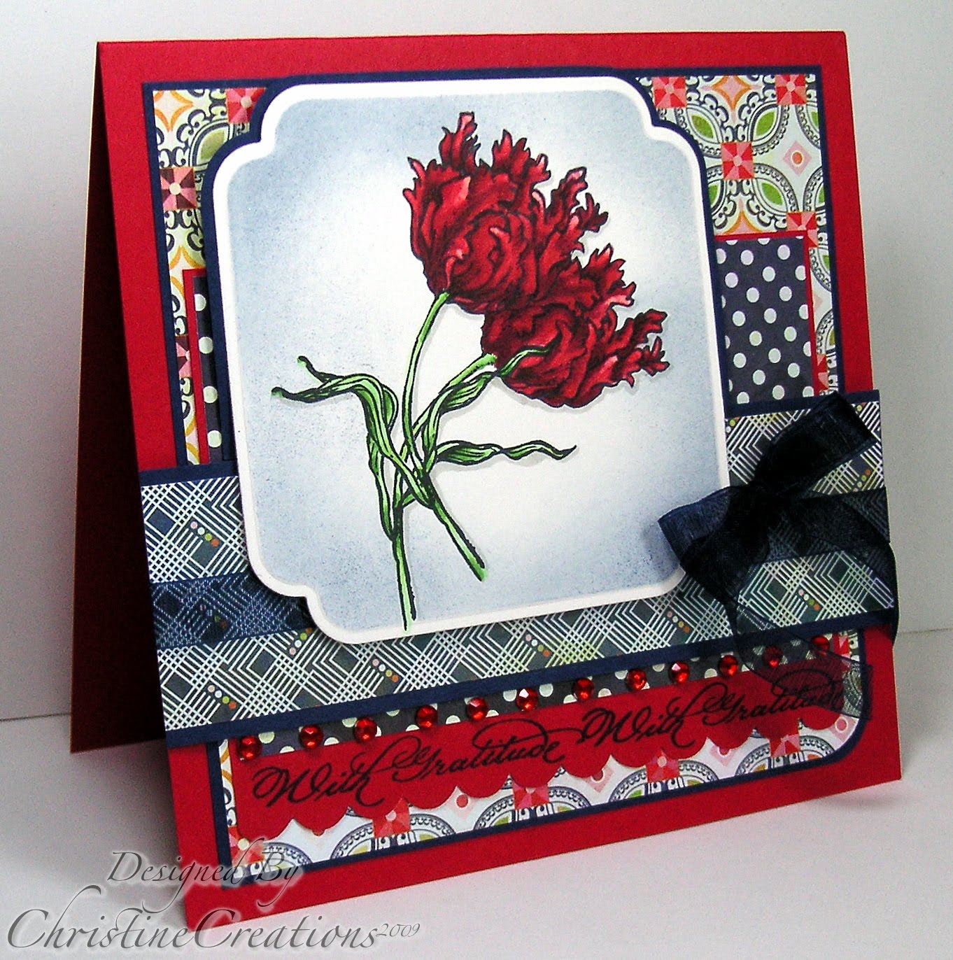
1.  What am I working on?   I’m almost always working on cards, the canvas size of a card is just right for me, so in that I’m usually colouring up something (I have a few designs I’ve coloured on my desk just waiting for a card - like above).  I’m also in organizing mode going through my supplies trying to decide what to keep, sell or give away.   One of my goals for the year ahead is to somehow get back to some scrapbooking - as our youngest son longs to have a baby scrapbook like his older sister and brother do.  3rd child you know....so that’s something I’d like to be working on soon.  And, today I’ll be painting my older son’s room and a Porsche Mural on his wall.  I am happiest when I am doing something that requires some artistic creativity.

2.  How does my work differ from others of it’s genre?  That is a really unique question because I’m not sure most of us understand objectively what our “niche” is, and how it would be different from others.  However, I think that one of the things I love best about the card making process is the colouring.  Over the years I’ve worked hard to hone my colouring skills in different mediums or applications.  I am also a person who loves vibrancy in what I create, so you will often see rich colour in my designs.  I’m neither CAS or Shabby Chic or technique based;  I’m somewhere in the middle with clean layers, designer paper, and classy embellishing.  (At least I think I am!)  I really love botanical images and also enjoy images with whimsy and fun too.  For me it’s all about excellent illustration.    I also love to include photography into what I show on my blog, it’s a skill I’m continuing to work on.

Here is some of my past work:


3.  Why do I write/create what I do?  I do it as an expression of me, it brings me such satisfaction and contentment to create.   For all of you out there who create, I know you understand that.   To take something from a blank sheet of cardstock and form it into something beautiful that could be given to someone else is delightful to me.    For me it is also an expression of thankfulness to the God who’s given me the abilities I’ve been given.  It’s like an artistic voicing of worship.  There’s a song I really resonate with when it comes to my faith and my creativity, and I find it to be really hope-filled.

“You make beautiful things, You make beautiful things out of the dust,
You make beautiful things, You make beautiful things out of us."

I’ve also built such a kin-ship with many amazing people in the industry as we have worked together over the years that I treasure.  I hope that it does inspire other people in the process along the way too!  I’ve always wanted this blog to be a place where you feel encouraged, inspired and have a little fun.

4.  How does my Creative Process work?  I do approach the creative process differently each time.  There are times where I look at an image and go research what it might look like in real life to be inspired with an idea.  Other times I start with some designer paper and then colour an image to match the paper.  I might also peruse Pinterest or other people’s blogs that inspire me,  or start of with a a sketch or colour challenge to create.  Then it’s always colouring, paper and embellishments in that order.  It’s rare for me not to colour something on my card.  I also take a lot of time.  I’m not a fast creator.  Even when I card is “finished” I’ll likely look at it a long time to decide if its really got the visual interest and polish that I want it to.  I find that even after I’ve photographed my card and blogged it, I’ll look at and and say “Oh I wish I would have done _______ differently.

What’s fun is that I can do it all again tomorrow!

And now I get to nominate some other lovely ladies who are inspiring to me!


Tosha Leyendekker - Stamp Talk with Tosh

If I were to use one word to describe Tosha’s work it would be polish.  Tosha always puts excellence into her work.  Whether its something soft and ethereal or something rich, shabby and warm she manages to create with a something extra or something unexpected and do it with a beautiful touch.  Whether it’s a card design, some gift item or a one of a kind piece of jewelry Tosha’s work is always inspiring.  She’s also a great deal of fun and has a wonderful quick wit and sense of humor as well as a kind and generous heart.  We had a great time when a bunch of us girls gathered together last summer.  And I’m blessed to know her!


Broni Holcombe - Splashes of Watercolor

Broni is a fabulous lady.   One of the things I have long admired about her is how she uses colour.  Whether it is in a card design, an altered item, or a page in an art journal she just knows how to make it sing with colour.    And another thing that inspires me about Broni is that her colouring skills in any medium are always stunning.  She knows how to infuse saturation and light into her work, and I always leave inspired.   I so appreciate her work and have for a long time, way back to our Dirty Dozen days on Splitcoaststampers.  


Clara Cecilia - Clara Cecilia Photography 

This sweet and beautiful friend of mine is fabulous.  Amoung the many things Clara does, one is as a talented photographer and also a lifestyle blogger (along with her friend).   Clara oozes talent and she has this lovely way of making things she touches beautiful.  Whether she’s doodling or lettering something and making it look like a piece of art, creating a graphic that grabs you, or capturing moments for others in a view finder - she creates a story that makes you want to jump into it.  Her photography speaks whimsy and design savvy, and is beautifully light infused.   Whatever she does, she does with heart, and I’m so excited to see where life takes her as she blesses the world with her gifts.  I’m so proud of her!  


Well it’s been delightful to introduce to you these lovely creative and inspiring ladies.  In a couple of weeks you’ll get to hear from some of them about their creative process and who inspires them.  

Monday, June 21, 2010

The Creative Process - Cool Tools

Hello Everyone!  It's a gorgeous day in my little corner of the world.  It's going to be hot today, and the birds are very chatty this morning.  We had a good and busy Father's Day weekend, four Ball Hockey games for the boys, time with my family on Sunday, and a birthday party thrown in there.

Today for the Creative Process I thought I'd show you some of my Go-To tools I use each time I create, so they are definitely some of my favourites, and also how I organize one of them.  We're all looking for ideas that will work for us on organization right?


This is the Bow Easy Tool.  Now that I have it, and use it on every bow I make, I can't believe I waited this long to get it.  And I'm almost embarrased at the bows I used to make.  It is the COOLEST little tool and gives me perfect bows every time, with the tails behind, not needing any fussing or rearranging.  The only draw back is that you have to attach to your card with a stitch or glue dots, you can't tie the bow directly onto your card because you are making it on the Bow Easy.  But that doesn't bother me at all, having perfect bows is SO worth it!  I purchased mine from Sharon Johnson at her Stamp Simply Ribbon Store, and Our Daily Bread Designs sells it as well.  Nifty, portable, inexpensive and worth every penny, 4 Stars from me!


It should be no surprise that this is one of my favourite tools.  When SU came out with the Big Shot I debated long and hard about getting it.  It is a pricier tool and for me to spend that much money on something I had better use it.  Truth is, I use it every day I craft.  For me it was well worth the money I invested.  For cutting shapes with Sizzix Dies, Spellbinders or adding texture with embossing plates and folders this will do the trick for you with ease.  Fabric, felt, paper, cork, metal....anything you can imagine it will cut.  I had to laugh after I was cropping this picture, see the front leg of the Big Shot?  I left a little piece of tape there.  Often when I'm placing Spellbinders dies in the right spot to cut an image I've already colored, I'll use a little tab of tape.  I forgot I had that one there!  So....Big Shot, easy to use, generally portable (it's really not much to cart around), can multi-task use, FUN, an investment but worth it.  4 Stars again from me.

And now ....what little goodie is in this non-descript black binder?   


My Spellbinders Dies.  Let's have a brief pause for these beautiful items.....

There are other dies other there, but not with the function and flexibility of Spellbinders.  If you are a paper crafter, in my opinion, these are the dies to invest in.  There is such an amazing range of style and shape, you have the beauty of being able to see where you will place your die (and see through the die), they come in graduated sizes perfect for layering, or just the flexibility in finding the right size for your project, you can cut and emboss with them AND use the dies as a template for sponging....alright want to see the inside? 


This is how I store all of my dies.  I saw this type of system on someone's blog a LONG time ago, and I wish I could remember who it was.  I don't have a permanent crafting place, so whatever I have needs to be portable and such that I can pull it out and put it away.  This binder is perfect for storing my dies.  I purchased these photo sleeves at a photo store, the top sleeve is for 4 x 6 photos and the bottom one would fit 5 x 7's.  In each section I cut a piece of white cardboard to size (the backs of old SU 12 x 12 paper packs), label each square with the die I'm going to use it for, and then cut sticky magnet strip for my dies to attach to (I purchased the magnet roll strip at Michaels).

I also cut up the picture side of the packaging from the Spellbinders Dies to put in each section behind the die square (this gives each sleeve some firmness so I can flip the pages better).  Then I use labels from the photo sheets and label each section (to the right beside the binder rings).  This way when I have tons of dies out on my table I always know where they go back to.


Here you can see the square pulled out and the dies on the magnet.


And above, here are my dies loose.  I love how the magnet holds everything together. 


And it still works perfect for Borderabilities and smaller sizes too.  Because of the magnet, nothing slips away, and the sleeves hold it all in.

I arrange my Spellbinders in order, Labels First, Shapes next (ovals, squares etc), then Borderabilities, and Shaped accents. 

It's been such a smart system for me.  But as you can see, I'm out of space in this binder, and will need to start a second.  I'm blessed to have a lot of dies. Flourishes is my source for all my dies too, in case you're wondering.  Without a doubt 4 Stars from me :)

Thanks for popping by today, I'll have more creative things this week!

Sunday, May 30, 2010

The Creative Process - Coloring Three Ways

Wow, what a busy weekend we had, with the wedding, our son's birthday, responsibilities for my husband and I at Church on Sunday and a meeting Sunday night.  It didn't leave much time for creating :)  But, it was a beautiful wedding, it really was such a privelage to be a part of, oh our girl looked absolutely RADIANT too, they were such a happy couple.   I have no pictures for you though!  Since we're up on stage DOING the wedding, I can't really take pictures LOL!     Anyway...we're all a little tired today from all the activities and excitement.   

So....today for The Creative Process I have a project that I worked on a while ago, but it will be new to you.  I enjoy creating sets of cards that give the example of three different styles of coloring.  My three favourites mediums:   watercolor, prismacolor pencils and copic markers. 

Here is the set of three cards.  I used Flourishes Thank You set, one of my all-time favourite, all purpose sets, the papers are Basic Grey June Bug DSP. 


The first card showcases Prismacolor Pencils for coloring. 


I also added some sponging inside the Nestability template to tie in the colors to the papers. I kept the accents on all the cards simple and tried to keep some of the detailing similar to tie all the cards together.  With prismacolors I add my different shades and blend with a blending stump and sometimes also use Odorless Mineral Spirits to help the colors "slide" together better. 


The next card showcases Copic Markers, and is a 5 1/2 x 5 1/2 inch square card.  You can see the more vivid, deeper color that copics give to an image.  I believe I used the Fuschia Copic Collection from Flourishes for the reds in this image.   I also sponged the image to keep that consistent focal image look. 


I love the contrast between dark and light in the image.  To create the highlight I used a blender pen in the red petals to pick up color and give more of a light-colored highlight after I'd colored the whole image. 


And the last card uses Watercolor as it's medium.  I think the colors turned out great in this one.  And I love the rounded and square corners that alternate with the rounded edges in each of the focal images.  Sponging always turns out so great on watercolor paper too.   It soaks up the ink just right with such even distribution. 


The patterns on the paper are so fun together too. 


To me what brings life to coloring images is the contrast between shade and dark and light.  A flatly colored image just doesn't jump out at you and carry the realism of a true to life image.  So, in each of the mediums I've worked hard to give that illusion of depth and highlight in the coloring.  With each medium it means different techniques.  In future Monday's I'll focus on each technique specifically to give you some tips that have worked for me. 

Have a great Monday everyone!  Hope to see you tomorrow!

Recipe:  Stamps: Flourishes Thank You;  Ink:  Memento Tuxedo Black, Stazon, White Craft, Night of Navy;  Paper:  Prism Papers (Red), Night of Navy, Basic Grey - June Bug DSP, Flourishes Classic White, Flourishes European Watercolor Paper;  Accessories:  Big Shot, Dotted Embossing Folder, Labels 11, 12 and 13 Nestabilities, Scalloped Ege Punch, Corner Rounder, Navy Sheer Ribbon, Red Rhinestones, Dimensionals, Copic Markers, Prismacolor Pencils, Reinkers, Stampin' Write Markers, Waterbrush, Sponge

Monday, May 17, 2010

The Creative Process - From Chaos to Card

Recently I gave away some fun blog candy and I asked you the readers for input on some things you'd like to see in the year ahead.  I really enjoyed reading your answers and it perked up something I've been thinking about for the last six months....many of you asked about my Creative Process, what it looks like for me to do certain techniques, or how I get from the idea stage to the completed card.  So, I've decided to start a series on that, and I'm calling it The Creative Process.  So, look for this special feature on Mondays.  I won't say it will be every Monday, cause life is just life and I want it to also be fun for me - and you!   So we'll just call it a regular feature, sound ok to you?  I'll look at lots of different topics related to creativity, or design principles I've learned along the way. 

And I'll add my disclaimer up front.  I'm not an expert by any means.  This is about what my creative process looks like, and that might look different from you, and I'm still a learner too....so I hope we can learn together. 

Today I thought we'd start by how I most often make a card, which is one of the most asked questions.  How do you go from Chaos to Card? 


How I most often start a card is with a stamped and colored image.  This one from Just-Rite (Autumn Blessings and Borders).  I colored it actually months ago just for fun with copic markers.  (sorry because it was several months ago I'm not even sure what markers I used!). 


I'm not *most typically* a person who starts with grand ideas in my head or a set plan, or even colors or papers I might use.  Generally I just start coloring - because that's my first love of stamping.  So, this cute image was sitting in my stamping cupboard for all these months begging me to take some time to finish the card. 

So, what do I do next?  I usually go through my papers, and find a color palette that will work with my stamped and colored image (which tells you I have tons of paper :).  For this card I wanted to pull out all my pretty Webster's Pages and some 7 Gypsies papers, all from Flourishes. 


Then I went through the paper pads and pulled out some papers that I thought might work.


What I often do from this point is *fiddle* :)  I know that's such a technical term!  But I pull out the papers in different ways and try and get a picture in my head about how they might work in a layout.  Today though, I knew I wanted to use a sketch, so this was my jumping off point.  Jen Del Munro's SFYTT.  Love my scribbling?  You can tell I've used this one as scratch paper before. 


At this point, because I already have a great sketch, I can determine which papers I might want in which sections to fit the sketch.  And I just love the patterns in these papers! 

I knew I'd be deviating from the sketch somewhat because my focal image was a horizontally oriented oval.  I could have flipped the sketch, but I thought I'd just go for it this way.


So, I knew at the point above that I'd have to add another oval layer running the vertical direction to fit the sketch, and I knew I needed a little more neutral in the card to tie it together a bit more.  I also nixxed one of my red papers because it was "too" red (too blue-red if you know what I mean), and I didn't need the distraction of another pattern with the sketch.  I also knew that I wanted to use the beautiful vellum from Websters' diecut and vellum pack as my horizontal stripe, it has the color and pattern, but with a transluscent quality.  You can also see how I added the focal basketweave as interest to match the sketch and match the apple basket.  It's made with linen thread wrapped around the vellum strip and tiny strips of chocolate cardstock woven through it. 


I knew by now I could quit and leave it without a sentiment....or work it in somehow.  I decided to keep going and thought that a neat idea would be to add a banner in a half oval on the bottom.  It would add weight to the card on the bottom.  Which if you're making a card is where your *weight* looks best.  Sort of like us girls, more pear shaped than apple!  (LOL!)

So I took two oval Nesties, the deckled and the straight small ovals and cut them into a 1/2 oval.


I took one of the sentiments from this Just-Rite Set and inked it with my Ruby Red marker and stamped on the oval I had cut.


I like how it sort of rounds-out the card.  Then to match it on the top of the card I gave the illusion of another oval with the 1/2 pearls.  I did not want the distraction of any ribbon or other embellies and kept the design more clean looking. 


Here's a close-up of the weaving and of the coloring. 


So there it is - chaos to card.  Hope you enjoyed my Creative Process today!

Recipe:  Stamps - Just Rite Autumn Blessings and Borders;  Ink:  Memento Tuxedo Black, Ruby Red;  Paper:  Chocolate Chip, Confetti Cream, Flourishes Classic Ivory, Websters' Vellum and Diecuts pack and Triple Pack Seaside, Garden Gala and Nature's Storybook;  Accessories:  Big Shot, Deckled Ovals Nestabilities, Small Oval Nestabilities, Copic Markers, BG 1/2 Pearls Dimensionals, Linen Thread.