Showing posts with label Feminine. Show all posts

Friday, January 15, 2021

Pure Fragrance from Power Poppy


I love the smell of fresh flowers.  When we (used to) go to the mall and walk by a flower shop, I always want to  take my steps a little slower and dwell in the fresh fragrance of the blooms.  Today we have a gorgeous new image to show you from Power Poppy that may make you wish for scratch and sniff on your screen!  It’s called Pure Fragrance Digital .  It’s a stunning blend of showy florals: iris, foxglove, wild rose, and bellflower in a elegant little French glass perfume bottle.  I printed the image up to fit most of the card size, which gave me lots of room for colouring.  
 

Colouring is done with Copic Markers, with the addition of Prismacolor Pencils in the nooks and crannies.  I’ve added a bit of pale blue buffalo plaid in the background paper to soften it, but the details are very simple, just to show off the beauty of the image.  Don’t you love the little raspberries next to the bottle?  I gave them a golden raspberry colouring to pair with that beautiful apricot wild rose, and the dainty foxglove.  You can see that I’ve tried to tie in each of the colours of the flowers into other parts of the image so that it works well and is cohesive.  


Be sure to stop by the Bloom Brigade because they have such gorgeous designs to who you with this image and another stunning new image that Marcy is releasing called Volumes of Beauty.  

Christine (me!) 

Thursday, November 19, 2020

Scatter Joy


Sometimes, you just want a set that is all about the sweetness.  Today’s new stamp from The Cat’s Pajamas,  Scatter Joy fits the bill perfectly.  Delightful little bunnies with petite and detailed illustrations totally give this one the awwwww factor.  


I was thinking about a precious friend of mine who was about to have a new baby girl when I created this card.  Her delivery was an intense and fast one so I think this card will be a good reminder to her of what an amazing mama and person she is.  I coloured up the sweet design with Copics and then die cut it out with TCP’s  Mailbox Dies to get that sweet little peek-a-boo in the little rectangle.  I picked some patterned papers that coordinated really well with scale and colour, and then topped it off with a scalloped “awning” with TCP's  Toppers CutUps.  


A sweet little heart from this week’s Yeti to Party  dies give the sentiment a little extra accent.  


Hopefully this will scatter joy over her when she receives it!


Here’s a peek at how sweet this little set is!


Are You In It To Win It?  As always with TCP...there’s a chance for you to win each day of Sneaky Peek Week!  Just comment on these designers blogs and you’re in the running for a $10 Gift Voucher from the TCP Store! 

Friday, August 28, 2020

Power Poppy’s New Healing Bouquet


We’ve got another WOW set at Power Poppy to show you today called Healing Bouquet.  It’s a creative mix of citrus (lemon or lime), lotus flower, eucalyptus, elderberry, and lavender. 

I chose some pretty delicate tones and decided to go with a lime for this arrangement.  I love lime.  All the colouring is with Copics and I kept the other details of the design quite simple so the focus would be on the beauty of the floral and fruit spray.  


The sentiment is from the lovely Power Poppy set, Simply Camellias.  Touches of lace and polka-dotted paper give it an elegant feminine touch.  

For more WOW with this set, please pop on by to see what the rest of the Bloom Brigade has in store for you.  
Christine (you are here)

Wednesday, January 6, 2016

Super Purple!


Hello again!  I hope you’re not getting sick of these super kids.  I just love them and am trying to build a stash of kid cards for my sister-in-law.  She really likes these super kids too, and even thought I’ll branch out to other stamps, I had to have at least one boy and one girl superkid.  I used MFT’s You’re Super and Superboy sets.    So, today it’s this snazzy supergirl in purple.  My little niece loves pink and purple, so I’ve gotta give her what she likes :)  

After colouring her up with Copics I fussy cut her out with a slim border and then did my background.  I wanted to have the purple/pink sky be in a background window so, on a piece of white cardstock I stamped the city scene in black, then sponged in the purple and pink inks over top.  After sponging I added some glitter pen to the city scene to give it a little nighttime sparkle.  

On the purple card base I sponged over a Simon Says Scrambled Letters stencil.  I like the soft effect, and it’s perfect for kids too.  


I embossed the sentiment in black and then added some pretty stars (TCP 3 x 3 Stars CutUps dies), and then a few black enamel dots.  

Sorry, I coloured this one up while I was away and didn’t have my camera to capture the Copics I used.  

Back with you tomorrow for a new challenge and new pretties from Power Poppy!  


Friday, May 1, 2015

Pretty Paper Dolls


Did you play with paper dolls when you were little?  I totally did and just loved giving my dolls different outfits and accessories.  Today we have some gorgeous new girls at A Day for Daisies to fill that Paper Doll lover in each of you.  Today I’m showing off one of them.  

I decided to give her a long lean look in the card because she’s such a tall leggy girl and some fun yellow and grey colours.  So I played with this week’s Mojo Sketch and some buttery yellows and warm grays in my Copics.  


To finish it all off I added an older Flourishes Sentiment, some seam binding and sequins.  


Here’s the Copics I used

And here’s the ADFD Gang playing along...


Christine (you are here)


Friday, March 13, 2015

Spring Blossoms


Happy Friday!  How about something completely feminine and spring-like?  I was in the mood for that when I saw this lovely pack of paper from My Mind’s Eye - Jubilee - Sherbet.  I thought it would go so well with Power Poppy’s Springtime Love set that so perfectly captures how delicate Spring is.  

The colour palette I used in colouring is taken directly from this sheet of paper and the sketch is this week’s Mojo Monday sketch.  Because the boldness of the colouring and the boldness of the paper could compete with one another I also added some strips of vellum to soften the effect.  


Finishing touches include zigzag sewing, pretty lace and enamel dots.  


Here’s the Copics I used to give it some life.  Ah...a breath of fresh spring air!  Can’t wait till it’s really here!


Don’t forget about our month long challenge over at Power Poppy this month, Go for the Gold!  


Play along and you could win some fabulous Power Poppy Stamps!  

Join these other Bloom Brigaders to see what fabulous inspiration they have for you today....

Christine (you are here)


Wednesday, March 5, 2014

New Reverse Confetti Quirky Cutie!

Don’t forget!  My For Sale posts are HERE, HERE and HERE!  


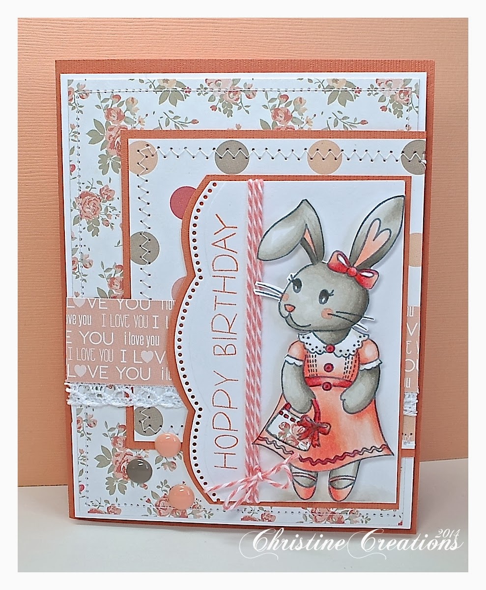
Well, I’m just so excited today to be hopping along today with the Reverse Confetti Crew and showing off a brand new Quirky Cuties set!  Thanks Jen for the invite!  Let me introduce you to  Bebe Bunny, I think she is pretty adorable!


She’s all dressed up in her Sunday best ready for the party!  I actually made this card for our little niece who turned 5 on Monday.  She likes dresses and girly things and is always jumping around so the card was perfect for her.  

I’ve coloured BeBe up with Copics in warm greys and peach tones to match this fun paper from Teresa Collins - You are My Happy. I fussy cut her out and popped her up on the paper, and I’ve given it some extra touches like sewing, lace, enamel dots and some cute twine to pull it all together. 


Don’t you love her paper pieced purse?  I’d like one just like it!  


Above is the inside of the card...


And...here’s the Copics I used.

Now for all the fun hippity hop details...

Today you can comment to win!  Visit all the spots showcasing new Reverse Confetti today and you’re entering to win this set.  Be sure to also stop by the Reverse Confetti Facebook page for another chance to win.  Here another look at Bebe....


All the details can be found on the Reverse Confetti Blog along with a full list of people sneak peeking today!  

Thanks for stopping by!  

Sunday, December 1, 2013

Honeycomb Pair

I enjoy making designs work in multiple ways, so today I thought I’d show you another couple of ways I played with the fabulous So Distressed Set from Flourishes, creating a more feminine and then masculine design with the set and chalboard style technique.  

I began by picking some interesting colour palettes that both included grey, one that has more feminine direction with the pink, and the masculine one with the blue and rust.  


On the feminine design I stamped the honeycomb hexagons in the multiple inks running on the horizontal plane, linking up the corners of the shapes along the way in a random pattern (Memento inks - Olive Grove, Gray Flannel and a hot pink) all stamped on Flourishes Classic Ivory cardstock.  Then after I had a pattern I liked I overstamped the design with the smaller damask image in the set and stamped off grey ink.  Then I sewed this panel onto some Color Made Easy - Cool Neutrals cardstock and Candy Pink card stock.   


For the main sentiment I used some designer paper that had these gray chalboard style sheets and cut out a larger honeycomb shape with the Spellbinders Hexagon die.  I overstamped this shape with Gray Flannel ink with the damask stamp.  Then, I embossed the sentiment from Country Time Christmas set in white, and then did a little chalkboard enhancing, white primacolor pencil accents around the words, then with a baby wipe I dipped a bit in white craft ink and swiped it over the hexagon.  I like the softness that the damp baby wipe adds to the ink so it doesn’t blotch too much.  To me it looks more realistic chalkboard effect.  

Then I stamped a few extra hexagons, trimmed them out and popped them up as accents with some enamel dots and pink seambinding and gray braided trim.  


Now for the masculine design I have a few subtle changes, do you notice them?  I’ve oriented the hexagons to a more vertical plane with the points up and down, changed the colors to Teal Zeal, Gray Flannel and Morocco ink.  The sentiment is from our new Grab A Cup set, and is done chalkboard style the same way as the feminine card.  


More masculine accents are buttons and silver metallic cording.  

This So Distressed set is SO fun to play with!  I think it’s helped give me a real renewed joy in just stamping!  


Wednesday, July 31, 2013

Happy Hopping with Melanie!


Good morning!  Today several members of the CardMaker Blog team and Gina K. Designs team are  showcasing stamps used in Melanie Muenchinger's newest book Fabulous Stamped Frames, published by Annie's. This cardmaking tutorial book features 36 projects using seven of Melanie's bold and line art frame stamp sets from Gina K. Designs.  These versatile setseach contain a frame stamp large enough to fill an A2 card front, which can be rotated portrait or landscape style, along with coordinating images and sentiments, that allow both beginners and advanced crafters to enjoy endless design possibilities for year-round themes, occasions and styles. Not all sets are needed to get a ton of instruction and ideas from this book! Melanie challenged us to each put our own spin on one of the sets, so we hope you enjoy what you see today!  She and Gina will be sharing videos as well to show more of the book and some of the stamps in action.

Here is what I made :)


I got to play with Melanie's beautiful set Branching Out.  It has numerous elements in square, circular or rectangle fashion that can be used alone, or other elements from the set added to accent the frames. I love the delicate feel to the set and the numerous elements that you can mix and match together.  All the bits and pieces are interchangeable.  I stamped the circular framing piece in black adding the pretty perched bird and then all the other coloured flowers and berries with soft peaches and blue-y greens to match this pretty Teresa Collins Summer Stories  paper.  Just those little bits of dimension really accent the frame.  


I've paired it with some metallic black paper, pretty pearls and some button, lace and iridescent twine.  I wanted it to have that simple delicate feel because it has that sort of dainty feel to me.  Lovely and peaceful isn't it?  

Here's what this lovely stamp set looks like:


Now you'll want to know this fun SALE NEWS from Gina K...


And here's where you can hop along to get tons of inspiration from Melanie's sets in the book...enjoy!

Christine Okken (you are here)

Tuesday, June 4, 2013

Fairy Small Wonder & A Giveaway!

A few weeks back I was delighted to find out I won some gorgeous digis from Birdie Brown.  Oh they are SO cute!  Here's what I did with this one...


Isn't she precious?  It's called Fairy 1.  I love her sweet expression and the little lotus flower she's perched in peeking at that pretty butterfly.  I coloured her up with Copic Markers, used a pretty Spellbinders shape to cut out (Decorative Labels 22), and then paired her with these pretty Carta Bella papers called True Friends.  AND, I thought I'd jump in with this month's SFYTT at Reverse Confetti!  


The sentiment is from an old SU Sale A Bration set I believe.  I thought it was perfect for the tiny fairy and then could be a little girl's baby card, or a little girl card.  All sweetness and light :)  

Now how about a Giveaway?  


This month's CardMaker Magazine has a little item in it from ME on page 65 :) 


It's a really great edition, with lots of wonderful summer papercrafting ideas.  CardMaker always sends me a couple of copies of the magazine when I'm published.  So, I'd love to share one of those copies....would you like to win? 

Just leave a comment here with your email address included (it just helps me contact you if you've won :)  Deadline is Saturday by 11 AM MTN time.  


Copics:  YG0000, YG00, YG21, YG23, Y11, Y21, G40, G43, G46, E00, E21, E23, E25, E27, E95, RV21, RV23, RV25

Thursday, May 16, 2013

She's Got Fabulous Feathers


Hello, Fabulous People!  We're back to show off another look at the May Releases at Flourishes.  Wasn't it a beautiful set of stamps?  I know you won't want to miss out having them in your crafty little hands...and TODAY is the LAST day to purchase the May New Releases at a discount.  So don't miss out!  

I thought I'd diva this gorgeous girl out today from our Glamour Girls set.  When I coloured her up with Copics I saw that the feather on her Kentucky Derby-worthy-hat were peacock feathers....that reminded me of some peacock feathers I had from a Ms. Peacock costume I made for a Clue youth event we had done one time...and then I just couldn't resist putting them on the card.  If you're going to go diva, you just have to go all the way :)


She's stamped on Flourishes Classic White with Memento Tuxedo Black ink, then die cut out with our Flourishes Perfectly Pierced Victorian Oval die.  She's paired with Flourishes Color Made Easy - Emerald Coast cardstock that was embossed with a peacock embossing folder called Courtship, it suited the theme perfectly.  


Some pretty teal velvet ribbon, green silk, turquoise ruffled edge ribbon, and some Kaiser Sea Breeze Sparklets to match all the glam.  


Be sure to visit the rest of the Design team to be inspired again...


***And I hope you can visit the Flourishes Blog today for a new feature we're doing this summer,  a closer look at our Design Team and a fun new challenge with prizes!  It's going to be great! ***