
Here we are at the May Pre-Release Challenge from Flourishes! And it's a fun one! (and I even have a coloring tutorial for you :) ) It's got a lot of pictures in it.
Here's the theme: Let your creativity shine by being inspired by something in your home - it could be the color scheme of a room, a painting, vase or floral arrangement - the sky is the limit on this Home Sweet Home Challenge!
So, here was my inspiration, you might recognize it as one of my Project 365 Pics from a few weeks ago.

It's a pretty bowl of pears on my counter. The bowl is from our original everyday dishes we chose at our wedding almost 18 years ago. Most of them are already broken, and we've chosen new ones, but I have a number of serving pieces left.

And here is where the inspiration went! I pulled out my pretty Flourishes Pears set and did some copic coloring (tutorial below). What's lovely about pears is that you can give them a number of different color combinations, so I chose greens. This card is 5 1/2 x 5 1/2. It uses this great Spellbinders Ornate Artisan dies that I love so much, plus the Classic Bracket Edgeabilities, some pretty lime satin plisse ribbon, lime braided trim and Basic Grey's Picadilly Square papers.

Here's the coloring tutorial:

This is a bit of how I start. I've picked these papers from Picadilly and now that's the color palette I want to go with (and it matches my inspiration picture too). I've already colored up a couple of the pears - partially with Flourishes New Leaves Collection but the coloring is a bit rough yet (as in not very blended), and you can see that I've left areas of highlight with no color. I used to color up my entire image all the time, but I've gotten into the habit of leaving some white areas uncolored. You can always come back and add color, but it's harder to take color away, and this way in the very last blending I can add color overtop and it will remain the lightest shade.

Here you can see the colors I've used to give the leaves definition. Pistachio Collection from Flourishes. Starting with the G40, adding in G43 and the G46 in the areas of deeper shadow, and blending with the G40.

I've given the pear blossoms a really light hand with the W00, W1, RV0000 and then the RV00 and RV69 for the stamens in the blossoms.

For the sections of wood I used mostly E43 and E44, with the lightest touch of E47 in the deepest shadows.

Now for specifics on how I colored the last pear. I start with some flicking strokes of the YG21 marker, leaving highlight on the larger part of the pear where the light would hit as well as the very top.
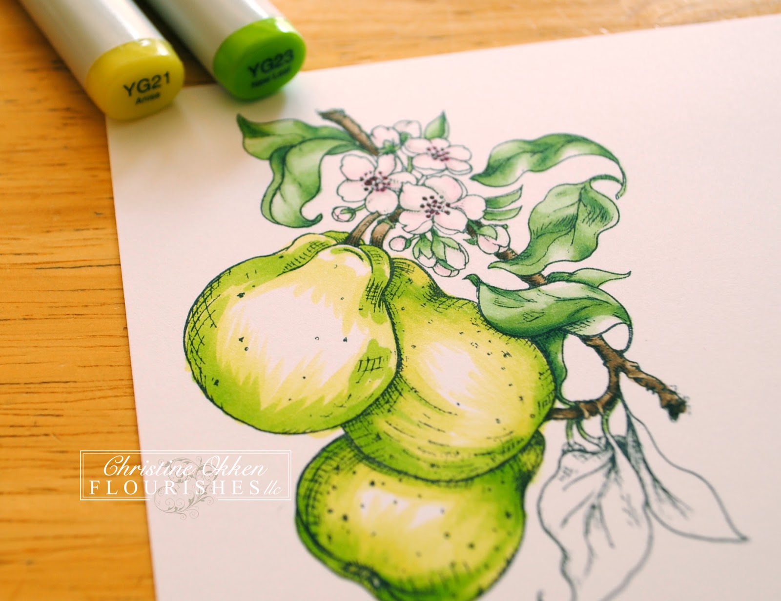
Now I'll add in some YG23 with the same types of stroke technique only in a smaller quantity of area. Then I'll blend with that same flicking stroke with the YG21.


Now I add in the deepest YG25 giving the pear that rounded appearance blending with both the YG23 and YG21, the same type of up-stroke technique.


Now these 2 pictures above are the "extra touch" to make your pears look even more realistic, the pear that appears the most in the background (lowest center), is the pear you can add some blue or violet color to - so that it appears to receed, and gives it more realism. Yellow or warm colors advance, and blue or cool colors receed. So I've added some BG11, BG53 and B21 to that pear. Then I've added YG21 to all of the pears to smooth everything out. Those areas I left white take on the yellow/green tone and still look highlighted with the least amount of color. I also added the E43 to the "spots" on the pear just like a regular pear would have.

And the last touches are on the leaves, also adding some B21 to the areas where the darkest shadows or depths would be. It really works well with the papers and also gives more realism.

And with a little B21 and B0000 I've added in some background that really makes the difference in the image "popping". There you have it. I think I still might have fussed a little with it smoothing out the coloring after this picture. I tend to do that, till I think it's just right!
So we're inviting you into our Home Sweet Home Challenge! Create something inspired by your home. Please take a picture and show the inspiration piece in your post. Entries must be in by May 11th at 5PM EST in order to be in the running for the entire May Release! When using online galleries please use the code FLLCMAY12. Have fun!
Please visit the rest of the team to see their home inspired creations! I know you'll be wowed!
- Barbara Anders
- Christine Okken (you are here)
- Cindy Lawrence
- Danielle Kennedy
- Dawn Burnworth
- Jan Marie Caruso
- Julie Koerber
- Sharon Doolittle
- Stacy Morgan
- Tammy Hershberger


19 comments:
Wow What a beautiful card.I love it.
Felicie
What a beautiful card. Gorgeous colors and gorgeous coloring.
love the beautifully colored pears
Gorgeous card! I love the step by step tutorial too! Thanks ;o)
Yummy pears! Your coloring is wonderful Christine and I appreciate your tutorials very much. Beautiful and vibrant creation.
o this is gorgeous christine and a great tutorial.
greetings karin
Thank you so much for sharing, your card and step by step are wonderful
Pearl,
I want to eat a pear LOL! Great tutorial and a lovely card. Off to cook for the youth retreat at the church...going to be a busy weekend!
Oh yummy! Beautiful coloring and thanks for the tutorial. One of these days if I see enough tutorials maybe my fruit will look that good. LOL!
Christine this is beautiful. Fabulous tutorial. Sure would love to see it in "person". Your coloring is always fabulous. I wish I had kept some of my old dishes for my daughters. I wasn't sentimental back then..lol. Great job.
Christine this is just a awesome tutorial, boy am I glad had a beautiful bowl of pears. Thanks,
Jan Marie
Flourishes
Oh Wow such gorgeous coloring, thanks for sharing, and such elegant framing and love the pleated ribbon!
Christine, your card is Beautiful!! Thanks for sharing the tutorial on how you coloured the amazing pears. They look stunning!!
WOW! Your gorgeous pears certainly reflect your inspiration photo! Thanks for your tutorial.
Love how you combined the blue and green. Great match to your inspiration photo. Wonderful coloring step by step, too. Love this challenge. Wish I had time to play.
Bautiful pears!!! And wonderful colors!!!
This is so beautiful Christine! I love how you created the "brackets" with the flourish die cuts! Very elegant!!
Christine, this is an absolutely beautiful card! I love it and all of the zesty colors!! I also appreciate the Copic tutorial help, since I am still so new to Copics :)
Beautiful card, Christine! Great tutorial too! You are so talented!
Post a Comment