Showing posts with label Ode To. Show all posts

Wednesday, March 21, 2012

Ode To - Chairs to You

It's been a while since I posted an "Ode To..."post, looking back at some of the older by "gooder" sets from Flourishes.  I had some time this month to pull out my Chairs to You set and play with it and some new paper.  I'll show you the new card and then pull out the older creations to remind you of some things I've done in the past with this great set.


The showstopper in this great set is this wonderful queen anne style chair.  Today I thought I'd paper piece it with one of my NEW favourite paper pads Authentique's Gathering, wow-wee gang, this is one gorgeous pack of paper, and I love that on every reverse page is a soft pattern that goes with every other design of pages.  

I wanted to make this look like a fancy chair sitting up against a chair-rail and wall that has been wallpapered with gorgeous stripes (botom) and texture (top).  So I used make a "chair rail" out of paper to seperate the two sections and embossed the top with a new embossing folder in the store Flamingos and Hedgehogs.  It's fantastic and a larger 5 x 7 size as an embossing folder which gives you more versatility.  I colored a bit of the paper pieced chair with copics to give the feeling of depth in the upholstery.  


I've colored up some of the icing sugar candy with a B11 copic marker to accent the Spellbinder's die.  It has an elegant and airy feel to it I think. 

Now let's open the vault and look at some oldies but goodies with this set!


This was my very first card with this set, early on in my Flourishes career, and I used the other great images in this set, the three different styles of chair and in the bottom right the cute pampered pup on a pillow.  The chairs are watercolored and the sentiment reads "A house needs these chairs, ones for solutide, ones for friendship and those for society!"


A few years ago after I borrowed my mom some books, she discovered that she actually really enjoyed reading!  So I made her a special bookmark to celebrate and to use in her books.  I put a lot of work in to this one, watercoloring the chair and adding gold accents to the upholstery tacks and the book edges. I wanted it to be a really rich bookmark.  


And this last card was part of a tutorial I did for the Flourishes Blog about how to create texture in your copic coloring.  I added a paisley background to the copic colored chair giving it the look of crushed velvet paisley upholstery.  The tutorial is HERE in case you missed it the first time around.  

Another great Flourishes set to show off once again!  Hope you've enjoyed the tour.  Don't forget that tomorrow (Friday) is the last day you can order March's New Release Bundle at a Discount!  Don't miss out!    I'll be back tomorrow with another peek at a March Release Creation!

Monday, January 30, 2012

Ode To...Life, Love and Lemons

Tough days in our house, I've got two boys down with the respiratory flu.  Fevers, scratchy throats, coughing, not so much fun on the kid front :(

But I am back with another Ode To....post, showing off some of the older Flourishes sets.  Today it's one of my all time favourites - Life, Love and Lemons.  It's just got everything you'd want in a fruit set, gorgeous artwork, fun and sassy sentiments, and a lot of the set is flexible to be lemons, limes, oranges, anything you'd like!

Here's my new creation:


I took the lemon tree from the set, paper pieced the pot and colored the tree with copics.  Then paired it up with this gorgeous Prima paper - Alla-Prima.  Fun tones of teal, sand yellow and green. 


Can you see how the light source is upper left and the bluer teal shading on the lower right?  I also added the shadow on the pot as well.  Accents are some pretty teal twill and some Sea Breeze Sparklets.  

Now how about some oldies with this set? 


 and in the same post....


A little watercoloring to make these pretty fruit limes :)


 A fun recipe card for Lemon Bars.  Stamped and masked background and Copic colored focal point.  


Soft and subtle watercoloring in some spring tones.  


And this last card was published in CardMaker last year with two other Life, Love and Lemon cards.  I LOVE the cute slices of orange, with the Crystal Effects and glitter "juice".  Coloring was done with Prismacolors.  

So there you have it!  A tour through Life, Love and Lemons.  A fantastic set!

Sunday, January 22, 2012

Ode To Waterlilies

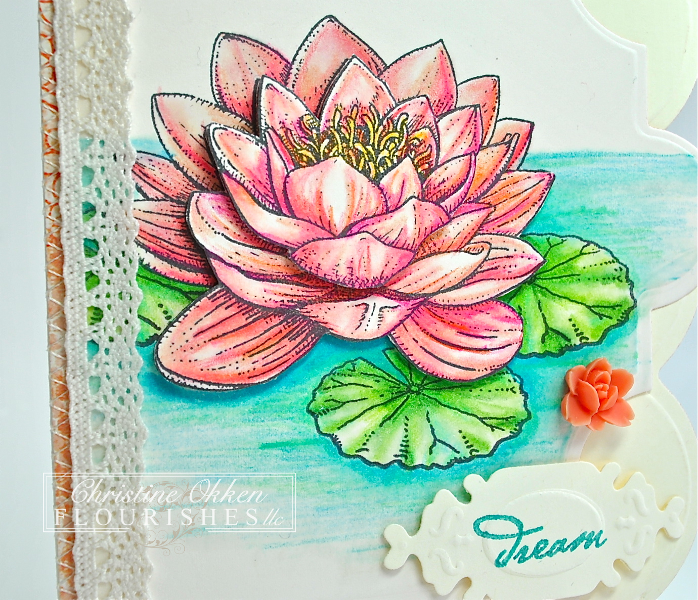
Last year I did a few "Ode To..." posts with some of my older Flourishes sets, reminding me (and you) why they're still wonderful.  I create something new, as well as remind you of some older cards I made with this set too.  Today I pulled out my Waterlilies set, penned beautifully by Marcella.  It contains some koi fish, lily pads, waterlilies and buds, and as always some lovely sentiments.

This card I created is a bit of a departure in style for me, it's a bit "scrappy".  I'm trying to stretch a little :)


I began with my Grand Calibur machine and the Grand Creative Book Pages Dies and Grand Creative Book Pages Two, creating this tall and narrow shaped card.  I took a few pieces of dp I had and sewed them on in a scrappy style.  

Now...for the waterlilies.  This set looks beautiful stamped on it's own, stamped and colored or layered like I have done - paper tole style. 


As you can see I colored up three layers of flowers with my Prismacolors and layered the waterlily up.  Waterlilies have this sort of vein-like coloring to them so you can see the sharper lines in the coloring.  


alright now for a trip down memory lane with this set:


A little water swirling in the koi pond with some copic markers....


Some reflection technique in the water with copics and metallic pencils.  


Some rich watercoloring and pretty piercing.  


Soft and romantic with Copics


And some more prismacoloring with a similar palette to the card today.  

So, you can see how I've changed, my styles and coloring have changed over time too, and hopefully you've seen all the potential in this lovely set!

Have a great Monday everyone!

Wednesday, October 5, 2011

Ode to Irises

Sorry I've been MIA for the last week.  So much in the work, ministry, kids, family schedule, I feel like I've barely had time to breathe.  And it's making me cranky too.  I don't like being cranky.

So, I thought I'd cheer me up and do a nostalgic look back to this pretty Siberian Iris set from Flourishes.  I think it's one of the first sets I ever got from the company.  And I still think is a show stopper...

Here's one I made earlier this summer and didn't show you yet...


Nope, not velvet Elvis, it's a velvet Iris :)   I paired this beautiful Iris with some older Velvet paper I had in my stash...I can't even remember who made it.  Coloring on this pretty flower is done with Prismacolors and OMS, I tried to add a little golden coloring into the center petals of the iris too. 


Now here are some more Iris cards I made that I've pulled out from the creative history vault :)


Above I combined several Flourishes flowers in this card for my mom, including poppies and violets.  This one was watercolored.  And as you can tell, I really like making my Irises burgundy.  It's my favourite shade of Iris. 


And above is the oldest one I could find in my pictures, this one was watercolored, cut out and popped up.  

Now, what you may not know is there is also a beautiful little topiary in this lovely set too.....


I watercolored this pretty scene to give it a very fresh spring feel... and guess what?  You can make it Christmassy too!


Here I paired it with some pretty Christmas plaid and added the small flourish from the set in the background.  I believe this one was watercolored too.  

Thanks for dropping by for this Ode To Irises. You can find my Ode To:  posts by clicking on the bottom words Ode To in the Labels.   :)  Be back tomorrow with a Flourishes Pre-Release Challenge for October, new release Sneak Peeks start next week!  

Sunday, September 25, 2011

Ode To Nasturtiums

I've been very blessed to be able to work with some of the most fantastic images in stamping.  I love lots and lots of stamps from different places and companies, but if you know me, you know that I only use what I love.  What I stamp with also represents me too, so what you see here on the blog is what I love.  And I also love the privilege of representing the companies I have been able to in the past 3 1/2 years.  Creating is joy for me, and probably for you visiting too.

I've been with Flourishes for almost 3 years, so I also feel very grateful to have most every set we've ever made :)  And sometimes some of those older sets don't get the love they're entitled to!  So, I thought I'd bring out some of my older Flourishes sets on a more regular basis and give you an "Ode to" that set.  I'll create something new, and then show you some of my older creations from that set too, it will remind all of us of style changes or how I've changed as a designer :)


I pulled out my pretty Nasturtiums set from Flourishes.  When Marcy first illustrated it a few years ago I bought some seeds and planted my own nasturtiums outside too.  They came up beautifully, full of plentiful delicate looking blooms, varied warm colors, gorgeous green round leaves....and they're even edible!  Sort of a peppery taste to them.  

Coloring on this card is done with Copic Markers (R22, 27, 29; G40, 82, 85, G21, 24, 28, BV00, Y17, 35, 38), and I've used the Spellbinders Labels Twenty-Three Die to cut all the shapes.   This perfectly pretty paper is new in the store from My Minds Eye.  This one's called "Lost and Found - Rosy".  I am beside myself about all the new My Minds Eye line in the store :)  The pretty ribbon is a lovely puckered/pleated Satin Plisse.  The card is 5 1/4 x 5 1/4 in size.  


Because I set the sentiment overtop of the main image, I took a second stamped nasturtium and layered overtop to match what was underneath and popped it up, as well as popping up one of the leaves (lower left leaf close to you).  Full of cheer wouldn't you say?

Now how about some OLDIES with this set?  


This card was colored with Copics as well, and I added a few extra blooms with the other stamps in the set filling out the design a little more.  Sorry - the photo is a little over-exposed....but it's very white on white.  


This was a fun one, I made a little gift seed-box out of cardstock vellum to put in a package of nasturtium seeds to give away.  This one was watercolored.  And again I popped up the flowers.  I seem to love that :)


I love how dramatically this card turned out.  As you can see I've stamped the nasturtiums with a horizontal orientation.  I stamped the image in White Craft Ink, embossed it in white on the black cardstock, and then colored it in with Prismacolor and metallic pencils.  It's really iridescent and has a  cool effect.  
So there you have it, my first "Ode To".  Hope you enjoyed this beautiful set!  

Let me know what FLLC sets YOU'D love to see featured and I'll put them on the list!    

Have a great Monday friends!