So....today for The Creative Process I have a project that I worked on a while ago, but it will be new to you. I enjoy creating sets of cards that give the example of three different styles of coloring. My three favourites mediums: watercolor, prismacolor pencils and copic markers.
Here is the set of three cards. I used Flourishes Thank You set, one of my all-time favourite, all purpose sets, the papers are Basic Grey June Bug DSP.

The first card showcases Prismacolor Pencils for coloring.

I also added some sponging inside the Nestability template to tie in the colors to the papers. I kept the accents on all the cards simple and tried to keep some of the detailing similar to tie all the cards together. With prismacolors I add my different shades and blend with a blending stump and sometimes also use Odorless Mineral Spirits to help the colors "slide" together better.

The next card showcases Copic Markers, and is a 5 1/2 x 5 1/2 inch square card. You can see the more vivid, deeper color that copics give to an image. I believe I used the Fuschia Copic Collection from Flourishes for the reds in this image. I also sponged the image to keep that consistent focal image look.
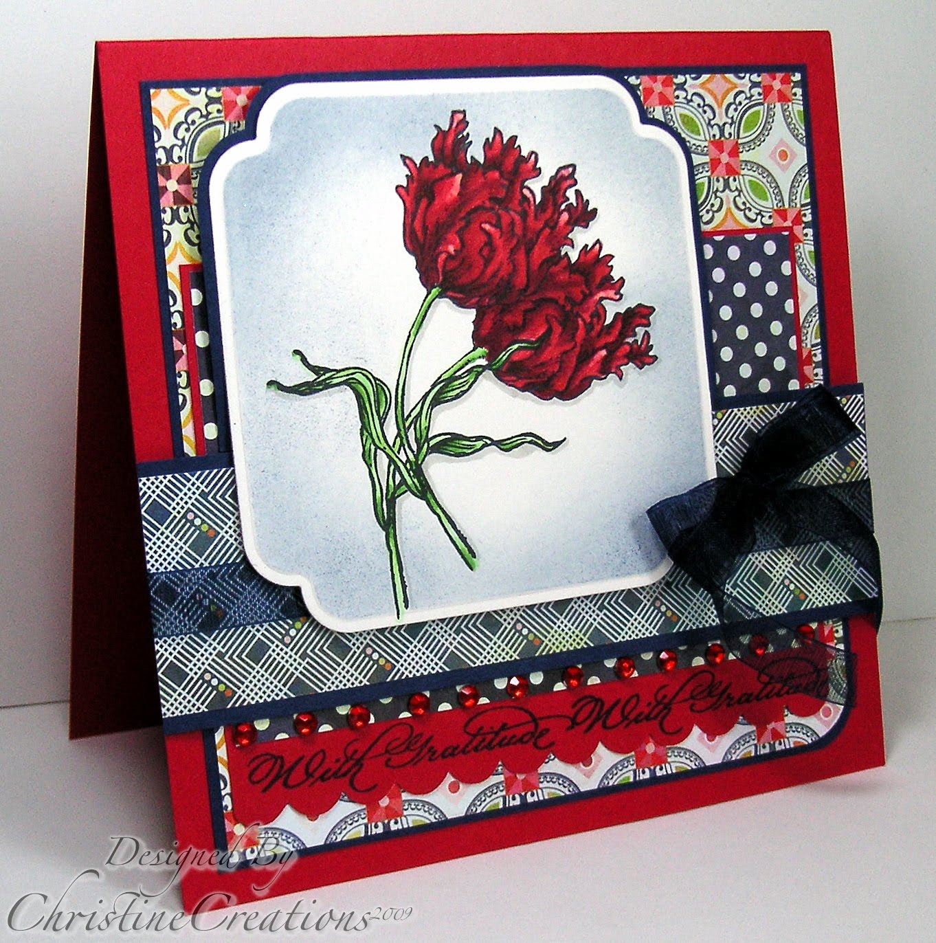
I love the contrast between dark and light in the image. To create the highlight I used a blender pen in the red petals to pick up color and give more of a light-colored highlight after I'd colored the whole image.

And the last card uses Watercolor as it's medium. I think the colors turned out great in this one. And I love the rounded and square corners that alternate with the rounded edges in each of the focal images. Sponging always turns out so great on watercolor paper too. It soaks up the ink just right with such even distribution.

The patterns on the paper are so fun together too.

To me what brings life to coloring images is the contrast between shade and dark and light. A flatly colored image just doesn't jump out at you and carry the realism of a true to life image. So, in each of the mediums I've worked hard to give that illusion of depth and highlight in the coloring. With each medium it means different techniques. In future Monday's I'll focus on each technique specifically to give you some tips that have worked for me.
Have a great Monday everyone! Hope to see you tomorrow!
Recipe: Stamps: Flourishes Thank You; Ink: Memento Tuxedo Black, Stazon, White Craft, Night of Navy; Paper: Prism Papers (Red), Night of Navy, Basic Grey - June Bug DSP, Flourishes Classic White, Flourishes European Watercolor Paper; Accessories: Big Shot, Dotted Embossing Folder, Labels 11, 12 and 13 Nestabilities, Scalloped Ege Punch, Corner Rounder, Navy Sheer Ribbon, Red Rhinestones, Dimensionals, Copic Markers, Prismacolor Pencils, Reinkers, Stampin' Write Markers, Waterbrush, Sponge


11 comments:
this is a masterpiece!!!!
Hi Christine
these cards look great
I'm agree with you that the copics of the highlights better come forward than the color pencils
but is nice too see the different
great demonstration
greetings karin
These are gorgeous, Christine!
What a fabulous use of Nesties, Christine!! Just love how you have layered the images on each card. Great colouring on all and I love the sponging too! Great set of cards!
Very pretty. I love the Copics coloring, nice and bright. You are such a talent!
All of these cards are wonderful, and it's so interesting to see all three mediums together for comparison. It's hard to tell the difference between the Copics and the watercolors, other than the paper. You do such a beautiful job with all your coloring.
No matter what medium you color with, your coloring looks GORGEOUS! LOVE that set of cards!
Hugs and smiles
i love that they look spotlighted with the sponging around each one. i think my fav is the watercolored one. the patterned paper is great too!
These are lovely. My favorite is the copic but it is wonderful for the side-by-side comparison. I really like your combinations of the DP - very rich combos.
This is such a gorgeous set, and you have showed us 3 wonderful examples, Christine! You have mastered these techniques. I am looking forward to your more in-depth focus in the future!
Oh wow...your coloring looks incredible on each and every one of these, Christine!! I love the papers too!!
Post a Comment